
Learn how to create an Elementor justified gallery slider. Simply follow the simple steps below!
See the demos here.
You can also check out these related premium tutorial:
Method 1. The Simple Version (with same width for all images)
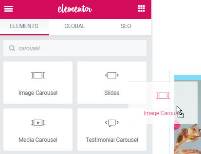
To begin with, create your Elementor image carousel
That will be the justified carousel gallery.
Then, add the code below under Advanced > Custom CSS
<script>
/* Please login to get the code
 * The code will be for the Awesome Elementor Justified Image Gallery Carousel tutorial
 * Found at this URL https://element.how/elementor-justified-image-gallery-carousel/
 */
</script>
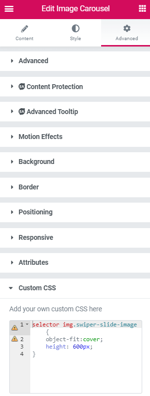
Now, adjust the code to fit your Elementor gallery design
If you want the image carousel to be 300px tall, for example, change the 'height' value to '300px'. You can also set a value in vh , such as 100vh for a full screen justified gallery carousel.
You can modify the object-position also, although you usually would not really have to change this. Watch the video to learn more about that property!
Finally, enjoy your new Elementor Justified Gallery Carousel!
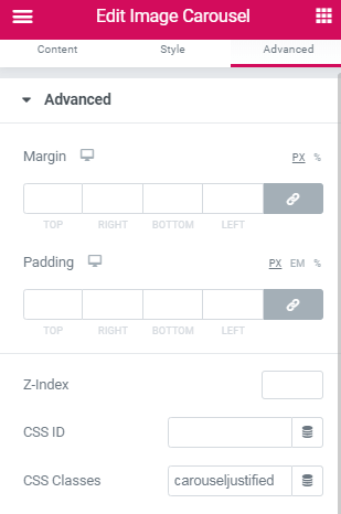
If you have Elementor free, this will still work! Simply change the word 'selector' , in the code, with '.carouseljustified' , and add the CSS to your page. Also give your image carousel the CSS class 'carouseljustified' ! Learn more about how to add CSS to Elementor free websites.
Method 2. For Custom Width Images Elementor Justified Carousel
This method is now deprecated and no longer updated or supported, I strongly suggest you instead have a look at the Elementor Carousel Mods (Vertical, Fade, Justified, Center) premium tutorial.
This is compatible with ACF gallery field. So it can be a dynamic justified image carousel.
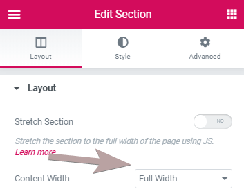
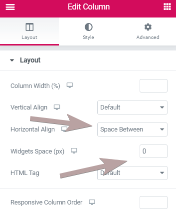
To start with, setup your section and columns settings
Set the section to 'full-width', and set the column horizontal align to 'space-between', and set the widget spacing to '0'.
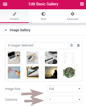
Then, create your image gallery using the 'basic gallery' element
Set Image Size to 'full', and Columns to '1'.
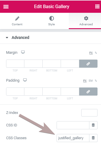
Under 'Advanced' , give your basic gallery the class name 'justified_gallery'.
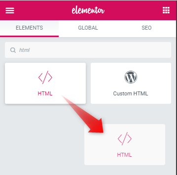
Now, add this code to an html element
<script>
/* Please login to get the code
 * The code will be for the Awesome Elementor Justified Image Gallery Carousel tutorial
 * Found at this URL https://element.how/elementor-justified-image-gallery-carousel/
 */
</script>
After this, create your right and left navigation arrows using the 'icon' element
You can use the icon you want! Even your own SVG!
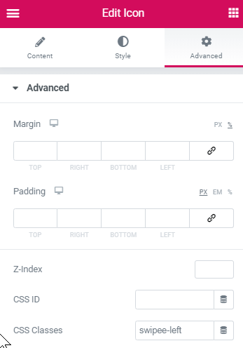
All you need is to give the left navigation the class name 'swipee-left', the right navigation the class name 'swipee-right'.
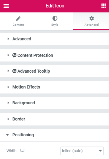
And set the width to both of them to 'inline' , under Advanced > Positioning
Finally, enjoy your new Elementor Justified Image Slider!
Let me know if you have any questions or if you need help with anything!
71 Responses
Hello, the contribution of this gallery is excellent. It works perfect, but if I need to include this same gallery 3 times in the same section it causes conflict. Any suggestion?
Did you use method 1 or method 2 ? Probably method 2.
You will need to give each of them a different class name, and then duplicate the code and adjust it to reflect the new class name of the other 2 galleries.
so you would change all instances of .justified_gallery to .justified_gallery2 and .justified_gallery3 , everywhere in the copy pasted code.
Maxime Desrosiers Excellent, it was perfect! thank you for your support.
Thank you so much for this, it worked perfectly! I used the 2nd method and I was wondering, is there a way to change the appearance of the navigation dots? I also want it to show captions too, if possible
Hello Tangmo! Glad it worked good for you! to show captions, simply set it as you normally would, in the Basic Gallery element settings.
Then, change that code
.justified_gallery .swiper-wrapper , body:not(.elementor-editor-active) .justified_gallery .gallery{
height:calc( var(--swiper-height) + 30px);
}
to this
.justified_gallery .swiper-wrapper , body:not(.elementor-editor-active) .justified_gallery .gallery{
height:calc( var(--swiper-height) + 90px);
}
It will allow enough space for the caption to show properly. You will also want to adjust the
--swiper-nav-margin: 300px
value. This correspond to the positioning of the navigation arrows, for desktop.
To chagne the dots appearance, some custom work would be needed... no simple way. If you just want to change their size, you can play with the scale value here
transform: translateX(-50%) scale(1.4);
I hope this helps!
Maxime Desrosiers Thank you so much 🙂
Doesn't work on my end. Please help
To let other readers know, I helped Ethyl and was able to get it working. She was using the new Elementor V 3, and a few fixes were needed in my code for compatibility.
I updated my code provided here as well. Now, it should work for every Elementor version!
Its looks so much better and works but how can I make arrows placed outside the carousel so images don't cover it?
Hello, this tutorial was amazing but I am having issues with it on the mobile. the images are not in a box, they are all displayed horizontaly accross the page on mobile. Anyway to fix this please?
Share me your URL please
Maxime Desrosiers
https://surabhigupta.com.au/
thank you 🙂
Also the gallery shows it has 30 photos even though I have only 10 photos in the gallery
Surabhi Gupta 30photos, that's normal.. it's how swiper works. To fix the overflow problem, go in the Section settings (the elementor section that contains this swiper) , then set 'Overflow' to 'Hidden' . It will fix this right away!
And your website is amazing... such beautiful photos!
Maxime Desrosiers that fixed it! thanks so much Maxime, you are amazing! And thanks so much for your kind words regarding my work. Building the website has been hard but so rewarding. Couldnt have done it without amazing articles from genuinely helpful people like yourself <3
Aloha Maxime! I did everything you outlined here but the images are stacked in one column, all the same width (just like on your video), but I want the images all in one row, all the same height, while keeping their individual aspect ratios or full images (also like in your video). I'm trying to create a justified image carousel for photos that scrolls left and right.
I'm using Elementor v3.0.15, Elementor Pro v3.0.9.
Mahalo for your help!
With Method 2, it should work fine... If it doesn't I would need to check the page to have an idea why it's not working.
Maxime Desrosiers Sorry, I re-created everything and it works! However I have one image that is a panorama and it's aspect ratio width is squeezed so that the full image is preserved, but the width is too small. https://www.kenrobertson.photos/home/
Thanks for your help with this if possible...
Ken Robertson When I visit, it's not working and I get an error. I actually realised a ' ; ' character needed to be added somewhere in my code. I updated it now, so it should fix the swiper not working ifi you change to my updated code....
I don't know if it will fix the panorama image though... Maybe you will need to resize it to make it fit..
Maxime Desrosiers I just noticed the panorama changes width as I resize the browser window. Any idea what width I should resize the image to? All other images work fine. I'll play with resizing but I don't no what principle to follow for a sensible width/solution...
I looked on a tablet and smartphone and the pano width is squished to fit each screen. It seems that it would need to be set to a much smaller height to fit the full width to all these screens, but that would make all the other images quite small as all would adjust to that same height. Is there a way to allow the image to bleed off the screen thus needing to scroll left or right to view it all?
If not then it seems I would need to crop the image to an appropriate aspect ration so it fits at full width while matching the heights of the other images. Perhaps I could chop the image in half, then put the two images together with no border between so they appear to be one image???
Thanks Maxime for any understanding you can give me about this!
Ken Robertson Hey Ken. Just got a chance to look at this now... Here is how you can improve this.
In the code, find :
.justified_gallery .elementor-image-gallery .gallery-item {
width: auto;
}
Change to :
.justified_gallery .elementor-image-gallery .gallery-item {
width: auto;
max-width: unset;
}
Maxime Desrosiers I noticed that the images do not show up when I have width set to auto. I had to selt an explicit width.
Maxime Desrosiers The panorama displays just great now! Thanks so much Maxime!
Ken Robertson Really glad to hear that!
hi!! thanks so much for thiss!!!!!!!! i wanted to ask. instead of scrolling by pinching and move, whats is the code to scroll just by softly touching the trackpad?and in which line should i put it? thank u!
and another..in mobile version is very tiny the slide..how do we display it fullscreen or bigger?
Doesn't appear to be working at all with the latest versino of Elementor. Followed the instructions to a T. Looking at the html I see the figure element with the image, but all I get on the front end is a blank area where the slider is.
I figured out it's an issue with my theme (Blocksy) that is doing something to the figure element. I guess I have to track down what exactly. Switching to the Hello theme made the slider show up.
Christian Nevil Thanks for sharing!
Maxime, This happens only when I use the keyboard right directional arrow. I notice that when I use my keyboard to arrow arrow right the images move just fine, but the "swipee" arrows move as well and then the images no longer center on the screen. Instead they align relative to how much the swipee arrows have moved. In fact the entire page seems to move with the arrows. This only happend when I keyboard the right arrow. The keyboard left arrow doesn't respond or move the images at all. Can the those left and right swipee arrows be made to stick in position when using the keyboard left and righ arrows? Or else haw can I disable to keyboard right arrow action...
Thanks again!
Hi Maxime,
Thank you so much for writing this, it's much appreciated. However, I'm finding it doesn't work on desktop Safari. If I open the Web Inspector and press refesh everything shows up, I can then close Web Inspector and it continues to work on refesh. However, if I close the browser and re-open it fails once more. Here is the URL https://warrenre.webpi.co
Any help would be very much appreciated.
I can't replicate the bug... the swiper on your site works just fine on my Safari desktop, even after closing and opening the window, private mode, etc... just works!
Maxime Desrosiers Oh wow, interesting. Thank you so much for taking the time to test it, really appreicate it. This just makes the issue even more difficult to track down though...
Thanks again 🙂
Man, you helped me so much. Thanks. I wish you the best in your life. Thank you very much
Welcome!
Hi! I am currently trying to remove the square border that appears around the nav arrows when they are clicked. How do I do this?
You will need some CSS ...
.elementor-element.swipee-left:focus, .elementor-element.swipee-right:focus{
outline:0;
}
However this is there for accessibility purposes, and generally recomemened to be kept, or at least, replaced with some similar styling that will make it clear which item has the focus.
Hey! If you get the download, and import the template, is it working?
You can get it for free by entering 0 !
I have 27 slides, everything works except for the last 7 slides are not shown and it loops to slide 1. There are however 27 dots so I'm thinking when I press the arrow the slides do not move all the way so on dot 27 I'm on slide 20 and the next one skips to slide 1. Any ideas?
Could you share you URL? I don't have any idea otherwise...
Maxime Desrosiers it's super weird, my hosting provider's server crashed and after the crash the images were swiping all the way like the should 😀 so everything works perfect now
Pavlin Todorov Great!
The method 2 is nice and working for me. I want to reduce size of slider on tablet. How do I adjust the height for tablet?
is there any way to take this to the next level and make the center image larger as if to highlight that image?
Yes there is! Add this CSS:
.swiper-slide{
transform: scale(0.9);
transition: transform 0.4s ease;
}
.swiper-slide.swiper-slide-active{
transform: scale(1);
}
Hello.
I try to do everything as explained in method 2 and I get error in JS (ReferenceError: Swiper is not defined at HTMLDocument.)
What am I doing wrong?
This is the url: https://temp.jazzconcola.band/
Thank you very much.
<script src="https://unpkg.com/swiper@7/swiper-bundle.min.js"> </script>
Add this in the html element, at the end. It should fix this...
Hi!
The gallery works perfect. Many thanks for that. But i'm trying to get one more class in to your code ('.swiper-zoom-container')
Having problem to get it to work. Using Method 2, Is this possible? Any suggestion?
Hi, Is there a straightforward way to have the carousel sync to have a larger image/slider above the thumbs carousel? Thanks
Thanks, works perfect!
Welcome Bert!
Fabulous tutorial thank you!
I followed the second option and it works perfectly however it extends to the full width of the page. What could I change for it to stay inside the section/column width?
Oh sorry I just put overflow hidden on and now is great.
Thank you again for the amazing tutorial
Hey Lucien!
Glad you worked it out. Cheers!
Thank you for this tutorial! I'm just having a problem with the navigation function. The gallery images & icons are in place on the preview but the carousel doesn't move when I click on arrows. I'm using current versions of Chrome (Version 106.0.5249.119 (Official Build) (x86_64) & ElementorPro Version 3.7.7 - also tried Safari & numerous attempts at building the page to make sure I followed instructions correctly but no luck. Might you be able to take a look for me?
Many thanks in advance : ) Karen
https://tonymastersdesign.com/?page_id=2683&preview=1&_ppp=67166293b6
Oops! I sent you the wrong link - sorry!
this is the correct page preview -
https://tonymastersdesign.com/?page_id=2714&preview=1&_ppp=19b89f39ef
I'm not logged into your site, so can't see this page... it will need to be a published page with a proper URL...
I am having trouble this this. I followed the instructions and this the coding but the arrows show below the images and the gallery just made the page wider instead of "hiding" behind the around. When i swipe left the entire page moves. Not sure what I'm doing wrong.
2022, the code seems to no longer work. Shame as this is one of only two guides on how to do this. At least the second one kind of works. Unfortunate.
Hei Max :=)
thanks a lot for your code!
it is really cool!
bad thing is: I have some small problem (can I post a link here?)
I used method 1, but when I charge the page it does't start from the first foto, and second ... after the last Photo there will be loooootttsss of empty white (both ways, if I do infinite loop or not)
any suggestions?
this will help me a lot!!
thanks again for you super script!
Greetings Valerio!
If you remove my CSS, these issues go away? Are you certain you used method 1 ?
With method one, it's just a bit of CSS, and it's quite unlikely it would cause the problems you mention...
Hi Maxime :=)
you are right ... I tried with out your css ... and its similar problem :=(
thanks a lot for your help!
this is really appreciated!
ciao ciao
Val.
Hey Maxime!
Does this still work with the Elementor Containers (Flexbox)? I tried following method two but just simply couldn't get it to work. The code didn't change the images in the simple gallery. Maybe you could try it on a site with Flexbox?
I have something much better coming soon than the methods here... And managing very similar designs left and right is getting tough! I think I will remove method two from here, and update the tutorial with better options soon.
Hope you understand,
Cheers!
Hi Maxime, we are waiting for you patiently 🙂
Thanks Joe,
Here is an update: It is still at least 3-4 months away as it's part of a larger project that will require lots of my attention. I have a few priorities first and then my attention will go to that project.
Cheers!
Hi Maxime!
Looking forward to that project, I'm sure it will be great!
For now...Do you know if there is an easy way to change the transition duration of the second option? I tried with CSS but I can't find the way.
Thank you very very much!
Ángela
Yes! Directly below the line:
loop: true,
Add
speed: 900,
Cheers!
Hi maxime,
i cant swipe
can you help me?
https://aa.bureaupeters.dev/test/