")
")
Make the Elementor background-attachement setting work, even for Mobile devices such as iPhones.
Actually, because background-attachement:fixed is blocked at the browser level on mobile, we need to use an alternative technique, that will give the exact same result.
The only inconvenience is that we are using the Background Overlay tab to add our background image, instead of Background tab. So if you needed both of them, you might need to edit your image to add your overlay directly to it.
Here is what we are creating.
Let's get started.
You can also check out these related premium tutorials:
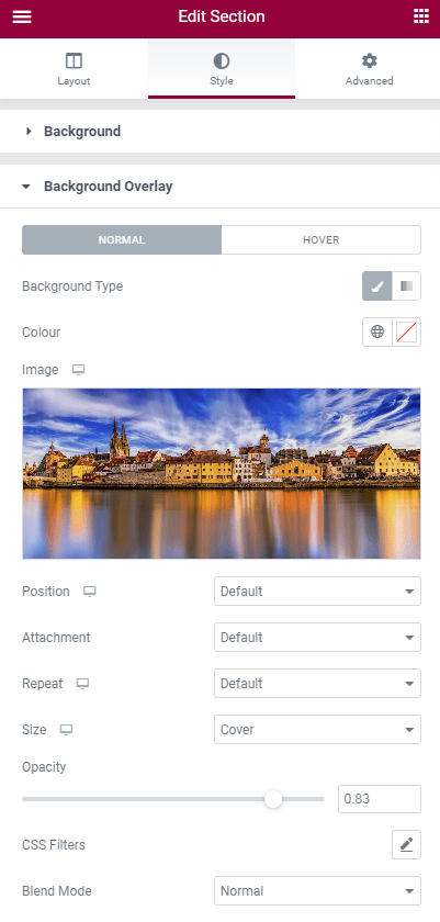
First, setup your background image in the Elementor section's settings
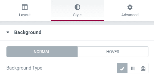
Clear and reset everything under 'Background'. You only this to be enabled (the little brush icon), for the Background Overlay option to show up.
In the 'Background Overlay' tab, your settings should be the following.
Importantly, do NOT set attachment to 'fixed'. The code will take care of that.
Set opacity, CSS filters and Blend mode as you wish.
Then, go under Advanced > Custom CSS, and add this CSS
This is to make the Elementor background image fixed, to replicate the background-attachment:fixed; behaviour.
Code for sections and columns:
<script>
/* Please login to get the code
 * The code will be for the Elementor Background Fixed on Mobile (100% Working) tutorial
 * Found at this URL https://element.how/elementor-background-fixed-mobile/
 */
</script>
Elementor Free Users: learn how to add CSS to Elementor free and how to deal with the 'selector' keyword.
Code for containers
<script>
/* Please login to get the code
 * The code will be for the Elementor Background Fixed on Mobile (100% Working) tutorial
 * Found at this URL https://element.how/elementor-background-fixed-mobile/
 */
</script>
Optionally, add this code in an HTML element, on the same page
This is to avoid a rare bug where on the newest iPads (and iPhones?) when the user changes its screen orientation, the images will overflow on the entire page.
I think it's rare enough for users to be changing their screen orientation while they are currently browsing a web page...
I would suggest adding this only if you have the kind of page where users are likely to rotate their devices (like if you have videos on your page).
<script>
/* Please login to get the code
 * The code will be for the Elementor Background Fixed on Mobile (100% Working) tutorial
 * Found at this URL https://element.how/elementor-background-fixed-mobile/
 */
</script>
Finally, enjoy your new Elementor fixed background on mobile design!
You should now have a fully working fixed background image on mobile, as well as desktop and tablets!
Let me know if everything worked well for you.
120 Responses
You are a genius!
...I had to be the first to post on this one! 😉
Hey thanks, great tutorial!
But what if we have a background overlay set up for increasing darkness of the current background image. will this code work for background-image?
Thanks in advance!
Hey Hamza!
Yes that's an inconvenient of this method. The background overlay is already being used. You will need CSS to create your own background overlay, or edit your image to have it included in the image file.
You can give the background a color and the background overlay a transparency to have the same effect! 😉
That's actually quite clever! Thanks for sharing
Hi! great work, but there seems to be a side effect on the Navigation button of the menu when used on iPads/iPhones. Do you have any idea?
Thanks Martin
Hey Martin!
Could you be more precise? Would you have a screenshot or screen recording of the issue? If yes, email it to me. Thank you.
- Using containers
- CSS ID for my container =“sticky-background-image”
- Set my Image for the container on the background overlay
- Tried adding the custom CSS (you added in comments for using containers) to the “sticky-background-image” container
- getting a red “x” error saying “Unknown @ rule: @supports.” On line 1
Is there some setting I’m missing, should I be adding the CSS to the container or making a separate HTML block somewhere and adding it there? (Full disclosure, c# pro but CSS newb 🙂
Thanks
Hey Bryan!
You can safely ignore this. It's because Elementor use a very old CSS linter, that's quite inaccurate.
The CSS will work regardless of the red X.
Hey Maxime!
When setting up a web site with Elementor we used a menu screen in the header of all pages which in itself includes the menu structure form 'Appearance' in the WP dashboard. And this structure includes some sub menus that link to the separate pages.
The standard 'fixed' feature for background works for desktops, and in the tablet/mobile view still scrolls. In the latter the menu is shown as a drop down with the three-strip button.
That is when your feature comes in and then fixing the background picture also works on tablets and mobiles.
However, when applying your feature the menu unfolds on Android systems but not on Safari systems (iPad, iPhone). When clicking on the three-strip button in Safari, nothing happens and we can not change to a different page.
Thank you for your help
Hey Maxime!
great work. Your recent change made it perfect also on the Safari side - on any iPhone and iPad it will be a happy viewing experience!
Thanks Martin
Thanks Martin!
For viewers: I updated the code to fix these issues Martin discovered on iPhones and iPads.
Is this still working? It doesn't seem to do anything for me :(, except moving the image to the background because the "edit section" top bar disappears, but the scrolling doesn't have the effect. Idk what I did wrong, I pasted the code in a html widget, in between the style tags and replaced the "selector" with the CSS class that I gave to my section with the image. Is there something I'm missing? I'm not very good at coding but this seemed the easiest and friendliest tutorial I found
Hey!
Maybe you are using the new containers elements? I just added instructions for these in the tutorial.
Example code if you are using normal section, with class name "sticky-background-image".
@supports (-webkit-clip-path: polygon(0 0, 0 10%, 10% 10%)) or (clip-path: polygon(0 0, 0 10%, 10% 10%) ) {
    .sticky-background-image{
    -webkit-clip-path: polygon(0 0, 0 100%, 100% 100%, 100% 0);
    clip-path: polygon(0 0, 0 100%, 100% 100%, 100% 0);
}
.sticky-background-image .elementor-background-overlay{
    position: fixed;
    top:0;
    left:0;
    height:100vh;
    pointer-events:none;
}
}
Here is the same, for a container
@supports (-webkit-clip-path: polygon(0 0, 0 10%, 10% 10%)) or (clip-path: polygon(0 0, 0 10%, 10% 10%) ) { .sticky-background-image{ -webkit-clip-path: polygon(0 0, 0 100%, 100% 100%, 100% 0); clip-path: polygon(0 0, 0 100%, 100% 100%, 100% 0); } .sticky-background-image::before{ position: fixed; top:0; left:0; height:100vh; pointer-events:none; } }Containers? Umm I don't think so, I'm just adding an inner section into the Elementor section and from there.
Edit: Oh wait it worked now!! I erased the previous section and tried it again from start and it worked, even the style options work, that's exactly what I wanted, to show the image in full-size with size:contain and also the fixed background. Thank you so much Maxime!
Welcome!
Hi there, I'm using containers but this doesn't work, my background is finally showing properly on mobile but it's not fixed.
Have tested on Chrome and Safari on iphone.
Thanks!
Hey Pageant!
Do you have a URL I can inspect to see what might be the issue?
I really like your solution, but I am wondering whether it can cause links from not working because of this. I made use of your solution on https://new-limits.nl/. There are several linked elements which do not link on iOs (at least on my iPad and that of my customer) eg the three images halfway the page, the titles below those mages (Vitaliteit, Personal training and Revalidatie) and the buttons at the bottom of these columns. Also the text link Contact which is below that part is not working.
Hey Frans!
In your code, you didn't copy that line :
pointer-events:none;
It's required! Otherwise it will have the bug you mention. Add it and it should fix this.
Cheers!
Maxime
really nice tutorial, thx! any chance to get it work with a background video?
Yes actually this same technique would work fine with background videos. Just need to change the selectors...
However, on mobile, background videos aren't reliable and don't always autoplay. Something to keep in mind...
unknown rule @ supports in custom css
You can safely ignore this. This is due to Elementor using an outdated CSS validation tool.
The code works just fine.
I do not see the result either in the PC version or in the mobile version
You might have an error elsewhere in this case, such as broken CSS upstream... I would need to see the URL.
https://www.steli-novoyi-oseli.com.ua/
The background image overlay is what is sticky, with this code. So your sticky background image needs to be set as background image overlay, not as background image.
The code is there, and working, you just need to switch the image to the background overlay!
And indeed. EVERYTHING works! Thank you very much!
Cheers!
it worked, but the result is that my landingpage looks like it's completely covered by a transparent color that wasn't there before, what's the solution?
Do you have a screenshot to share? What device do you see this on?
Thank you.
Fixes image in place but my transparent sections are appearing grey and not showing the image behind them. How can I resolve this?
Wow!!!
Works great!
Thank you very much!
Welcome!
Hello,
This tutorial is great and well-done! Everything worked as intended until the last bit with the script to make it work on iPads/iPhones. When added in an html div, nothing changes.
I know a bit about html/css, but nothing with php. After trying a few solutions (plug-ins to add the script in the header), i tried php checkers, all saying there's a problem in the 1st line (excluding ).
The page I'm working on is https://reno.se-agency.fr/fixed-image-example/
Can you help me please?
Hey Hugo!
I'm sorry I didn't look at your page earlier. The code works on iPad and iPhones out of the box, the part with the <script> code is only required to prevent a bug on screen orientation change... it's not required for the sticky background to work!
Oh what a pity, doesn't work! 🙁
Isn't it compatible with emt 3.9.1 and the new flexbox containers?
Hey Meister!
It should work fine... in my demo above, I'm running Elementor 3.9.2 and it's working as intended!
For sure? I can't believe this. I've tested it with sections and columns and it works fine, but it does not work with containers.
Hey Maxime! I figured out that you already did post a code for containers in the comments. That works – awesome!
But please put this code in the article on top. I guess most people won't find it in the comments.Thank you!
You are right! I have added it to the tutorial.
Hello everyone! I also have a problem, I copied and attached the code for the fixed background in Custom CSS and the code in the HTML element in the page to which I attached the link below, everything works fine until I try to zoom on the ipad/iphone and in any instead of the page, I would try to zoom, the background image from the second section appears. Below I leave you a YouTube link where I made a screen recording with the problem. Can someone help me please? Thank you very much!
Page with problem:
https://aqua-prestige.com/home/
Youtube link:
https://www.youtube.com/shorts/_aXnpURW064
Greetings!
This looks like a render bug from the Safari / iOS browser. You will have to write to Tim Cook to get that one fixed! I won't be able to help here.
Cheers!
I did some research and I also discovered that it doesn't work only on iOS, I tried other browsers on iOS and I still have the same problem, but on Android I see that everything works correctly, I don't know what to do or what options I have , I'll probably talk to Tim Cook 😂 ... Thanks for the answer and for all the effort you put in!
Help! Thank you so much for the article. It worked perfectly and this was exactly the fix I was looking for, however, the fixed image is cropped to the left on mobile. Is there a way to maybe make it less cropped or do you have any other advice?
Thank you so much for your help!
Greetings Mendy!
The image is set to 'cover', meaning it will occupy the full space available, and part of it will be cropped. This is normal, expected, and essentially what we want... otherwise the entire space would not be occupied and it would not look very good.
For some image, the cropping that occurs isn't quite positioned as we wish, so we have the background-position CSS property for that. In Elementor, it's called Position, under your Background Overlay settings. Change it to position your image differently.
Cheers!
Hello - I have noticed a bug on zooming in.
The effect works perfectly on mobile, however, when you zoom in (with your fingers), the whole viewport grays outs. And it happens if you zoom in anywhere on the page. So if you have this fixed effect on a page and for example, you zoom in on a photo or a feature anywhere on that page, the viewport goes gray. When you zoom back out the screen goes back to normal.
Do you know a fix for this that?
Greetings!
Like I wrote to someone else above:
This looks like a render bug from the Safari / iOS browser. You will have to write to Tim Cook to get that one fixed! I won't be able to help here.
Sorry!
Hi Maxime!! I've been applying this to many sites and it works perfectly.
Recently I tried on other site but when I add the code to the section (I use the section code) the image turns into blank and there's no effect..
I did exactly the same as the tutorial and as on the other pages but for I don't know what reason it doesn't works.
Did you experience something similar?
Thanks!
Hey Gabriel!
I don't know what would be the issue here... I haven't seen this or heard of this bug...
If you can share a page with me where you have the bug (and also let me know where to look for it)
Cheers!
Maxime, thanks for your reply.
You can see it here https://www.lavozdelutero.com/metodologia-new/ on the bottom of the page you'll see the same section, one with no-image (code that does not works) and below that one the section with the image.
Thanks 🙂
Hey Gabriel!
Everything seems to work as it should. The issue in that particular case is that you don't have any image set as background overlay for that section!
When I copy pasted the CSS from the section below, the image was added, and it was fixed as expected.
If in Elementor you do have a background image set as overlay, then it's a CSS issue.. try WP > Elementor > Tools > Regenerate CSS
Cheers!
Thanks Maxime for taking a look... I Regenerated CSS and the problem persists.
Here I recorded a video so you can see if I'm missing something
https://www.loom.com/share/640e2dbd8541400c9eaee68a162f6f06
Cheers!
Hi Maxime, sorry to bother again! I've been trying all but still the problem persists. Even on other pages on the same site.
I copy the code on other sites and works, it seems something related to the site itself.
Do you know what could it be?
Thanks.
Yea it's definitely a bug. Inserting the code on the front end makes everything work as it should... so it's a issue with the proper CSS not being generated for some reason.
Sorry I can't troubleshoots everyone's problems though! If you need paid help, reach out to me.
Cheers!
Hello and thanks for this solution with background fixed images on iPad.. The tutorial fixed the iPad's landscape mode now showing full size image but on portrait mode and mobile mode the image is overflow. I also added the script code in an html element at the end of the page but it does't work unfortunately..
Did I do something wrong?
Here's the page I'm working on: https://manuelopezgomez.com/presskit-test/
Best,
Maje
Hey Maje,
I think you need to set your background overlay's position to :center center, in the Elementor editor's settings.
Hi Maxime,
It worked. Actually, I didn't need to put the optional html code and it's running fine in all my devices so far. Thank you very much!
Hi Maxime, works great in sections, and I love it. Unfortunately it does not work in containers ;-(
Hey Yasemin!
I updated the code for the containers, please import it again in your project!
💘 THANKS a lot Maxime ♥️ Finally works - helped me a lot since I am going nuts with the container-bunsiness 😉
When I enter the container code into the CSS, the red warning triangle shows up telling me that @supports is an unknown rule. Does anyone have any idea what I need to do in order to make it work?
Hey Kerstin!
You can just ignore that. It's from the CSS validator Elementor uses, which is outdated.
The CSS will work regardless of the warning.
Cheers!
Hi, I randomly ended up here, and this seems to be great. I wondered if it only works with Elementor Pro, or can I add it to the "HTML widget" from the basic Elementor version? I don't know about coding, yet I've done a lot with tutorials; it's just that I don't get to make this one work. And should I add it to each section where I have the background overlayed pictured or on one single separate section box?
I really appreciate any help you can provide.
Hey Dominique!
Yes it works for Elementor free as well. You will need to follow the instructions I have here:
Elementor Free Users: learn how to add CSS to Elementor free and how to deal with the 'selector' keyword.
Cheers!
Works perfectly for me , thanks very much:)
Welcome!
it doesnt work on latest version of elementor pro at lease.
on mobile phone or tablet it does nothing
SORRY ! it WORKS PERFECTLY !
i missed the part that i need to setup the photo as a background overlay AND NOT as a normal background.
Awesome Thodoris, glad it's resolved!
Cheers!
Hello,
I have added this css on my page but in my preview version of the updates it looks like nothing has changed. The site is still in build mode so can only use the preview option.
I had the image as background but added it as background overlay too. Used the CSS code and also got the unknown @ rule : @supports - which I note you said above it should still work.
Using Elementor Pro
Thanks in advance!
Greetings!
I would need to see the page...
Hi Maxine, the page is https://theremedyroom.com.au/our-team/
Thanks!
Cara
Hey Cara!
I recorded a small video: https://vento.so/view/e6587f15-1ffe-4767-b247-974397ef2087?utm_medium=share
I hope it's helpful.
Cheers!
Working on a site here using this code:
staging.aj-photography.co.uk
Works perfectly for one section, but if I try to use it twice on the same page, the second one is bugging on iPad/iPhone devices only, jumping to a fixed full screen which then can't be scrolled back up or down.
The first instance worked perfectly, and both work on other devices except iPad!
For readers: Ste actually found a fix for this (adding overflow:hidden to the parent element) and I updated the code in the tutorial with this fix.
Thanks Ste!
Hi Maxime!
This is awesome thanks! Is it possible to have the inner containers a visible overflow? I tried giving the inner container the following code, but this did not work
selector {
overflow: visible !important;
}
Hey Nick!
I'm not certain what you mean here by inner containers... would you have a URL I can have a look at ?
Cheers!
Hi Maxime,
Thanks for your response.
Here's a link of the website ( https://82606.jouw-nieuwe-website.nl/ ) the password of the page is ccreative.
The inner container I've mentioned is the red block in the second section that overflows into the third section. What I would like is that the block is completely visible instead of having a hidden overflow.
Thank you in advance for your response!
Kind regards,
Nick
Hey Nick!
Sorry that won't be possible... I had to add "overflow:hidden" to the parent container to prevent a bug on iOS (see a few comments above).
You could just remove the "overflow:hidden", but then the bug will be back.
Instead, you will have to either :
1. Go with another layout for this part or
2. Create a container below that one, set it to 100vh height and top margin of -100vh. Then set your inner container in that container that's now sitting on top of the fixed background container.
Cheers!
Maxime
I used this code and it was working fine but suddenly I have a 1px transparent line at the top of my upper shape divider and its driving me crazy!
I am still experiencing this issue sporadically. Sometimes the line is there, other times it is not
Greetings Sara!
What you are seeing is a well known "1px bug" with SVGs... more information here:
https://stackoverflow.com/questions/44170229/how-to-prevent-half-pixel-svg-shift-on-high-pixel-ratio-devices-retina
and here:
https://stackoverflow.com/questions/64600824/white-gap-between-svg-and-div
Cheers!
Hi Maxime! I'm finding a bug on Safari (is updated) using Iphones.
So, when you scroll down the effect works perfectly, but when you start scrolling up the background image gets repeated on all containers.
You can see the site here https://gabrielk72.sg-host.com/
I recorded a video on my device so you can appreciate it better. You can download it here: https://we.tl/t-6luWgsU5mV
Thanks a lot!!
PS: I also added the HTML code but the problem persists.
Greetings Gabriel,
Sorry I won't really be able to help with this... It's a render bug from iOS, and for some reason, on some pages, it's more buggy than others.
Sometimes on iOS everything will work just fine, but other time this kind of bug will show up... you will have to take it up with Tim Cook.
Cheers!
Máxime, thank you for your explanation.
So, it's random? I mean on some pages can happen and in others not? Even on the same domain?
Thanks again.
Hey Gabriel,
I think it's probably not really "random", to be exact... I think it probably has to do with DOM complexity, DOM size and
DOM depth. (in other words on much 'stuff' there is on the page)
But I can't say with certainty, and we can't say exactly when a page becomes too complex... we would need to test it out, and see when it starts breaking.
Cheers!
The problem, it seems, is that this doesn't just fix the background image... it also fixes the containers themselves, so that nothing scrolls anymore. 🙁
I added both of the main two lines of code recommended here... is there a way to make it so that everything on the page, all the containers, scroll up past the fixed background image!?
Greetings!
What you are describing isn't normal, maybe there is an error somewhere. Do you have your test page URL that I could check?
Cheers!
Hello Maxime,
Not only does the custom CSS fix everything, it does that on mobile AND on desktop. Adding the second line of code doesn't seem to change anything.
Here's the page:
https://theoryunderground.com/tu-staging-2024/?page_id=6580
I can't see the page, I see a WP Staging login form.
Hello Maxime, sorry about that! I thought it was visible to others... Well, here it is published and replicated on the main site side:
https://theoryunderground.com/links/
Actually, because that was freezing up every page across my whole live site, I decided to disable for the time being until I can figure out why it's doing that... I really wish this worked! If I could show you how it freezes just one page that would be fine, but it does so across all pages so I can't make an example...
(I tried to add the code to JUST the individual page via the HTML element but even with the "<style></style>" around the code from above that didn't do anything to the page...)
Here's a video of the issue: https://youtu.be/T2_cLKkfyUc
(Sorry no voice over because my mic doesn't work on this computer... but when it's showing it not moving just know I'm technically scrolling with the mouse and it's not doing anything)
Greetings!
Okay I understand the issue, you can't use the CSS code there in the Site Settings > Global CSS!
We are using the keyword "selector" in the CSS, so it can only be added to the container element > Advanced > Custom CSS field. It is targeted to that specific container that has the background image.
I hope this helps!
Ok, that makes a lot of sense! Right now the background image is set as background in the site settings, which does make it global. I understand you are saying the only way I could make this CSS work for the background image would be for me to make it a background via a container on a specific page.
Is there a way to make the background image work as a background for the whole page if it is only a container?
Greetings! try this CSS:
body::after {
    content: '';
    position: fixed;
    left: 0;
    top: 0;
    z-index: -3;
    width: 100%;
    height: 100%;
    background-image: url(https://templates.element.how/wp-content/uploads/2024/04/wp_dummy_content_generator_54232.jpg);
    background-size: cover;
}
Just change the URL to your own image.
Cheers!
How do you do it if you want to do a fixed background display with a slideshow type style on the background image?
Hey Taqy!
I could recommend against this... too likely to cause UI glitch, on Safari in particular.
Cheers!
It‘s very helpful, but please do you have an CSS for a tablet as well?
Greetings Tiva!
The same CSS works for Desktop, Tablet and Mobile.
Cheers!
Hi there, it seems the solution didn't work for me. Since I'm a beginner, I might have made a mistake. I followed the tutorial by placing the HTML box at the end of the webpage within the 'style' tags. I also used the background overlay and replaced the selector with my class name. Additionally, I attempted it with the CSS ID with '#' but didn't work either..😕
Greetings Veridia!
Please share your page I will have a look.
Tanks for the quick reply:)) https://littlebnb.de/elementor-3344/
Greetings Veridia!
Please change this line:
#ggf-fixed .elementor-background-overlay {
To this:
#ggf-fixed::before {
Cheers!
Thanks a lot 🙂 I tried to get an effect like here https://littlebnb.de/test/
But even with a overlay on the picture it does not work.. is there a trick
Greetings Veridia!
For this you will need to add an ::after pseudo element, with a background gradient that's half transparent.
Thank you a lot again , you are amazing, works perfect! There is only one buck at the top while scrolling down. Is there a option to fix this as well
Greetings Veridia!
Under Advanced > Padding, set the padding to 0 on that container that has the background overlay.
Cheers!
Unfortunately does not work 😐
Maybe I misunderstood the issue.
What does this mean? "There is only one buck at the top while scrolling down."
At the top of the page, there's a narrow bar that appears while scrolling down. It seems like the picture might be too small because the line is from a section of the background image. This issue only occurs on iPhones, even in the mobile view on Wordpress, the bug isn't visible. Perhaps it's a ‘1pm bug’.
Hi Maxime,
Thank you very much for this tutorial! 🙂
It seems the solution doesn't work for me, though, and I can't quite figure out where I went wrong.
I followed the tutorial by placing the HTML box at the end of the webpage within the 'style' tags. I also used the background overlay with the settings you showed.
When this didn't work, I tried pasting the code for containers in Code Snitppets but no luck.
I'm trying on two seperate pages on the same website. Here they are:
For the first one, it's the bottom picture:
https://abnormalgoat.xyz/
For the second, it's the top picture:
https://abnormalgoat.xyz/services/
The images are now fixed on PC or mobile.
Hope you can find time to have a look.
Thanks!
By "now" I mean not, haha 🙂
Greetings!
You have done everything right, you just need to add the class
sticky-background-image
to your container that has the sticky image!
Cheers!
HA HA HA HAAAH! It works! It's aliiiive!
OMG Maxime, you are my heroine!
Thank you! 🙂
Here's a poem for you:
In the world of code, where lines can confound,
A hero emerged, her talents profound.
Maxime, the wizard of CSS art,
With a generous spirit and a kind heart.
She worked her magic, with fingers so swift,
Giving my website a marvelous lift.
Fixed backgrounds on tablets and mobile, so neat,
She conquered the challenge, a wondrous feat.
No request too small, no problem too tough,
Maxime's skills turned the complex to fluff.
For free she bestowed her knowledge and care,
A gesture so selfless, beyond compare.
My gratitude flows like a river so wide,
For Maxime, the hero, and her expert guide.
With a heart full of thanks and a cheer in my rhyme,
I celebrate Maxime, one of a kind.
May her days be as bright as the screens she transforms,
Her kindness and brilliance, breaking all norms.
Maxime, the legend, in coding she reigns,
A true friend and savior in digital plains.
Welcome and thanks for the poem!
How can I convey this to someone step by step? I want to do this when it comes to the kotnener division
Hey Ariel!
Follow the steps, it works for containers as well!
Cheers!