
In this tutorial we are going to have a look at how to make an Elementor "WordPress Menu" element horizontally scrollable, for mobile devices. It could also work on desktop, if you have many nav items.
Here is an example of the horizontally scrollable nav menu we are going to create:
For a better preview, visit the demo page from your mobile.
Features:
- Left and right arrows to scroll (accessible)
- Left and right gradients in the directions where scroll is possible
- Arrows become unclickable and lower opacity if you can't scroll in that direction
- Optional 'buttons' shape design
- Different current menu item styles
- Automatically scrolls to the current menu item (if one of them is the current page)
- Automatically scrolls to the center of the clicked item (useful for a sticky nav with anchors)
- NEW: Pseudo tabs easy styles (see this tutorial to learn more about pseudo tabs)
If you would like even more features, check the Elementor Horizontal Scroll Menu, Taxonomy, Tabs With Images Premium tutorial. This is what that premium tutorial shows you:
First, let's prepare the Elementor WordPress Nav Menu Element
This tutorial is made to work with this element:
It used to be called "Nav Menu", but now Elementor changed it to "WordPress Menu".
If you already have it on your page, with some styles, I suggest you start by right clicking > clear styles. The code we will be adding will take care of the styles.
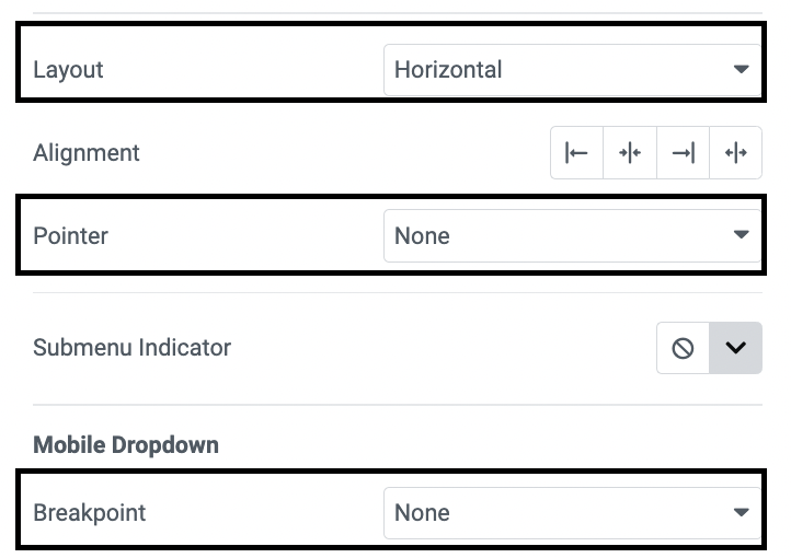
Now, set the layout to Horizontal, the Pointer to None, and the Breakpoint to None.
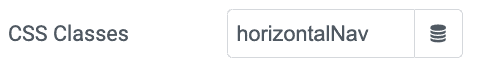
Under Advanced > CSS Classes, give it the class name horizontalNav
Now, let's add the Elementor Horizontal Scroll Navigation Menu code
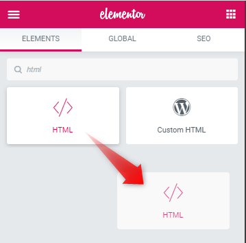
Add the HTML element right after your Nav Menu element.
Go under Advanced > Position, and make the HTML element position absolute so that it doesn't occupy any flow space. You will be able to find it back easily through the Navigator.
Add this code in the HTML element:
<script>
/* Please login to get the code
 * The code will be for the Elementor Horizontal Scroll Navigation Menu On Mobile Easily tutorial
 * Found at this URL https://element.how/elementor-horizontal-scroll-navigation-menu/
 */
</script>
Adjusting the code
In theory, everything should be working just fine already!
However, you might want to adjust various styles to make it match your project's requirements.
Adjusting the JavaScript
The first part of the code is the JavaScript. You don't really have much that you could edit here, except the SVG Icon.
If you would like another SVG, simply replace the SVG code that's there currently with your own. You only need the left arrow SVG code, as we are rotating it to create the right arrow.
If you like these arrows but want another color, change the fill="#444444" to your own color.
Important: the arrows will only show up on the front end, not in the editor.
Adjusting the CSS
Below the JavaScript, you will find the CSS inside of <style> tags.
At the very start of the CSS, you will see this:
<script>
/* Please login to get the code
 * The code will be for the Elementor Horizontal Scroll Navigation Menu On Mobile Easily tutorial
 * Found at this URL https://element.how/elementor-horizontal-scroll-navigation-menu/
 */
</script>
Adjust everything as you see fit. The rest of the CSS below that should not be changed.
If you have multiple horizontal navs like this on your page, and want to adjust the styles individually, simply add this CSS under Advanced > Custom CSS, and then adjust each property there. It will only affect this particular Nav Menu element.
<script>
/* Please login to get the code
 * The code will be for the Elementor Horizontal Scroll Navigation Menu On Mobile Easily tutorial
 * Found at this URL https://element.how/elementor-horizontal-scroll-navigation-menu/
 */
</script>
Finally, enjoy your Elementor Horizontal Scroll Navigation Menu!
I hope you have enjoyed this tutorial!
Cheers!
5 Responses
Hi Maxime, and first of all thank you a bunch for the great tutorials and more specifically about this one!
I have only a little query - what happens on mobile when you have more than 3-4 menu items with anchor sections on the page, p.e 'How it works ' page with 12 steps, respectively 12 anchor sections and the menu items are linked to them. Ideally I would like to be able to have the horizontal scroll navigation menu automatically scrolling to the active menu item when a person scrolls down the page and reaches p.e. the fourth, fifth etc anchor sections. I know you will be able to help on this and I would trully appreciate it
Greetings Teodor!
I have updated my premium tutorial here to add this feature: https://element.how/elementor-horizontal-scroll-menu-taxonomy-tabs-extra-features/
I want to add dropdown so it is work in show sub menu normal
me too. any ideas have you made it possible?
Hey Ariff!
Please share your test page URL with me where you have this setup, I will have a look.