
In this tutorial I'm going to show you how to create an amazing Elementor off canvas menu, that works for desktop, tablet and mobile.
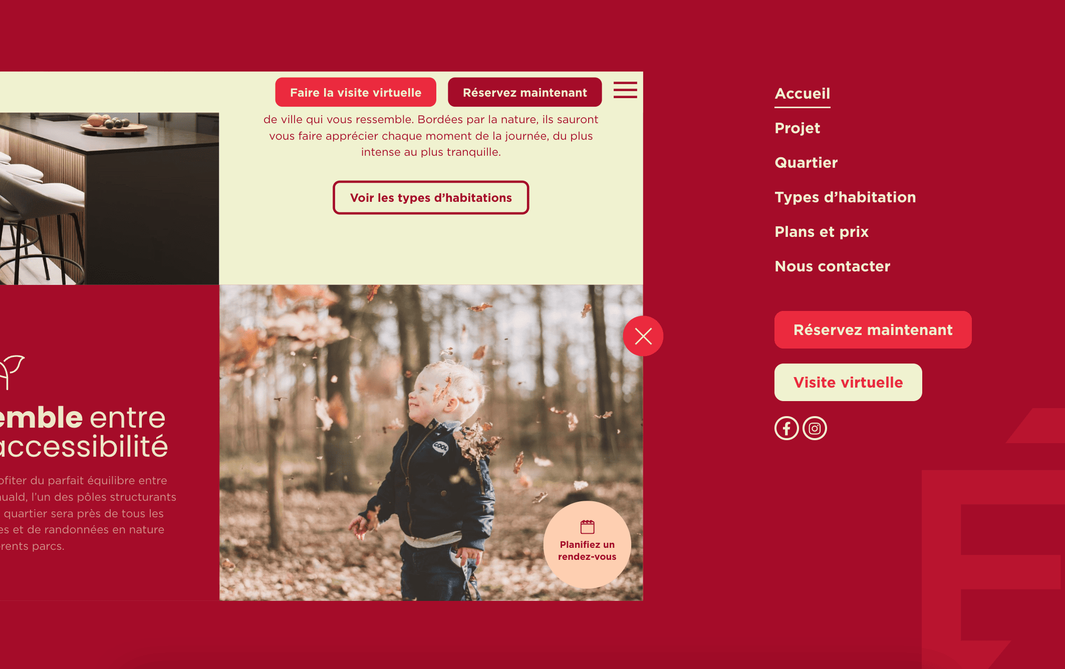
You will learn how to replicate this awesome Elementor off canvas navigation menu:
Here it is on a production website:
Features:
- Full Design Flexibility: The off canvas content that shows up is an Elementor Container Template, that you can design however you wish
- Make It Your Own: Adjust the colors of everything as you wish, as well as other styles
- Awesome Design: Wow your visitors and clients with this great design
- Accessible: Keyboard and screen reader ready
- Made For Hello Theme: Supports Hello Theme, might not work for other themes
Let's get started!
26 Responses
Hi Maxime.
So it all works great, except I encountered something unwanted that happens many times on mobile. As soon as I open the menu and scroll, my header disappears on the "page preview". When I close the menu and go back to the page, the Header went to the left and I can see 30% of it. To fix it I have to flip the phone several times so the header snaps into it's place.
This bug can be replicated also on Desktop, open the menu, then zoom out and in again(ctrl + mouse scroll), and the header overflows to the left side.
Can you help me?
PS: Hello Theme and have 100%width on the header. I do have it sticky and changes the color on scroll with just css (and offset effects), tried even with Template Headers from Elementor Pro but to no avail.
Greetings Joao!
Please share your URL with me, I will have a look.
Essentially it is because your header's width and/or position is calculated from JavaScript, for one reason or another. I will need your URL to find out the reason.
Hello maxime,
That works great for me.
I still have an issue. If I have a sub-menu, I can't get the sub-menu to deploy below the main entry; it's out of place and out of the frame. In fact, I'd have to be able to apply the elementor widget option Content>Layout > Mobile drop-down menu > Threshold > Desktop for this to work, but it's obviously not planned. Do you have a workaround? Here's the url for the recipe site: https://542c-14ae9e63eb87.wptiger.fr/
Thank you in advance,
OLivier
Hey Olivier!
Here is what you can add, hopefully it will work for you!
Add this to the nav menu element Custom CSS field:
selector .elementor-nav-menu--dropdown {
    position: static;
    margin: 0!important;
}
Cheers!
Thanks Max !
Hello,
Is menu bad for SEO?
Greetings!
No, it's fine for SEO!
You sure?
I don’t see template under code?
If you right click > inspect, you will see that the
How does this do in terms of accessibility standards and folks who are using screen readers?
Pretty well! I added extra instructions to add an aria label to the nav toggle just now, for even better A11Y.
Keep in mind it will also depend on the elements you will be adding in your navigation template. Ideally, these would be well structured nav elements like the WordPress Menu element.
Cheers!
First, great tutorial! And a different menu from any normal menu you see today on all websites. I created the menu but there is a small problem, when closing with the X button there is a small jump before closing. How can this be solved? Thank you very much!
https://wordpress-1249885-4480487.cloudwaysapps.com/
Hey Galit!
I just had a good look at this, and I can't find out the issue, or replicate it on my end.
I believe it might be due to either the preloader, or your smooth scrolling solution. Try disabling one or both to see if that solves it.
Cheers!
Hi Maxime
First of all, thank you very much for the response.
I tried to disable the two plugins responsible for preloader and smooth scrolling and it didn't help. Do you have another suggestion?
Greetings Galit,
It could be quite complex to debug, so I'd need access to help any further... From the front end, I can't quite make out what the issue is.
If possible, please email me the login info at maxime@element.how
Hello,
I bought your training, but it doesn't work for me, don't work in php 8.3 ?
I followed all the instructions but the problem starts quite quickly, you say "Importantly, you might notice that after giving it the ID, it's background color changed.". No color change for me?... No consideration of the code then?
In the end the "Container template" loads directly before the header in 100% width, the button has no effect.
Help please?
Greetings Antonin!
Have you fixed this? From the URL you shared in the other tutorial, it all seemed to be working fine.
Cheers!
Hi, i've have an anchor on the Container that appear when it's clicked, but when i click the anchor, the side menu must close and scroll to the anchor on the page, how can i fix this?
Greetings Dev!
I just updated the code to manage same page anchor links. Please update your code snippet, except the line that you edited with your template shortcode.
Cheers!
Hi Max, amazing tut as always. Do you think that somehow the website could resize but not move as much to the left? I don't want the logo to disappear (at least on desktop)
Hey Trevor!
Add this CSS for this:
@media (min-width: 1025px) {

    html #contentWrapper {
        transform-origin: 0% 50%;
    }

    html .fancyNavOpened #contentWrapper {
        transform: scale(0.604);
    }

}
It will only scale the page down instead of moving it left. Desktop only, tablet and mobile stay the same as there just isn't enough space there to only scale down.
Cheers!
Thanks again! It works really well.
Do you know why I'm seeing the "container template" on every new template that I'm editing with Elementor?
Hey Trevor!
Try this. Directly below this line, in the PHP snippet:
function setupFancyNav() {
Add this:
if (\Elementor\Plugin::$instance->editor->is_edit_mode() || \Elementor\Plugin::$instance->preview->is_preview_mode() ) {
return; /* don't run while in the editor */
}
Let me know if that works!
Cheers!
I think it worked, but I'm seeing it on another published pages 🙁 is there any way that the container could be included on the same template and not by an external container?
Greetings Trevor!
Where did you add the CSS?
On what page are you seeing it? Maybe pages that don't load the CSS?
Try moving the CSS somewhere global that will load on all pages... Then you should be fine.
Let me know!
Cheers!