Easily make your Elementor sticky header hidden on scroll down, and show while scrolling back up the page.
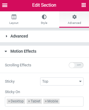
To begin with, create your header, and make it sticky
It will also need a background color.
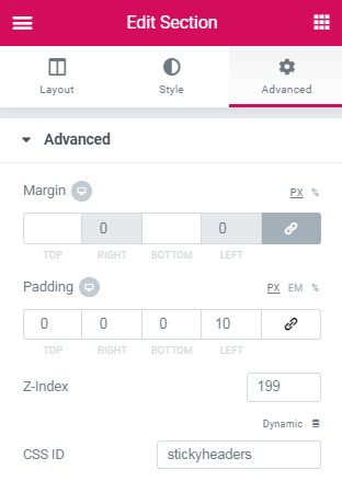
Then, give that header section the CSS ID of ' stickyheaders '
Also give it a z-index value of 199.
Finally, add this code in an html element
This html element needs to be in the same page as the header. If you create this in a header template, place the html element somewhere in the header template.
<script>
/* Please login to get the code
 * The code will be for the Elementor Hide Header on Scroll Down - Show on Scroll Up tutorial
 * Found at this URL https://element.how/elementor-header-show-scroll-up/
 */
</script>
That's it! If your section is the initial one in the page or template.
If your sticky header is not the very first section of the page or template, you will need to modify
if (mypos > 40) {
to the approximate height, in PX, of the bottom of your sticky header from the top of the page. example:
if (mypos > 740) {
Et Voila! Simple!
When you know the code… let me know if you need help!
Is there an easy way to adjust this code to get a footer element to only show when a user scrolls up?
If I add an ID of stickyfooter, and change this - translateY(-110px) ? But what translateY would I need to add to make it disappear below the screen? 110px instead of -110px?
I changed all sticyheaders to stickyfooter, headerup to footerup (both of these more for it to make more sense in case my client hires someone else to change things later) and made the translateY(110px).
If there is any way to make the button not visible when the screen first loads (at the moment it is there on page load, then when you scroll down disappears, then on scroll up appears again), that would be awesome!
Sorry, one more thing. When the user gets to the bottom of the page, the button is now showing in a different location to before. Is there a way to say when it hits the full bottom, to relocate the button to its proper place?
if (mypos > 40 || $(document).height() < mypos + 300) {
and change that '300' value to the approximate px distance that your button should normally be at from the bottom of the page.
Thanks again for code! Very helpful! Quick question. Is it possible to only display the sticky header once the user has scrolled back to the top of the page vs once they begin scrolling back up? I'm trying to keep the header transparent (I know! ;-). and as I scroll back up the header is covering text...
Thank you very much for the code. It works very nice!
I am curious that is it possible to make it responsive? I tried to hide the html element on specific page (tried to keep the header on mobile) but the scolling effect is still there.
Use this code instead. It will make the design work only for mobile. If you want the oppositve, change the < to > where it says ' if ($(window).width() < 767){ ' .
</script>
<style>
#stickyheaders{
-webkit-transition: transform 0.34s ease;
transition : transform 0.34s ease;
}
.headerup{
transform: translateY(-110px); /*adjust this value to the height of your header*/
}
</style>
Is there a way to disregard the "sticky on scroll down - show on scroll up effect" and just make the sticky row disappear after a certain amount of pixels? It probably requires a different code snippet, but I searched everywhere and can't find a solution.
</script>
<style>
#stickyheaders{
-webkit-transition: transform 0.34s ease;
transition : transform 0.34s ease;
}
.headerup{
transform: translateY(-110px); /*adjust this value to the height of your header*/
}
</style>
Hi there, thanks for this! I've implemented it on a few sites already and it's so smooth.
I was wondering though; could this code be modified to show a hidden header when user scrolls down X pixels? Top of page would have a non-sticky header, and after it's out of view, this targeted sticky header slides into view?
The described kind of header was an option on a theme (the7) I used to use before switching to Elementor Pro, and I really liked it when I had a transparent header, and after scrolling the colors changed on logo, navigation and background.
Could you please give me some advice on how to add a code that hides the menu when jumping to a section? . Also, could you give me some advice on how to add a code that shows the menu when you reach the top of the page, or when you hover the mouse at the top of the page?
I made a slight alteration to the code to allow it to work on height-varying headers (such as if the menu is shorter on mobile devices) without requiring any additional setup:
It works great so far! Probably has a few minor problems with changing resolutions (i.e. window sizes) while scrolling, but it should fix itself on subsequent scrolls.
But as soon as I scroll down. They become "constrained" in the height of the header. Here you can see the issue clearly: https://snipboard.io/adeW7N.jpg
What's odd is that I can't see the issue while logged in as Admin but all visitors do. I tried changing the CSS. I noticed that unchecking "overflow" and "transform" make some part of the woocommerce menu appears but not as it should.
The URL is
Do you have any idea how I can fix this?
#stickyheaders{
transition : top 0.34s ease;
}
#stickyheaders.headerup {
top: -110px; /*adjust this value to the height of your header*/
}
Hi Maxim,
I've tried to change the CSS but it didn't work. Also I should have pointed out that I am using the amended code from Sean since my desktop, tablet, and mobile headers have very different heights. I first thought it was a Z index issue but it's not.
Here is it how code I have looks like:
document.addEventListener('DOMContentLoaded', function() {
jQuery(function($){
var mywindow = $(window);
var mypos = mywindow.scrollTop();
mywindow.scroll(function() {
if (mypos > 40) {
if(mywindow.scrollTop() > mypos) {
let headerHeight = $('#stickyheaderup').outerHeight();
$('#stickyheaderup').css('transform','translateY(-'+headerHeight+'px)');
} else {
$('#stickyheaderup').css('transform','translateY(0px)');
}
}
mypos = mywindow.scrollTop();
}); }); });
#stickyheaders{
transition : top 0.34s ease;
}
#stickyheaders.headerup {
top: -170px; /*adjust this value to the height of your header on desktop*/
}
@media (max-width:1024px){
#stickyheaders.headerup {
top: -170px; /*adjust this value to the height of your header on tablet*/
}
}
@media (max-width:767px){
#stickyheaders.headerup {
top: -110px; /*adjust this value to the height of your header on mobile*/
}
}
Hi Maxim,
I have added this code:
document.addEventListener('DOMContentLoaded', function() {
jQuery(function($) {
var mywindow = $(window);
var mypos = mywindow.scrollTop();
let scrolling = false; /* For throlling scroll event */
window.addEventListener('scroll', function() {
scrolling = true;
});
setInterval(() => {
if (scrolling) {
scrolling = false;
if (mypos > 40) {
if (mywindow.scrollTop() > mypos) {
$('#stickyheaders1').addClass('headerup');
} else {
$('#stickyheaders1').removeClass('headerup');
}
}
mypos = mywindow.scrollTop();
}
}, 300);
});
});
#stickyheaders1 {
transition : top 0.34s ease !important;
}
#stickyheaders1.headerup {
top: -126px; /*adjust this value to the height of your header on desktop*/
}
@media (max-width:1024px){
#stickyheaders1.headerup {
top: -70px !important; /*adjust this value to the height of your header on tablet*/
}
}
@media (max-width:767px){
#stickyheaders1.headerup {
top: -99px !important; /*adjust this value to the height of your header on mobile*/
}
}
I added the Z-INDEX and the CSS ID "stickyheaders1" to my header container. Unfortunately I couldn't make it work. The header does not disappears.
Hi there, thanks for this awesome stuff! I am looking to achieve similar results except that I need the header to hide when you scroll down from the top and only show back again when you scroll back to the top. Is that possible with this snippet?
I don't understand... isn't that the default behaviour for a standard header, that is not sticky? Why make it sticky if you only want to show it at the top ?
It should be working on mobile as well, if you are using the same header there! If not, you will need to duplicate the code, and give your mobile header a unique id!
Hi there, am trying to apply this with my header template. What do you mean with "place the html element somewhere in the header template". How do I place an html element? Thanx in advance
Thanks so much for this 🙂
Id like to ask if it possible to change the timing when the header shows again when scrolling up, I mean, the header appearing just on the second scroll up or a specific length. Thanks
This is possible, however it would need to be coded in. And I don't think most people will want that, so I won't be adding this feature to the tutorial... Also I don't think it would be good UX.
Thanks so much, worked like a breeze for me on desktop, just copied your code as it is. Though not tested on mobile & tablet. Will come back here again for that 🙂
Hello I have a question, I apply every thing and it work in the testing but when I try to apply it to the website it doesn't let me and a message appears "ERROR 403". What can I do ??... thanks
Have another question, in addition to the show and hide code or configuration how can I add the option that once you pass the mouse pointer in the area of the menu it appears again and ones you get the pointer from there it hides, but the show and hide scroll option keep working.
#stickybootom{
-webkit-transition: transform 0.34s ease;
transition : transform 0.34s ease;
}
.footads{
transform: translateY(100%); /*adjust this value to the height of your header*/
}
@Everyone else: when you break your head off trying to understand why Chrome on iOS is the only browser now showing transition — restart the freaking browser
Thanks for this code! I do have one problem though. I have a one-page-design and if i click on a link in my menu it scrolls to the appropriate section, but it leaves a blank space with the height of my header above it. If my header wouldn't hide on scrolling down, that would be correct, but elementor doesn't seem to know that my header gets hidden. Anyone knows a way to fix this?
I suggest you ignore this... just a bit of extra white space, which is pretty much always welcome. If you really want to get rid of this, it's not as simple as you think.
Let's say, for example, someone goes to the bottom of the page first, then clicks a link. It will auto scroll UP to that link, so the header will show. If you removed the offset, then it would not show properly... So you would need a solution that considers where the user is on the page, and if he goes up or down, then adjust exactly where he lands... a well written JS snippet will be required for this.
It was a very practical training.
But I want this change to be made when the user stops (not scrolling) on the page? (that's mean both of scroll up + not scroll)
----------
Thank you
Thanks for this tutorial. I am wondering if the code can be tweaked so that the original state of the header is transparent --> when scrolling down it is hidden --> When scrolling up it is sticky with solid background color.
I found some other tutorials doing this, but they all have the issue that the header disappears on mobile when scrolling all the way back to the top. I can see this is not happening with your code, but I need to somehow add that the header is transparent to begin with.
I have the same HTML and CSS coding that works for my header. But I would like to only appear when start scrolling and not when loading. I have another header that is transparent when loading so I fit into the image background and I would like my secondary header to only show when scrolling down and hide when scrolling up. I believe that the coding is the same as what is in this post but I would need that extra coding to hide it when loading.
Do I need to add the HTML widget in one of the header's columns?
Where do you have it now, if not in a column?
I think I"ve tried it all
I've placed it inside the column of the header section.
And also tried it in a different section directly below the header section and it still won't work.
Hello, I have multiple header in one page. When I try to add same CSS ID to more then one header it fails. Just one header hides it self. Is there any way to use it in more then one Elementor object.
Thanks for this! I'm having an issue where the header does not fully hide. a sliver of the bottom still shows when I scroll. know any fixes to this? thank you!
Great tutorial! and thanks for putting out such good content, I appreciate it a lot!
I only got a small problem. So my header has a height of 13.3 VH and when scrolling down there is still some header visible. This is the website https://beyondweb.ch/ and the code I'm using:
document.addEventListener('DOMContentLoaded', function() {
jQuery(function($) {
var mywindow = $(window);
var mypos = mywindow.scrollTop();
let scrolling = false; /* For throlling scroll event */
window.addEventListener('scroll', function() {
scrolling = true;
});
setInterval(() => {
if (scrolling) {
scrolling = false;
if (mypos > 40) {
if (mywindow.scrollTop() > mypos) {
$('#stickyheaders').addClass('headerup');
} else {
$('#stickyheaders').removeClass('headerup');
}
}
mypos = mywindow.scrollTop();
}
}, 300);
});
});
#stickyheaders{
-webkit-transition: transform 0.34s ease !important;
transition : transform 0.34s ease !important;
}
.headerup{
transform: translateY(-13.3vh); /*adjust this value to the height of your header*/
}
Hi, thank you very much for the great code! One quick question though: How do we find the mypos and the height of the header in px? My menu header is the second section from the top and Ive tried an number of numbers but cant seem to target it correctly. I also tried inspecting the element but I can't seem to find it. Any help would be greatly apprceiated!
the "mypos" only needs to be changed if your header isn't the first thing on the page... and the value doesn't need to be precise. It represents the value, from the top of the page, after which the header will hide on scroll down, and show on scroll up.
The height of the header in px also just needs to be approximate. If on scroll down, you can't see any part of your header, then you got it right. If you can still see a bit of it, increase the value.
hi! this worked great, thank you very much!
however, I'm left with a strip about 5px high of the header's background. this only appears on desktop, tablet and mobile view display smoothly.
any idea why that could happen?
Thanks for your tutorial. Just only, when I use it in mobiles, when you click on the hamburguer, appears the menu but hides in the same moment without woing anything. You have to click on the hamburguer a second time and it works.
My code in this tutorial doesn't have anything to do with the hamburger misbehaving (or not). It's just the entire header section that is added, or removed, a transform:translateY() css declaration, and this is very unlikely to result in the behaviour you mention.
Hi Maxime. Thanks for this code. I hope I explain this clear enough. I have a sticky footer section below my main footer that is similar to an inner section above my sticky header. When I scroll up, the top inner section disappears and the sticky header inner section with the menu stays on top as I scroll down. What I would like to have happen is for the sticky footer inner section below my footer to appear on the bottom of the page after the one on top disappears from scrolling down. I have tried reverse engineering your code but I appear to be missing something. The site is https://ryplio.elementor.cloud/. The site isn't published yet, so please reply to this and when I get your email, I will send you the 4-digit access code. Thanks for your help in advance.
Hey Maxime, this is great! Although i´m using this for a mobile header and it's not working correctly. On the left I have the brand logo and on the right the menu icon. When making the header sticky, the menu icon disappears. Any thought on what I might be doing wrong?
Hi Great tutorial thank, Is there any way to do that in a opposite way? I mean, when I'm scroling down header is not visible when I'm scrolling up header shows up?
This thread is so tight!
Thanks for sharing Maxime Desrosiers.
But I'm having a specific need, how can I change the background color if the header is showing up (from scroll up after hide)?
Because I don't see any way out from the previous comments.
I tried to add 'background-color' to the .headerup but it changed the whole header background (I only need it to change when scrolling up, but transparent on top of the sticky
For this you can follow any tutorial that shows you how to have a transparent header to background color header on scroll... they will work with the current setup.
We DO want a sticky header that only appears if the user is scrolling up. The tutorial you provided seems to not do this.
Are you sure there isn't a way to have both?
Both being:
1. A sticky header that only appears when user is scrolling up
2. The ability to change the CSS of the sticky header and make it a little different to the standard header (before scrolling down)
Extra update.
I am confused. I used the Chrome/Firefox Inspector to find the Class which is for the sticky header only:
It works perfectly (1) in the elementor page editor interface and the (2) browser inspector. But when I click Update and try and view the page without being logged in, the styling disappears.
Well, sounds like what you are doing is right in fact. So I suspect some cache issue. Did you Try WP > Elementor > Tools > Regenerate CSS files ?
Did you flush your cache from PhastPress and from your CDN, if you have one?
Also an other issue: If I open the DevTools (F12), go in the network tab, filter by CSS files, I see post-2230.css as a 404. So if that's where your header stylings are, that would be the issue...
I'm using a website builder by Ionos formerly 1&1. I can't seem to get this to work 🙁 Maybe Im not understanding right... I copied and pasted in the header custom html/css section., but nothing has happened.
Will this code for every header?
Hi, Thanks a lot. I´ve seen that when you use the toogle menu in IOS, at least in IPHONE, the first element of the menu appears with a blue border and just the first time that you open the menu in the same page, but not the second tiem you open it that that border dissapear.
If you click on an item of the menu and go to a differente page, happens the same, the first time you open the menu the first item appears wiuth the blue border but not the second time.
I have the website maaike.pucoo.nl. After the header that is 1000px, the scroll up and down functie should be working. But when you're below the 1000px the function shouldn't work because you will see the menu build in the header.
Right know the menu shows after the header, that part is almost good, but after the header the menu shouldn't just show up, only if you scroll up when you've passed the header down.
Hi Maxime, can i get in contact with you for a price indication?
Greetings Pucoo,
Yes certainly.
Hello Maxime! this works like a charm currently i have 2 headers, one transparent with white colors, logos etc and the normal one when the user scrolls up, when i add your code obviously the sticky one gets on top and then it works as usual, is there a way to hide the sticky one until the users scrolls and then show it again when scrolls up? probably i'm not making sense, i'm trying to combine 2 tutorials! lol
I have a mobile and desktop header. I managed to use the code on the mobile header and it worked fine. I then added it to desktop and it stopped working on the mobile site. Does it only work with one header?
If that's the case, I guess I can edit to just one header.
Thanks again!
Kam
Greetings Kam!
In that case, change to class names intead of an ID (which should be unique and only one time on the page).
So change instances of
#stickyheaders
to
.stickyheaders
in the code.
In the CSS, you might need it twice to have greater specificity:
on mobile i can scrolling a little bit to the right because the sticky header is a little to big - i dont know why and its only when im using your code..
thx
Hi, I did everything as in the tutorial, but a small piece of my header peeks out when I scroll down. I have also set the height of the header in the custom code.

Hey there,
First off thank you so much for putting this up!
When I have applied this, the transition is very snappy, would you be able to advise on how to make the transition a bit smoother.
Thanks so much
Hey Carlos!
Simply increase the values in this part of the code!
#stickyheaders{
-webkit-transition: transform 0.34s ease;
transition : transform 0.34s ease;
}
If for some reason it remains snappy, you might need to add !important . Like this :
#stickyheaders{
-webkit-transition: transform 0.34s ease !important;
transition : transform 0.34s ease !important;
}
Is there an easy way to adjust this code to get a footer element to only show when a user scrolls up?
If I add an ID of stickyfooter, and change this - translateY(-110px) ? But what translateY would I need to add to make it disappear below the screen? 110px instead of -110px?
Never mind, I tried it and it worked!
I changed all sticyheaders to stickyfooter, headerup to footerup (both of these more for it to make more sense in case my client hires someone else to change things later) and made the translateY(110px).
If there is any way to make the button not visible when the screen first loads (at the moment it is there on page load, then when you scroll down disappears, then on scroll up appears again), that would be awesome!
Sorry, one more thing. When the user gets to the bottom of the page, the button is now showing in a different location to before. Is there a way to say when it hits the full bottom, to relocate the button to its proper place?
Beth Gillies Hey ! Try changing the line
if (mypos > 40) {
to
if (mypos > 40 || $(document).height() < mypos + 300) { and change that '300' value to the approximate px distance that your button should normally be at from the bottom of the page.
Maxime Desrosiers If would like my footer to appear only on scroll down instead of up, what do I need to change?
Great codes on here, but when I try this one i can't get it to work. I use the html elementor widget. Is there something I miss?
Solved..You need to preview.. Thanks!
Is there a way to set this to hide menu after a specific range they have scrolled? Eg: hide if they scroll more than 40px, 5%, 10em, etc?
Yes, and this is already in the code!
if (mypos > 40) {
the '40' value here is PX. so you can adjust it to what you want!
Maxime Desrosiers Perfect! Thats what I assumed but I figured I would check in first. Thanks for the quick response.
Thanks again for code! Very helpful! Quick question. Is it possible to only display the sticky header once the user has scrolled back to the top of the page vs once they begin scrolling back up? I'm trying to keep the header transparent (I know! ;-). and as I scroll back up the header is covering text...
I don't understand the use case though. Why make it sticky at all then? Would not that make it the same as being fixed at the top of the page?
See this tutorial for the header being transparent.. https://element.how/elementor-transparent-header.../
Ignore the part about making it sticky.
Thank you very much for the code. It works very nice!
I am curious that is it possible to make it responsive? I tried to hide the html element on specific page (tried to keep the header on mobile) but the scolling effect is still there.
Anyway, I love the effect so much. Appreciate!
Use this code instead. It will make the design work only for mobile. If you want the oppositve, change the < to > where it says ' if ($(window).width() < 767){ ' .
<script>
document.addEventListener('DOMContentLoaded', function() {
jQuery(function($){
if ($(window).width() < 767){
var mywindow = $(window);
var mypos = mywindow.scrollTop();
mywindow.scroll(function() {
if (mypos > 40) {
if(mywindow.scrollTop() > mypos) {
$('#stickyheaders').addClass('headerup');
} else {
$('#stickyheaders').removeClass('headerup');
}
}
mypos = mywindow.scrollTop();
});
}
}); });
</script>
<style>
#stickyheaders{
-webkit-transition: transform 0.34s ease;
transition : transform 0.34s ease;
}
.headerup{
transform: translateY(-110px); /*adjust this value to the height of your header*/
}
</style>
I am using your code with my transparent header but when i tried to add a white background color to the header when it's up.. but i can't make it work
I'm not sure what is wrong here
document.addEventListener('DOMContentLoaded', function() {
jQuery(function($){
if ($(window).width() 40) {
if(mywindow.scrollTop() > mypos) {
$('#stickyheadersm').addClass('headerup');
} else {
$('#stickyheadersm').removeClass('headerup');
}
}
mypos = mywindow.scrollTop();
});
}
}); });
#stickyheadersm{
-webkit-transition: transform 0.34s ease;
transition : transform 0.34s ease;
}
.headerup{
transform: translateY(-70px),
background-color: rgba(255, 255, 255, 1),
opacity: 1;
/*adjust this value to the height of your header*/
}
Maxime Desrosiers Thank you very much!
Maxime Desrosiers Thanks for this code ! I was looking for how to do this 🙂
In the meantime I had found this workaround :
<script>
document.addEventListener('DOMContentLoaded', function() {
jQuery(function($){
var mywindow = $(window);
var mypos = mywindow.scrollTop();
mywindow.scroll(function() {
if (mypos > 40) {
if(mywindow.scrollTop() > mypos) {
$('#stickyheaders').addClass('headerup');
} else {
$('#stickyheaders').removeClass('headerup');
}
}
mypos = mywindow.scrollTop();
}); }); });
</script>
<style>
@media all and (max-width:767px) {
#stickyheaders{
-webkit-transition: transform 0.34s ease;
transition : transform 0.34s ease;
}
.headerup{
transform: translateY(-110px);
}
}
</style>
Is there a way to show or hide menu on mobile and tablet?
This is what you are looking for : https://elementor.com/help/mobile-editing/
Hi, thank you for putting this up:)
Is there a way to disregard the "sticky on scroll down - show on scroll up effect" and just make the sticky row disappear after a certain amount of pixels? It probably requires a different code snippet, but I searched everywhere and can't find a solution.
Thank you for doing good work!
Hey Damir! Here... adjust the '340' value to where you want the header to go up.
<script>
document.addEventListener('DOMContentLoaded', function() {
jQuery(function($){
var mywindow = $(window);
var mypos = mywindow.scrollTop();
mywindow.scroll(function() {
if (mypos > 340) {
$('#stickyheaders').addClass('headerup');
} else {
$('#stickyheaders').removeClass('headerup');
}
mypos = mywindow.scrollTop();
});
}); });
</script>
<style>
#stickyheaders{
-webkit-transition: transform 0.34s ease;
transition : transform 0.34s ease;
}
.headerup{
transform: translateY(-110px); /*adjust this value to the height of your header*/
}
</style>
Maxime Desrosiers HeY, thank you for helping out! I appreciate it:)
Hi, i need something similar.
I need code to show sticky header after 30% scroll page.
How is possible?
Check this article for that : https://element.how/elementor-change-header-on-scroll/
Hi there, thanks for this! I've implemented it on a few sites already and it's so smooth.
I was wondering though; could this code be modified to show a hidden header when user scrolls down X pixels? Top of page would have a non-sticky header, and after it's out of view, this targeted sticky header slides into view?
The described kind of header was an option on a theme (the7) I used to use before switching to Elementor Pro, and I really liked it when I had a transparent header, and after scrolling the colors changed on logo, navigation and background.
Thanks!
Hello Erno!
Yes, that's possible! In fact, i have another article about exactly that, here : https://element.how/elementor-change-header-on.../
You will see that the code is similar...
Cheers!
Hi, thanks for sharing your code.
Could you please give me some advice on how to add a code that hides the menu when jumping to a section? . Also, could you give me some advice on how to add a code that shows the menu when you reach the top of the page, or when you hover the mouse at the top of the page?
Thank you!!
I made a slight alteration to the code to allow it to work on height-varying headers (such as if the menu is shorter on mobile devices) without requiring any additional setup:
<script type="text/javascript">
document.addEventListener('DOMContentLoaded', function() {
jQuery(function($){
var mywindow = $(window);
var mypos = mywindow.scrollTop();
mywindow.scroll(function() {
if (mypos > 40) {
if(mywindow.scrollTop() > mypos) {
let headerHeight = $('#stickyheaders').outerHeight();
$('#stickyheaders').css('transform','translateY(-'+headerHeight+'px)');
} else {
$('#stickyheaders').css('transform','translateY(0px)');
}
}
mypos = mywindow.scrollTop();
}); }); });
</script>
<style>
#stickyheaders {
-webkit-transition: transform 0.34s ease;
transition : transform 0.34s ease;
}
</style>
It works great so far! Probably has a few minor problems with changing resolutions (i.e. window sizes) while scrolling, but it should fix itself on subsequent scrolls.
Thanks!
Thanks for sharing Sean! That's a good way to code this as well!
Hi Maxim & Sean,
This is really cool! Thanks for sharing.
I have a tiny issue with woo commerce cart widget and a hamburger menu widget.
When I first load the page, they appear perfectly normal as you can see here: https://snipboard.io/wXuPGO.jpg
But as soon as I scroll down. They become "constrained" in the height of the header. Here you can see the issue clearly: https://snipboard.io/adeW7N.jpg
What's odd is that I can't see the issue while logged in as Admin but all visitors do. I tried changing the CSS. I noticed that unchecking "overflow" and "transform" make some part of the woocommerce menu appears but not as it should.
The URL is
Do you have any idea how I can fix this?
Hey Nawfel,
I don't see the URL ? Please share it.
Hey Nawfel!
Try changing the CSS to this instead:
#stickyheaders{ transition : top 0.34s ease; } #stickyheaders.headerup { top: -110px; /*adjust this value to the height of your header*/ }Hi Maxim,
I've tried to change the CSS but it didn't work. Also I should have pointed out that I am using the amended code from Sean since my desktop, tablet, and mobile headers have very different heights. I first thought it was a Z index issue but it's not.
Here is it how code I have looks like:
document.addEventListener('DOMContentLoaded', function() {
jQuery(function($){
var mywindow = $(window);
var mypos = mywindow.scrollTop();
mywindow.scroll(function() {
if (mypos > 40) {
if(mywindow.scrollTop() > mypos) {
let headerHeight = $('#stickyheaderup').outerHeight();
$('#stickyheaderup').css('transform','translateY(-'+headerHeight+'px)');
} else {
$('#stickyheaderup').css('transform','translateY(0px)');
}
}
mypos = mywindow.scrollTop();
}); }); });
#stickyheaderup {
-webkit-transition: transform 0.34s ease;
transition : transform 0.34s ease;
}
Any idea how to fix this?
Try the original code again, but with this CSS:
#stickyheaders{ transition : top 0.34s ease; } #stickyheaders.headerup { top: -170px; /*adjust this value to the height of your header on desktop*/ } @media (max-width:1024px){ #stickyheaders.headerup { top: -170px; /*adjust this value to the height of your header on tablet*/ } } @media (max-width:767px){ #stickyheaders.headerup { top: -110px; /*adjust this value to the height of your header on mobile*/ } }Hi Maxim,
I have added this code:
document.addEventListener('DOMContentLoaded', function() {
jQuery(function($) {
var mywindow = $(window);
var mypos = mywindow.scrollTop();
let scrolling = false; /* For throlling scroll event */
window.addEventListener('scroll', function() {
scrolling = true;
});
setInterval(() => {
if (scrolling) {
scrolling = false;
if (mypos > 40) {
if (mywindow.scrollTop() > mypos) {
$('#stickyheaders1').addClass('headerup');
} else {
$('#stickyheaders1').removeClass('headerup');
}
}
mypos = mywindow.scrollTop();
}
}, 300);
});
});
#stickyheaders1 {
transition : top 0.34s ease !important;
}
#stickyheaders1.headerup {
top: -126px; /*adjust this value to the height of your header on desktop*/
}
@media (max-width:1024px){
#stickyheaders1.headerup {
top: -70px !important; /*adjust this value to the height of your header on tablet*/
}
}
@media (max-width:767px){
#stickyheaders1.headerup {
top: -99px !important; /*adjust this value to the height of your header on mobile*/
}
}
I added the Z-INDEX and the CSS ID "stickyheaders1" to my header container. Unfortunately I couldn't make it work. The header does not disappears.
Am I missing something?
https://www.cryochambers.com/contact/for-testing/
Max, it's fixed,
I had to remove "#stickyheaders" before .headerup. I also needed to replace "top" by "transform: translateY(-XXXpx)
Thanks again for your help!
Awesome Nawfel, glad you managed to solve this!
Ciao complimenti per il codice. It works very nice!
I ask you, if it is possible, when I scroll the menu it disappears to the left instead of up
Hey Omar! Yes this is possible... change this
transform: translateY(-110px); /*adjust this value to the height of your header*/
to
transform: translateX(-110vw);
Maxime Desrosiers thank you so much!!! 🙂
Hi there, thanks for this awesome stuff! I am looking to achieve similar results except that I need the header to hide when you scroll down from the top and only show back again when you scroll back to the top. Is that possible with this snippet?
I don't understand... isn't that the default behaviour for a standard header, that is not sticky? Why make it sticky if you only want to show it at the top ?
This code gives Elementor a 403-error code. Adding anything else works fine.
What goes wrong?
Security... because you are adding JS. You probably have WordFence or some other security plugin, place it in learning mode!
Hi, just want to leave a comment here to say thank you! It's really easy to implement, thanks man.
Thanks!
Hey, thanks a lot work great!!!
Is there a way it will work on mobile as well? did i miss something?
It should be working on mobile as well, if you are using the same header there! If not, you will need to duplicate the code, and give your mobile header a unique id!
Hi there, am trying to apply this with my header template. What do you mean with "place the html element somewhere in the header template". How do I place an html element? Thanx in advance
The Html element is an Elementor element, just like the image, heading, text, accordion, etc elements... you will find it on the left!
Thanks so much for this 🙂
Id like to ask if it possible to change the timing when the header shows again when scrolling up, I mean, the header appearing just on the second scroll up or a specific length. Thanks
This is possible, however it would need to be coded in. And I don't think most people will want that, so I won't be adding this feature to the tutorial... Also I don't think it would be good UX.
Maxime Desrosiers Ok, thanks anyway 😉 cheers
Hello Mbd Bruno, did you managed to make that? the header appearing just on the second scroll up or a specific length?
Thanks so much, worked like a breeze for me on desktop, just copied your code as it is. Though not tested on mobile & tablet. Will come back here again for that 🙂
Welcome!
Hello I have a question, I apply every thing and it work in the testing but when I try to apply it to the website it doesn't let me and a message appears "ERROR 403". What can I do ??... thanks
This is frequently a WordFence (or similar plugin) problem.. place it in learning mode, then try again!
Hey there,
Have another question, in addition to the show and hide code or configuration how can I add the option that once you pass the mouse pointer in the area of the menu it appears again and ones you get the pointer from there it hides, but the show and hide scroll option keep working.
Use this code instead:
<script>
document.addEventListener('DOMContentLoaded', function() {
jQuery(function($){
var mywindow = $(window);
var mypos = mywindow.scrollTop();
mywindow.scroll(function() {
if (mypos > 40) {
if(mywindow.scrollTop() > mypos) {
$('#stickyheaders').addClass('headerup');
} else {
$('#stickyheaders').removeClass('headerup');
}
}
mypos = mywindow.scrollTop();
}); }); });
</script>
<style>
#stickyheaders{
-webkit-transition: opacity 0.34s ease;
transition : opacity 0.34s ease;
}
.headerup{
opacity:0;
}
.headerup:hover{
opacity: 1;
}
</style>
Hello! it works great. thank you very much!
Just wanted to ask what part do I need to adjust to make it wait a sec to show header again when scrolling back to the top?
Hello! do you know how to disable scroll bouncing? it ruins the efect 🙁
https://www.smashingmagazine.com/.../scroll-bouncing.../
Maxime Desrosiers Hallo 🙂 is it possible to make it opposite? Show Sticky Header on Scroll Down and Hide on Scroll Up? Thank u so much!
Wicky Triky Yes, change
if(mywindow.scrollTop() > mypos) {
to
if(mywindow.scrollTop() < mypos) {
Hello, great tutorial! Is it the same process to hide my "logo" only on scroll?
Quite similar, yes... that should work
thanks for this useful tips
Hello, I create sticky footer from your code. But how to remove blank space when I scroll has finish.
(Sorry for my bad english)
This is the website : https://ajegbali.my.id/2015/04/bahasa-korea-kangen-atau-aku-rindu-kamu.html
This is my code
/* Hello, I create sticky footer from your code. But how to remove blank space when I scroll has finish.
(Sorry for my bad english)
This is the website : https://ajegbali.my.id/2015/04/bahasa-korea-kangen-atau-aku-rindu-kamu.html
This is my code
document.addEventListener('DOMContentLoaded', function() {
jQuery(function($){
var mywindow = $(window);
var mypos = mywindow.scrollTop();
mywindow.scroll(function() {
if (mypos > 40 || $(document).height() mypos) {
$('#stickybootom').addClass('footads');
} else {
$('#stickybootom').removeClass('footads');
}
}
mypos = mywindow.scrollTop();
}); }); });
#stickybootom{
-webkit-transition: transform 0.34s ease;
transition : transform 0.34s ease;
}
.footads{
transform: translateY(100%); /*adjust this value to the height of your header*/
}
*/
@Maxime, awesome job, thank you!
@Everyone else: when you break your head off trying to understand why Chrome on iOS is the only browser now showing transition — restart the freaking browser
Id like to ask if it possible to change the timing when the header shows again when scrolling up, like a delay with 5 px? Thanks
Yes this is possible, however it increases the complexity of the code by a good bit, and for most users the code provided works well enough.
Thanks for this code! I do have one problem though. I have a one-page-design and if i click on a link in my menu it scrolls to the appropriate section, but it leaves a blank space with the height of my header above it. If my header wouldn't hide on scrolling down, that would be correct, but elementor doesn't seem to know that my header gets hidden. Anyone knows a way to fix this?
I suggest you ignore this... just a bit of extra white space, which is pretty much always welcome. If you really want to get rid of this, it's not as simple as you think.
Let's say, for example, someone goes to the bottom of the page first, then clicks a link. It will auto scroll UP to that link, so the header will show. If you removed the offset, then it would not show properly... So you would need a solution that considers where the user is on the page, and if he goes up or down, then adjust exactly where he lands... a well written JS snippet will be required for this.
Yeah thats too difficult for me to do. I will ignore it than. Thanks you!
how to open late when swiping up? For example when it goes up 50px.
Thank you 🙂
It was a very practical training.
But I want this change to be made when the user stops (not scrolling) on the page? (that's mean both of scroll up + not scroll)
----------
Thank you
Hi,
Thanks for this tutorial. I am wondering if the code can be tweaked so that the original state of the header is transparent --> when scrolling down it is hidden --> When scrolling up it is sticky with solid background color.
I found some other tutorials doing this, but they all have the issue that the header disappears on mobile when scrolling all the way back to the top. I can see this is not happening with your code, but I need to somehow add that the header is transparent to begin with.
Did you ever fix this?? Having the same issues 🙂
Hi guys!
I have the same HTML and CSS coding that works for my header. But I would like to only appear when start scrolling and not when loading. I have another header that is transparent when loading so I fit into the image background and I would like my secondary header to only show when scrolling down and hide when scrolling up. I believe that the coding is the same as what is in this post but I would need that extra coding to hide it when loading.
Thanks
Maybe that will help John? Not certain if it's what you are looking for... https://element.how/elementor-change-header-on-scroll/
Really nice for Desktop, but isn't working on mobile 🙁
Hey Michael!
If you visit this page here with your mobile, is it working?
Does not work for me 🙁
I want to use this at the top a (single-post)template. Only on mobile devices, to get back to the news-overview.
Any idea how I can get this work?
URL = https://www.wielercafes.nl/nieuws/wielercafes-nl-bestaat-1-jaar/
Thanks in advanced. 🙂
Found it! The specific element needs to be sticky.
Especially when you don't want a complete section to be sticky, but just one element.
Great Ruben thanks for sharing!
Hello, I have a problem because on my page it works only when I minimalize a site 🙁 what is wrong? Thanks
I don't know, can't say from the info you provided.
I found a problem - Additional Custom Breakpoints - when I start to use it, then jetsticky dosen't work on normal screen, I have to minimalize site
Guys I found a solution. What to do? Make a sticky menu by your own.
It's not working, please. Where exactly I'm I going to input the code?
I created my header with the theme builder.
See this image https://element.how/wp-content/uploads/2020/05/elementor_add_html_element_2.png
Add this in your header somewhere, place the code in it.
Exactly what I did.
Do I need to add the HTML widget in one of the header's columns?
Where do you have it now, if not in a column?
I think I"ve tried it all
I've placed it inside the column of the header section.
And also tried it in a different section directly below the header section and it still won't work.
Thanks for your time.
What's the URL where you are trying this at? It's probably some other bug then... I would need to have a look.
So sorry it was an error on my end🙏😞.
I gave the header CSS Classes instead of a CSS ID of "Stickyheaders"
It"s fine now, thanks!
Glad you made it work!
Hello, I have multiple header in one page. When I try to add same CSS ID to more then one header it fails. Just one header hides it self. Is there any way to use it in more then one Elementor object.
Thanks for this! I'm having an issue where the header does not fully hide. a sliver of the bottom still shows when I scroll. know any fixes to this? thank you!
Hey Paul!
In the code, you will find this:
.headerup{
transform: translateY(-110px); /*adjust this value to the height of your header*/
}
Just adjust the px value there!
Hello
Great tutorial! and thanks for putting out such good content, I appreciate it a lot!
I only got a small problem. So my header has a height of 13.3 VH and when scrolling down there is still some header visible. This is the website https://beyondweb.ch/ and the code I'm using:
document.addEventListener('DOMContentLoaded', function() {
jQuery(function($) {
var mywindow = $(window);
var mypos = mywindow.scrollTop();
let scrolling = false; /* For throlling scroll event */
window.addEventListener('scroll', function() {
scrolling = true;
});
setInterval(() => {
if (scrolling) {
scrolling = false;
if (mypos > 40) {
if (mywindow.scrollTop() > mypos) {
$('#stickyheaders').addClass('headerup');
} else {
$('#stickyheaders').removeClass('headerup');
}
}
mypos = mywindow.scrollTop();
}
}, 300);
});
});
#stickyheaders{
-webkit-transition: transform 0.34s ease !important;
transition : transform 0.34s ease !important;
}
.headerup{
transform: translateY(-13.3vh); /*adjust this value to the height of your header*/
}
Hey Kim!
To fix this, just add a bit of height here:
.headerup{
transform: translateY(-13.3vh); /*adjust this value to the height of your header*/
}
Maybe like this:
.headerup{
transform: translateY(-16vh); /*adjust this value to the height of your header*/
}
Hey Maxime!
It worked, thanks a lot!
Thank you for your amazing tutorial!
I only have one problem it's when I click an object with an anchor it scrolls to it but leaves the spacing of the header... How can I fix that?
Hello, excellent tutorial. Thanks for sharing. I have a doubt. How can I make it work on multiple elements in my header?
Hey Elkin!
Have all your elements in one section, then apply the code to that section!
Hi, thank you very much for the great code! One quick question though: How do we find the mypos and the height of the header in px? My menu header is the second section from the top and Ive tried an number of numbers but cant seem to target it correctly. I also tried inspecting the element but I can't seem to find it. Any help would be greatly apprceiated!
the "mypos" only needs to be changed if your header isn't the first thing on the page... and the value doesn't need to be precise. It represents the value, from the top of the page, after which the header will hide on scroll down, and show on scroll up.
The height of the header in px also just needs to be approximate. If on scroll down, you can't see any part of your header, then you got it right. If you can still see a bit of it, increase the value.
hi! this worked great, thank you very much!
however, I'm left with a strip about 5px high of the header's background. this only appears on desktop, tablet and mobile view display smoothly.
any idea why that could happen?
Do you have a URL to share with me?
Thanks for your tutorial. Just only, when I use it in mobiles, when you click on the hamburguer, appears the menu but hides in the same moment without woing anything. You have to click on the hamburguer a second time and it works.
Can you tell me a solution, please?
Thanks
My code in this tutorial doesn't have anything to do with the hamburger misbehaving (or not). It's just the entire header section that is added, or removed, a transform:translateY() css declaration, and this is very unlikely to result in the behaviour you mention.
Hi, i set my header as sticky top. I want when the page loads, it appears after 500px I scroll down. How to do that?
It looks like you already succeeded!
Hi Maxime. Thanks for this code. I hope I explain this clear enough. I have a sticky footer section below my main footer that is similar to an inner section above my sticky header. When I scroll up, the top inner section disappears and the sticky header inner section with the menu stays on top as I scroll down. What I would like to have happen is for the sticky footer inner section below my footer to appear on the bottom of the page after the one on top disappears from scrolling down. I have tried reverse engineering your code but I appear to be missing something. The site is https://ryplio.elementor.cloud/. The site isn't published yet, so please reply to this and when I get your email, I will send you the 4-digit access code. Thanks for your help in advance.
Hey Ted!
Sorry that's getting very specific... If you would like paid help for this, please reach out to me via my email in the footer. Cheers mate
Hey Maxime, this is great! Although i´m using this for a mobile header and it's not working correctly. On the left I have the brand logo and on the right the menu icon. When making the header sticky, the menu icon disappears. Any thought on what I might be doing wrong?
Hey Anita! I would need to have a look at the page...
Hi Great tutorial thank, Is there any way to do that in a opposite way? I mean, when I'm scroling down header is not visible when I'm scrolling up header shows up?
I mean exacly the same effect as we have on this page
HY please if you can help me to fix this issu
on scroling down my page jumps under the sticky header
https://khadarhawara.com/?post_type=product
Worked exactly as I wanted it to! Thank you!
Welcome Larissa! Glad it was useful to you!
thanks!
Welcome!
This thread is so tight!
Thanks for sharing Maxime Desrosiers.
But I'm having a specific need, how can I change the background color if the header is showing up (from scroll up after hide)?
Because I don't see any way out from the previous comments.
I tried to add 'background-color' to the .headerup but it changed the whole header background (I only need it to change when scrolling up, but transparent on top of the sticky
Here is the website: https://beautylabbali.com
Much appreciate
Greetings!
For this you can follow any tutorial that shows you how to have a transparent header to background color header on scroll... they will work with the current setup.
Follow that one : https://element.how/elementor-transparent-header-changing-color/
Cheers!
Great!
Thanks for your reply.
Just to finalize, I'm having this small issue
When I just scroll down, the header change bg color instantly. How can I make it change after it hides, or just make the transition smooth?
https://beautylabbali.com/
kindly check
Greetings,
Change
#stickyheaders {
transition: transform 0.34s ease;
}
to
#stickyheaders {
transition: transform 0.34s ease, background-color 0.34s;
}
Hey Maxime,
Not sure what's wrong.
I followed your instruction but still no fix.
You may inspect my website here to see if I'm missing something
https://beautylabbali.com/
Sorry for creating new comment, because i can't reply my last thread,
Turns out your latest reply worked, I just need to hard refresh my browser
Many thanks Maxime!
Thanks for your fantastic website and help! I have a question.
Using this tutorial you have provided, I now have 2 headers:
- "Header" (before you scroll down)
- "sticky-header" which appears when you scroll up after already scrolling down)
I would like them to be styled differently.
Question: How do you apply CSS to them separately?
For example, I want:
Header
0% white
Sticky-header
100% white
padding: 10px auto
box-shadow: 0px 10px 15px -3px rgba(0,0,0,0.05);
Many thanks!
Greetings Grand!
Try this tutorial instead for that : https://element.how/elementor-change-header-on-scroll/
You will have complete control over the styling of both headers
Cheers!
Thanks a lot for your input. 🙂
But it's not quite what I am after.
We DO want a sticky header that only appears if the user is scrolling up. The tutorial you provided seems to not do this.
Are you sure there isn't a way to have both?
Both being:
1. A sticky header that only appears when user is scrolling up
2. The ability to change the CSS of the sticky header and make it a little different to the standard header (before scrolling down)
Extra update.
I am confused. I used the Chrome/Firefox Inspector to find the Class which is for the sticky header only:
.elementor-sticky--effects
Then I used this CSS
.elementor-sticky--effects {
background-color:white !important;
padding:10px auto !important;
box-shadow: 0px 10px 15px -3px rgba(0,0,0,0.05) !important;
}
It works perfectly (1) in the elementor page editor interface and the (2) browser inspector. But when I click Update and try and view the page without being logged in, the styling disappears.
Any ideas?
Site - https://granddemo.com/altus/blocks/
Hey Grand!
Well, sounds like what you are doing is right in fact. So I suspect some cache issue. Did you Try WP > Elementor > Tools > Regenerate CSS files ?
Did you flush your cache from PhastPress and from your CDN, if you have one?
Also an other issue: If I open the DevTools (F12), go in the network tab, filter by CSS files, I see post-2230.css as a 404. So if that's where your header stylings are, that would be the issue...
Hope this helps.
Also, if it helps... here's a page I'm using
https://granddemo.com/altus/hello-world-8/
I'm using a website builder by Ionos formerly 1&1. I can't seem to get this to work 🙁 Maybe Im not understanding right... I copied and pasted in the header custom html/css section., but nothing has happened.
Will this code for every header?
Hey Justa!
The code won't work there. It needs to be in a HTML element.
Cheers!
Would this code work in Bricks builder also? Is it pretty compatible that way?
Hi, Thanks a lot. I´ve seen that when you use the toogle menu in IOS, at least in IPHONE, the first element of the menu appears with a blue border and just the first time that you open the menu in the same page, but not the second tiem you open it that that border dissapear.
If you click on an item of the menu and go to a differente page, happens the same, the first time you open the menu the first item appears wiuth the blue border but not the second time.
Can you help me to find a solution?
Thanks a lot
After lokking for a solution during 6 hours, I fouded it. Must use this css rule:
a{
outline: none;
}
Closed thread.
Thanks
thanks for sharing!
Goodmorning Maxime,
I'm trying to combine the 2 tutorials you wrote, this one and https://element.how/elementor-change-header-on-scroll/ But i can't get it to work.
I have the website maaike.pucoo.nl. After the header that is 1000px, the scroll up and down functie should be working. But when you're below the 1000px the function shouldn't work because you will see the menu build in the header.
Right know the menu shows after the header, that part is almost good, but after the header the menu shouldn't just show up, only if you scroll up when you've passed the header down.
Hope you can give me some tips.
Hey Pucoo!
That's a bit complex, please write to me if you would like this done as paid work.
Cheers!
Hi Maxime, can i get in contact with you for a price indication?
Greetings Pucoo,
Yes certainly.
Hello Maxime! this works like a charm currently i have 2 headers, one transparent with white colors, logos etc and the normal one when the user scrolls up, when i add your code obviously the sticky one gets on top and then it works as usual, is there a way to hide the sticky one until the users scrolls and then show it again when scrolls up? probably i'm not making sense, i'm trying to combine 2 tutorials! lol
Hey Ben!
Yes I understand, this gets a bit complex and specific. The kind of thing I would offer as custom work rather. Hope you understand.
Cheers!
Awesome code! Thank you very much!
Welcome!
Hi, thank you for the script.
But I am having a bug in Safari, when the bottom is hit, the header shows again.
Not doing it on Chrome.
Cheers!
Greetings!
Try adding this CSS:
html, body {
overscroll-behavior: none;
}
That should fix this.
Cheers!
This work perfectly. Thank you so much for putting it up.
Welcome Victors! Glad you found it helpful!
Just a BIG THANK YOU from me. This was very helpful - your tutorial and responses to questions allowed me to achieve the desired effect. Thanks again!
Welcome Kam!
I'm really glad you found this tutorial helpful!
Hi Maxime. Me again. 😁
I have a mobile and desktop header. I managed to use the code on the mobile header and it worked fine. I then added it to desktop and it stopped working on the mobile site. Does it only work with one header?
If that's the case, I guess I can edit to just one header.
Thanks again!
Kam
Greetings Kam!
In that case, change to class names intead of an ID (which should be unique and only one time on the page).
So change instances of
#stickyheaders
to
.stickyheaders
in the code.
In the CSS, you might need it twice to have greater specificity:
.stickyheaders.stickyheaders {
transition : transform 0.34s ease;
}
Cheers!
Hi -
on mobile i can scrolling a little bit to the right because the sticky header is a little to big - i dont know why and its only when im using your code..
thx
Greetings Benjamin!
My code can't cause this...
See this tutorial to fix the issue: Easily Remove Elementor Horizontal Scroll on Mobile
Cheers!
This breaks all sticky effects on all elements that have it on all pages of my site. it is completely unusable.
Greetings,
Sorry about that... I don't really know why that would be. Both should be able to work together fine, but maybe it depends on your exact setup.
Hi, I did everything as in the tutorial, but a small piece of my header peeks out when I scroll down. I have also set the height of the header in the custom code.
What could be the reason for this?