Menu
Elementor Change Header on Scroll With Smooth Animation
No extra plug-ins required! Elementor Pro Required.
To begin with, create your new header in a new section
It can be anywhere on the page. If you want the changing header on scroll on every page, then create it in your header template. Header templates are a Elementor Pro feature.
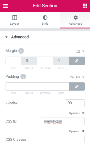
Then, give that section a CSS ID of ' menuhopin ' and a Z-Index of 999

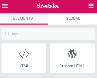
Finally, simply add the code below in an HTML Element
Adjust the transform:translateY value at the bottom of the code to match the approximate height of your header.
<script>
/* Please login to get the code
 * The code will be for the Elementor Change Header on Scroll - With Smooth Animation tutorial
 * Found at this URL https://element.how/elementor-change-header-on-scroll/
 */
</script>

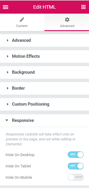
If you want your menu to show up only on desktop or mobile, simply use the Responsive settings

If your menu is an horizontal bar at the top of the page, the above code will work perfectly
For any other placement, modify the CSS. If it needs to appear below something else, change the top: 0; value. If it is placed to the left or right of the page, remove width: 100vw; and add left: 0; .
Outstanding. Easy to setup, works like a charm. Thanks!
Welcome!
Hey quick question, where does the HTML element go on the page? I tried to implement but the new navbar just stays on the page and there are no effects observed on scrolling.
Update: it works now but my old header doesn't disappear upon scroll so the two headers just overlap.
Michael Chan Hello Michael! You other header should not be set to 'fixed' or 'sticky' anymore. It should just be set to show up normally, at the top of the page!
Hey Michael, can you tell us what you did to fix your issue? I can't seem to get my header to work and I suspect that it's because the html element is not placed in the correct space.
Alexander Green I always put the HTML widget it in the footer so it applies to all pages
Thank you for this script. Just one question on loading we see the second header for microsecond. What can i do to fix this ?
Move the CSS part of the code to somewhere where it will load before the header ( for example in the wordpress customizer > additional CSS )
Thanks for this but you need to be a lot clearer.
For example just say " This effect works by using two sections to create the effect.
First, create a new section (or use your current one) like you would with any header. Add your menu widget, logo etc. (Note: Don't add any sticky effects, when the page scrolls up this section acts like any section normally does)
Add a 2nd new section (or duplicate the previous one) and style it. It can be placed anywhere on the page or in your header template. Give it an ID name "menuhopin" with a z-index pf 999. This section is what appears when the page scrolls creating the illusion of swapped headers.
Using the HTML widget, paste the code below etc.
But thank you, amazing!
hey, i get an error when adding this script - 403 forbidden why?
Probably just your security plugin... put WordFence in learning mode for a bit!
Hello, can i change the code to make it in reverse, i mean when the page open apears my header and when i do scrool the header hide? sorry my english.
What you describe is the default behaviour for 100% of headers on all websites...
Hey Maxime, such an elegant solution. Thank you!
Quick question:
I'm using your script to display a sticky header for mobile devices. My "menuhopin" has a nav menu element that brings in a menu panel (sliding-in from left to right).
Problem is that this menu panel is only visible within the area of the sticky header, those few pixels on the top of the page. I tried playing a bit with the Z-index of the "menuhopin" (888) and my nav menu element (999), but this didn't solve the problem.
Any ideas would be greatly appreciated!
Thanks!
C.
Hey Christos!
Really difficult to say without seeing the page. Sounds a bit to me like it might be an overflow problem maybe? Do you have overflow set to default on your sticky header section?
Turns out it was a mistake of mine, a duplicate css snippet somewhere... All good now, many thanks!
Thanks allot for this tutorial.
The header works as expected on safari. It swaps smoothly and perfect on safari. The slide in animation is smooth a works the same as in desktop.
--
Still jumpy on *** Mobile Chrome. I's there any solution for that?
Thanks
Thanks a lot for this tutorial. The header works as expected as you explained. I'm looking forward to the YouTube tutorial, on how to shrink the logo on scroll. Using ''HTML only...''. Rest condition remains the same.
Stay Blessed
Welcome!
Greetings - I seem to be encountering an issue on page load. When you first land on my site, the hidden header loads at the same time as the page and then disappears. So it shows real quick before hiding... Can you tell me where this issue would originate from? What do I need to adjust so that hidden header does not show at all until the page is scrolled? Your help is much appreciated.
Greetings!
Please try the following:
Instead of adding the code in an HTML element, add it in an Elementor Custom Code snippet (WP > Elementor > Custom Code) that is set to HEAD position.
Let me know if that solves it!
Fantastic - Yes! That fixed it. Thank you very much. Your the best.
Does this work on Bricks Builder? I have it working on my elementor site and followed the same steps on bricks and it wasnt working... Just wondering if its compatible.
Hi Maxim, first of all, many thanks for your tutorials. It really helped me with my actual project.
It works perfectly when I scroll down but I'm facing an issue in regards to the header reappearing every time I scroll up, even if I'm not at the top of the page.
Is there something I can do to make sure the header only reappears when the viewer is at the top of the page? otherwise it reaper at any level of the page at the same time as my sticky header.
Many thanks in advance!!
Hi,
first of all: It works perfectly! But I would like the header to come up from the bottom and then stay at the bottom. similar to awwwards.com. How would I have to adapt the CSS code to realise this?
Greetings and thank you very much for the great tutorial.
Hey Papi!
Try this tutorial : https://element.how/scroll-down-new-add-cart-button/
I realise it's not talking about a "header" at all, however, it's what you are looking for!
PS. the tutorial should work for Containers too.
Cheers!
could you provide a es6 version (without jQuery)?
I updated the code to get rid of jQuery.
Great tutorial, thanks!
Cheers John, welcome!
Hi Maxime,
First of all, let me congratulate you on this amazing portal you have here.
So many cool and really useful customisations for Elementor!
My question is:
I have used this on the website I'm working on and it works nicely.
However, because the trigger is on pixels scrolled, depending on the size that the user has its browser window, the second header is coming in early and I get duplicates (if the window is very deep) or coming in too late.
Here is the page so you can see : https://www.foliofurno.com/homepage-is/
Is there a way to change the trigger from pixels scrolled to perhaps when the scroll reaches the top or bottom of an element on the page?
Cheers!
Hey Martin!
Change this:
if (y > 300) { /* change this value here to make it show up at your desired scroll location. */
to
if (y > window.innerHeight) { /* change this value here to make it show up at your desired scroll location. */
That will make it the equivalent of 100vh. To have 110vh, change it like this:
if (y > window.innerHeight * 1.1) { /* change this value here to make it show up at your desired scroll location. */
Hope this helps!
Cheers!
And thank you for the kind words! Really appreciated.
Hi Maxime, the code worked perfectly! Thanks so much...
Did everything simply the solid menu simply doesnt show up.
my steps were, create new header menu, add css id menuhopin, z index 999 .
next i tried to put the code on the footer, didnt work.
also tried to have the code on a specific page.
doesnt show up either way.
What could be the problem?
Thanks
Joao
Thanks for this! However, I am using a BuddyBoss website. And when a user logs in, there's a social panel that's a vertical menu on the left side of the screen. When you scroll down part of the main menu that jumps in, is then pushed off, out of the viewer window. Any idea and what to change to fix that?
Hey Otis!
Probably you will want to disable page scroll while the buddyboss vertical menu is opened...
Cheers!
Thanks! Works perfect!!
Welcome John!
Hi Max, thanks a lot for this tutorial, it saved me a lot of time. I have only one question: Is there a way we can make the dropdown speed and the hide up speed different?
Thanks for your help.