
Creating circle buttons in Elementor is trickier than one can anticipate. Yes, adding different values into the padding fields might give you the desired shape but just moving your values up or down on the font size or icon size field would change everything for you.
So, in today's tutorial, you will learn how to create that perfect circle button in Elementor using the button widget that comes with the page builder. Before we dive into it, please note that you need Elementor Pro or know how to add CSS codes to your theme's customizer.
Here is what we will create:
Now, let's get started.
Step 1: the Essential Styles Settings
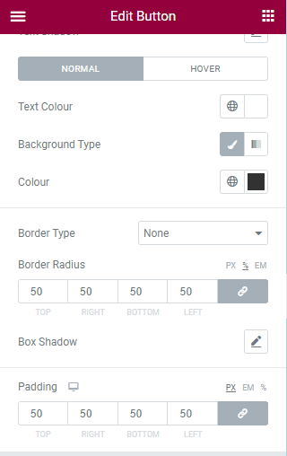
- First, design your button's background color(s) and pick the font that you want
- Then, at the bottom, all padding fields should have the same value (in the image above, I set them to 50px each)
- After this, select the border-radius unit(default is px, set it to percent %) before adding 50 to all the fields under border radius
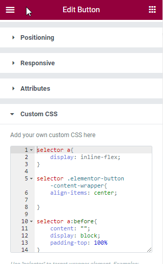
Step 2: Adding the Code
Copy the code below into the CSS field in your widget advanced section.
<script>
/* Please login to get the code
 * The code will be for the How To Easily Create a Circle Button In Elementor tutorial
 * Found at this URL https://element.how/elementor-circle-button/
 */
</script>
This should already give you perfectly circular buttons!
Elementor Free Users: learn how to add CSS to Elementor free and how to deal with the 'selector' keyword.
Extra: Adding borders and shadows to your Elementor circle button
Borders and box-shadow, creatively used, can give life to your buttons and Elementor allows easily implement these effects.
These are the steps you should take when adding a border and/or shadow to your buttons
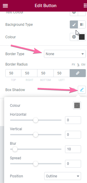
- On the border-type, open the select field and pick any of the 5 types Elementor provides by default
- Two fields will appear, a border width field and a color picker field. With these fields, you can choose how big in terms of width you want your border to be and what color it should have, respectively.
- To add shadow to your button, click on the icon that aligns horizontally to box-shadow.
- On the drop-down that appears,
- The Horizontal slider is used to control how far from the center, left, or right the shadow will be. A positive value will move the shadow to the right and a negative value will move it in the opposite direction.
- With the Vertical slider, you can control the position of your shadow. A Positive value moves it downward and a negative value moves it upward.
- The Blur slider is used to make the shadow bigger and lighter. This can only have positive values.
- While the Spread slider is used to either expand or shrink the shadow. A positive value expands the shadow while a negative value shrinks it.
Please note that the CSS code you copied above won't affect your circle buttons' borders and shadows.
Thank you and I hope you found this tutorial helpful in your web design project. Follow us on Youtube and turn on the notification to get new design tutorials about Elementor!
One Response
Thank you! Great way to make a perfect circle shape! I've tasted and work really well! 🙌