
In this tutorial, you will learn how to create a vertical icon sticky menu navigation with Elementor.
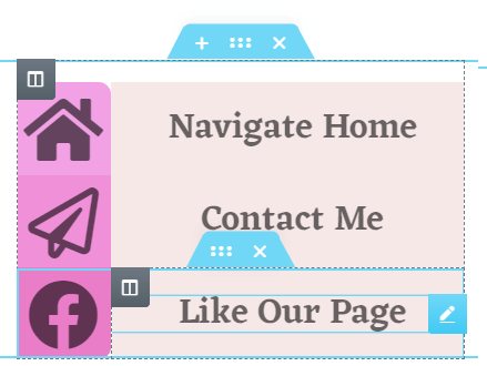
Here is what we will create:
Importing the template, and then editing the HTML element is the quickest way to replicate this design.
To start with, create a container with the "content width" set at 290px
Set the layout to full width, set the width to 290px and set the gap to 0.
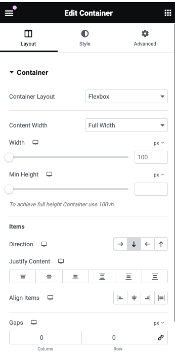
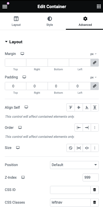
Then, give this container the CSS class name 'leftbar', and a z-index value of 999.
Now, add an inner container
We want to replicate this structure:
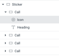
For now, add only the first "Call" container.
This inner container will be for the menu icon and the text that will pop up to its right when hovered.
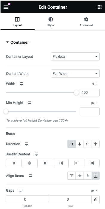
Set Direction to row, set Align Items to Stretch, and set Gaps to 0px,
Now add the Icon and Heading element.
Give the icon the class name "left-icon" and a z-index of 9.
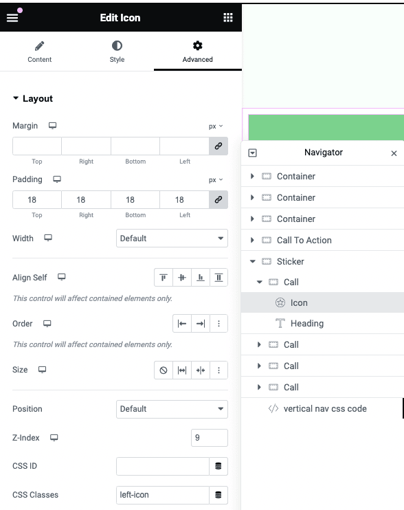
Adjust the rest of the icon's settings and heading settings as you wish.
When you get everything the way you want it to look, duplicate the inner "Call" Container until you got all the menu items(icons) you want.
Then, add this Elementor sticky icon expanding on hover CSS
<script>
/* Please login to get the code
 * The code will be for the Create a Vertical Icons Sticky Menu with Elementor tutorial
 * Found at this URL https://element.how/create-a-vertical-icons-sticky-menu-with-elementor/
 */
</script>
Elementor Free Users: learn how to add CSS to Elementor free and how to deal with the 'selector' keyword.
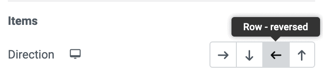
If you would like the design to be on the right, make these changes
To have it be on the right of the screen instead, near the start of the CSS, change
left: 0;
to
right: 0;
and then, for every "Call" container, make them row-reverse.
Conclusion
I hope you find this tutorial educative and useful in your web design project.
Thank you for reading and leave a comment if you have any questions or need help!
One Response
Is this all on a page?