
Today, we are going to learn how we can creatively create a beautiful menu, button and link hover effect in Elementor. Although this requires some custom CSS, I want you to know that you have nothing to worry about as the code you need for every part of it is available in this post.
Have a look at the live demo here:
Check out this premium tutorial to have an Elementor underline animation on scroll instead of hover.
Keep reading for the underline on hover tutorial.
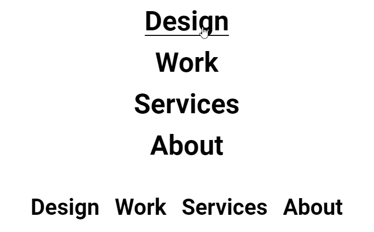
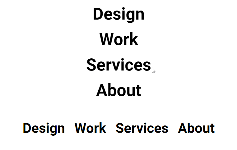
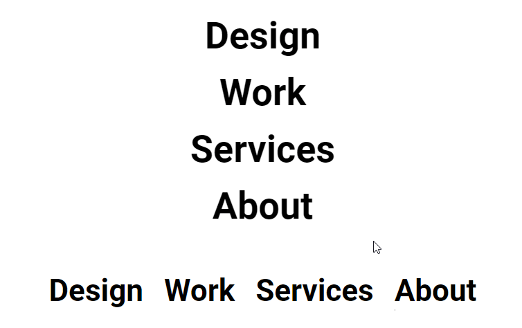
Elementor underline on hover for nav menu element
Left to right, left to right underline hover effect
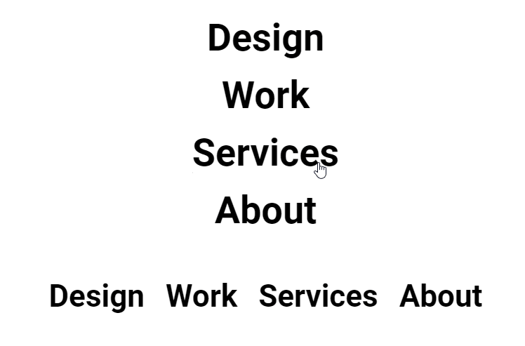
The way this underline hover effect happens goes like this; the line grows horizontally from left to right when the mouse cursor hovers on the menu item. And then disappears from left to right when the cursor leaves the menu item.
These are the steps to create this type of effect
- Add your nav menu to your Elementor template.
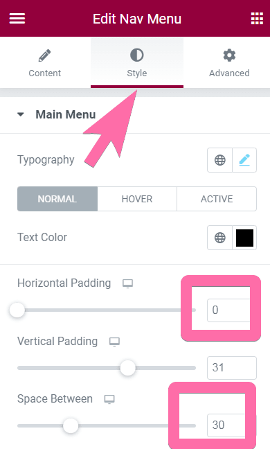
- Going to the style tab of Elementor, style your menu to how you want it to be. These can be font type, color, font size, etc.
- You should change the value for horizontal padding. Enter "0" to have the the exact effect as seen above.
- Adjust the distance between the menu items with the 'Space Between' setting instead.

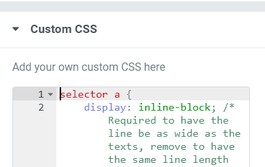
- Then go to the advanced tab > custom CSS of Elementor and add the code below.

This is in the Advanced tab
<script>
/* Please login to get the code
 * The code will be for the Elementor Underline on Hover For Nav Menu, Buttons & Links tutorial
 * Found at this URL https://element.how/elementor-underline-on-hover/
 */
</script>
If you are using a vertical menu layout, you will also need to add this CSS:
<script>
/* Please login to get the code
 * The code will be for the Elementor Underline on Hover For Nav Menu, Buttons & Links tutorial
 * Found at this URL https://element.how/elementor-underline-on-hover/
 */
</script>
What the code in the 'li::before' does:
- The background-color property is used to set the color of the underline. You need to change this to the color of your choice.
- The height property is used to set the thickness of the line. As you can see from the code above, the thickness was set to 2px. Adjust as you wish.
- The transition property sets the animation of the line. All you have to do here is to adjust the transition's duration and timing. The website "https://cubic-bezier.com" will help you create fancy timing functions.
- And the bottom property is used to set the vertical positioning of the line. Adjust as required.
Note: you don't need to do anything in the code inside the 'li::hover::before'.
What the code for the vertical menu layout does:
- display:flex & flex-direction:column are needed to center the nav items and adjust their width, so that the line is just under them (don't change this)
- align-items: center; is required to center align the nav items. You could change this to align-items:flex-start; or align-items:flex-end; if you would prefer.
Right to left, left to right underline hover effect
This underline hover effect does the opposite to the effect we saw in the previous section when a mouse's cursor hovers on menu items. But the effect when the cursor leaves the menu item remains the same.
The code for this underline hover effect is:
<script>
/* Please login to get the code
 * The code will be for the Elementor Underline on Hover For Nav Menu, Buttons & Links tutorial
 * Found at this URL https://element.how/elementor-underline-on-hover/
 */
</script>
If you are using a vertical menu layout, you will also need to add this CSS:
<script>
/* Please login to get the code
 * The code will be for the Elementor Underline on Hover For Nav Menu, Buttons & Links tutorial
 * Found at this URL https://element.how/elementor-underline-on-hover/
 */
</script>
Note: the same explanation from the previous section applies to this section. The only changes made here were done on the transform-origin property for both "a::before" and "a:hover::before".
Right to left, right to left underline hover effect
The underline grows horizontally from right to left when a mouse hovers on a menu item and disappears from right to left when a mouse leaves the menu item.The underline hover effect goes from right to left when the cursor of a mouse hovers on a menu item. And when the cursor leaves the menu item, the effort of goes from right to left.
The code for this underline hover effect is:
<script>
/* Please login to get the code
 * The code will be for the Elementor Underline on Hover For Nav Menu, Buttons & Links tutorial
 * Found at this URL https://element.how/elementor-underline-on-hover/
 */
</script>
If you are using a vertical menu layout, you will also need to add this CSS:
<script>
/* Please login to get the code
 * The code will be for the Elementor Underline on Hover For Nav Menu, Buttons & Links tutorial
 * Found at this URL https://element.how/elementor-underline-on-hover/
 */
</script>
Note: the same explanation from the first section applies to this section. The only changes made here were done on the transform-origin property for both "a::before" and "a:hover::before".
Left to right, right to left underline hover effect
The underline grows horizontally from left to right when a mouse hovers on a menu item and disappears from right to left when a mouse leaves the menu item.
This is the code for this menu effect:
<script>
/* Please login to get the code
 * The code will be for the Elementor Underline on Hover For Nav Menu, Buttons & Links tutorial
 * Found at this URL https://element.how/elementor-underline-on-hover/
 */
</script>
If you are using a vertical menu layout, you will also need to add this CSS:
<script>
/* Please login to get the code
 * The code will be for the Elementor Underline on Hover For Nav Menu, Buttons & Links tutorial
 * Found at this URL https://element.how/elementor-underline-on-hover/
 */
</script>
Note: the same explanation from the first section applies to this section. The only changes made here were done on the transform-origin property for both "a::before" and "a:hover::before".
Elementor underline hover effect for links and buttons
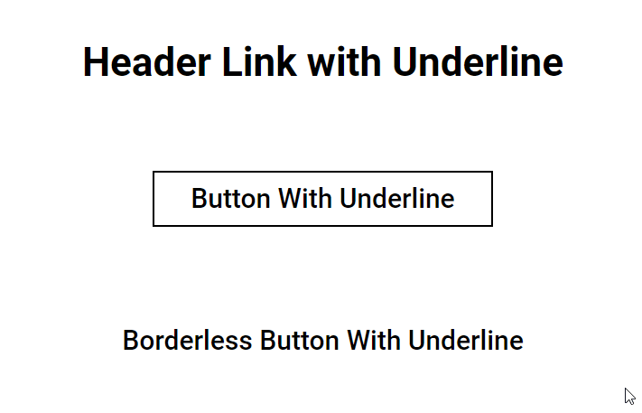
You can apply this hover effect on any link or button element(s) on your Elementor WordPress websites. Based on the demo you see on the gif above, we will keep it simple by giving the code for the left to right | left to right hover effect. You can achieve whatever effect you want by changing the values on the transform-origin property in the code. Change the 'right' value to 'left', and 'left' value to 'right', until you get the animation you want.
If you want this underline hover effect on just one link, use this code:
<script>
/* Please login to get the code
 * The code will be for the Elementor Underline on Hover For Nav Menu, Buttons & Links tutorial
 * Found at this URL https://element.how/elementor-underline-on-hover/
 */
</script>
You can add this code to the individual widgets that hold your links if you have the pro version of Elementor. Just go to the "Advanced" tab, scroll down to Custom CSS and add this code inside the text area.
And if you want all the links on your website to have the underline hover effect, use this code:
<script>
/* Please login to get the code
 * The code will be for the Elementor Underline on Hover For Nav Menu, Buttons & Links tutorial
 * Found at this URL https://element.how/elementor-underline-on-hover/
 */
</script>
While this code will give all buttons on your website the underline hover effect
<script>
/* Please login to get the code
 * The code will be for the Elementor Underline on Hover For Nav Menu, Buttons & Links tutorial
 * Found at this URL https://element.how/elementor-underline-on-hover/
 */
</script>
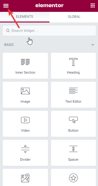
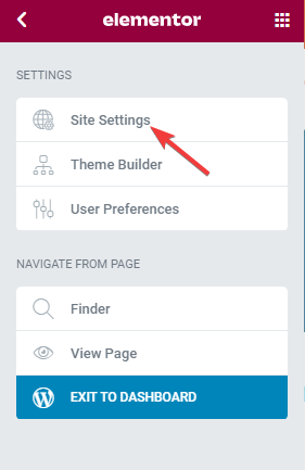
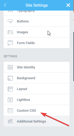
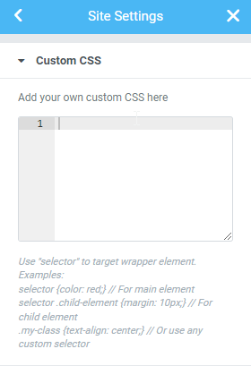
If you have Elementor Pro, you can easily add these codes to your website using this method:
- Click on the Hamburger menu on your Eelementor panel
- Click on site settings
- Scroll down to Custom CSS and click on it
- Copy the above code and paste it in the text area in Custom CSS
- Save and exit the site settings page.
The images below will show you how to add custom CSS to your site.
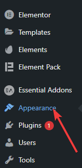
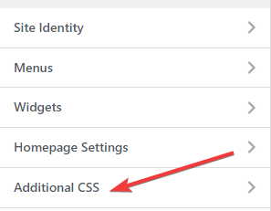
Now, if you do not have the Pro version of Elementor, you can still achieve this by adding the code to your theme's customizer.
- Go to your WP dashboard, hover on "Appearance" and click on "Customizer"
- Your theme's customizer allows you to do some changes on the front-end. Here, you have to scroll down to "Additional CSS"
- Open it and paste the code you copy above
Trendy thick underline hover effect for Elementor
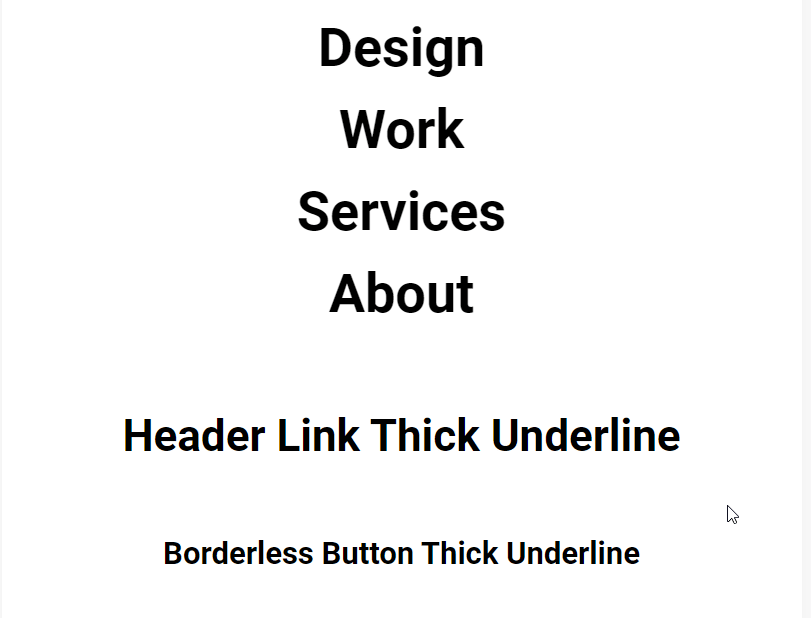
With a little tweak to the original code, you can have a beautiful underline effect behind your texts that appears and disappear when you hover on a link or button.
How to create this effect:
- Copy any of the codes above that you wish to use
- Then change the height property (make it bigger by increasing the value)
- Finally change the color so that it's different than your text's color
I hope you found this tutorial helpful in your web design project. Follow us on Youtube and turn on the notification to get new design tutorials about Elementor!
67 Responses
This is awesome!!
One question, when I paste the code into a "align to center" menu, the code cancels it and forces "align to left", and I can't get it back to center align. How can I fix it?
And again, thanks a lot for sharing this 🙂
Thanks for asking! I should have added this information in the tutorial indeed.
Here, just add this CSS and it will center the menu items!
selector li {
text-align: center;
}
Cheers!
You are one of a kind 🙂
Thanks!!!
Hi,
it's make my arrow of under menu at the line,
do you have a work around to solve this
thanks
I don't understand what the problem you are having is...
Hi! I've a problem using the code for a button. The underline doesn't match the text but it starts at the left limit of the button (where there is no text).. How can I "move" the starting point of the underline?
Sorry for my bad english and thank you 🙂
Hey Davide!
In the CSS, you will want to change the 'left' and 'width' property. Here is the optimal way to get what you are after:
Completely delete the 'width:xx%;' line.
Edit 'left:xx' to 'left:20px' where 20px is the value of the left padding in your buttons.
Add 'right:20px' where 20px is the value of the right padding in your buttons.
Cheers!
Is it possible to change the thickness of the lines throughout the breakpoints. Especially when using a thicker line on the desktop - this doesn't translate down.
Yes it is! That's exactly what CSS media queries are for!
Nice, thank you very much Maxime
Welcome Jivaneo!
Hi Maxime,
Thank you - this is wonderful!
However, is there a way it can work with a submenu? I'm finding that it pushes the sub menu icon under the nav menu?
Website in question is: https://conjunctconsulting.org
Many thanks - Heather
Hey Heather!
Indeed it didn't work for these scenarios. I updated the code now, and it's working fine even when there are sub menu items!
Thanks a million Maxime - that works perfectly 🙂
Great!
Hi,
I want to have align-items: left, but the hover underline will not correspond with the lenth of word, all of underline will be 100% length. How to adjust it? By the way, I use vertical nav.
I have the same question! Thanks
I just figured it out! Change "align-items: left;" to "align-items: flex-start;" and it works perfectly! 😀
Hello, I tried using the "Left to right, left to right underline hover effect" and followed all your steps but the space-between isn't working. The horizontal and vertical padding work...
In the CSS you will see this:
selector nav > ul.elementor-nav-menu.elementor-nav-menu.elementor-nav-menu > li {
position: relative;
z-index: 1;
flex-grow: 0;
}
change to:
selector nav > ul.elementor-nav-menu.elementor-nav-menu.elementor-nav-menu > li {
position: relative;
z-index: 1;
flex-grow: 0;
margin-inline: 20px;
}
Adjust the margin-inline value.
Thanks it was great!
Welcome!
Your website never cease to impress me. It's really a great resource for anyone who want to push elementor past its limitations. This effect is working really well, thanks!
Thank you Raphael for the kind words! Really appreciated.
Hello, how to leave the underline when the page is active?
Is this possible to do with the links in a dropdown menu?
Yes it is, however some CSS modifications might be needed to get the desired result.
When I add the CSS Code the effect Works fine, but the space between setting doesn't work. am i doing something wrong?
In the CSS you will see this:
selector nav > ul.elementor-nav-menu.elementor-nav-menu.elementor-nav-menu > li {
position: relative;
z-index: 1;
flex-grow: 0;
}
change to:
selector nav > ul.elementor-nav-menu.elementor-nav-menu.elementor-nav-menu > li {
position: relative;
z-index: 1;
flex-grow: 0;
margin-inline: 20px;
}
Adjust the margin-inline value.
I don't know if I missed something or not, but for some reason, after entering the custom CSS code, my menu items all get smooshed together, as if I didn't add a value to "Space between" - it just doesn't add any space between, if that makes sense. I'd greatly aprpeciate some ideas to fix that problem 🙂
In the CSS you will see this:
selector nav > ul.elementor-nav-menu.elementor-nav-menu.elementor-nav-menu > li {
position: relative;
z-index: 1;
flex-grow: 0;
}
change to:
selector nav > ul.elementor-nav-menu.elementor-nav-menu.elementor-nav-menu > li {
position: relative;
z-index: 1;
flex-grow: 0;
margin-inline: 20px;
}
Adjust the margin-inline value.
I had the same problem as Verena, but adding the margin-inline bit of code fixed it.
I'm using Elementor's flexbox containers, so I'm wondering if that had something to do with it.
Regardless, thanks Maxime for the excellent solution!
I've entered the code but for some reason, the underline goes the full length of the column as opposed to the length of the text. How do I achieve that please?
Hey Matt. I'd need to see the page in question to find out what might be the issue.
Hi! This has been a godsend thank you. I have tried to achieve this effect for a few days without luck. Now it all makes sense.
Please, could you advise on what to add to the code if I want ACTIVE page to have the same effect? Many thanks!
Greetings John!
Good question!
To have the same underline already present on the active menu item, add this CSS:
selector nav > ul > li.current-menu-item::before {
    transform:scaleX(1);
    transform-origin:left;
}
Cheers!
Hi Maxime,
That is great, it is working like a charm!
Many thanks for these magical lines of code.
All the best
Welcome John!
Hello Maxime, I have tried this CSS for the active menu, but it doesn't work. In which line can I add this CSS for the active menu? Thank You
Greetings!
Could you share your URL with me? I will have a look.
Hello Maxime.
I went a bit further with this for the fun of it and tried to make a vertical menu. I almost succeded: https://prnt.sc/J9IlEyttSX83
Item underline on shorter titles stretches for the length of the longest. How would you go about this? 🙂
Kind regards
Change "align-items: center;" to "align-items: flex-start;" and it works perfectly! 😀
Thanks for sharing!
Hello Maxime,
Thank you for another amazing CSS solution for Elementor. I've used several of your awesome solutions across projects, and never fail to learn something new while adding a excellent feature to a site that Elementor just can't do!
I have a question about the coding for this one:
Is there a reason for repeating the class .elementor-nav-menu 3 times in two different places within each code instance?
The first time it repeats is here:
selector nav > ul.elementor-nav-menu.elementor-nav-menu.elementor-nav-menu > li {
position: relative;
z-index: 1;
flex-grow:0;
}
The second time it repeats is here:
selector nav > ul.elementor-nav-menu.elementor-nav-menu.elementor-nav-menu > li > a {
margin-inline-end:0px;
margin-inline-start:0px;
}
When I implemented this solution on a website, I tried removing the 2 extra .elementor-nav-menu citations, leaving just one in each CSS rule, and the effect still seems to work fine without them.
Thanks again for your time and effort!
Greetings!
Yes, there is a good reason: it's to be certain that our custom CSS will have priority over any inherent CSS Elementor has, or might generate based on which options are selected on the nav element.
If you delete it and everything still works, you didn't need it in your case, so all good!
Learn more about CSS Priority in the CSS Specificity chapter of my CSS Course.
Cheers!
Ah, OK, understood. Thank you for your reply!
I'm a novice, but unfortunately, I cannot get this to work with the mega menu option in the new nav widget. Maybe once those features are stable, a new code version will be required?
Hey Chris!
Yes indeed I don't have a code snippet yet specifically for the mega menu element.
You can try the one that's just below the line :
"If you want this underline hover effect on just one link, use this code:"
That one should work, however it might work on more links that you would want to!
That one doesn't work, either. It must have something to do with using containers because it's not only the menu; it doesn't work anywhere. Maybe Elementor will add this feature as a standard transition.
Awesome! Thank you for sharing!
Welcome!
Would it be possible to have the underline stay at the active page?
Yes it is!
To have the same underline already present on the active menu item, add this CSS:
selector nav > ul > li.current-menu-item::before {
    transform:scaleX(1);
    transform-origin:left;
}
Cheers!
How can I add a hover box like the line?
I'm not certain what you are asking. But if it's what I think it is, just make the line really thick, and position it as needed...
Hey,
Thank you for the great code! 🙂
The only thing what I'm struggle with is that when I apply the code to my menu, the submenu's box shifts to the right (~10px). When I delete the code, it fits again perfectly.
A previous commenter linked her website here, and I see it is having the same problem with the code. (https://conjunctconsulting.org)
I've uploaded a print screen about the problem: https://ibb.co/5YXpfqV
Would you be so kind as to take a look at the code, how can I fix this? 🙂
Thank you in advance!
Greetings inzen,
Simply change this part:
to this:
Cheers!
I rewrote it to 5px as you suggested, but it didn't bring the submenu box back to its place, instead it moved the underline (red line) to right by 5px. I have attached a picture of the result:
https://ibb.co/PxMk4KN
Please come back here when you can share the URL. Trying to fix a CSS problem through screenshots really isn't productive...
Sure I can share it, thought it would be easier to have drawings on it what I mean. Here is the link to my website: https://aiverzum.hu 🙂
Greetings Inzen,
Please add this CSS:
.elementor-nav-menu--layout-horizontal .elementor-nav-menu>li:not(:first-child)>ul {
    --e-nav-menu-horizontal-menu-item-margin: 0;
}
Cheers!
Thats great! Thank you! 🙂
And one more question, if you don't mind: Based on what was written above, I also used the code for links (blog post article titles), but if the title is too long and therefore the page breaks it into 2 lines, then only the bottom line of the title is underlined by the CSS code:
https://ibb.co/YNLqZWT
Would you please take a look and see if you can fix this as well? 🙂
Thank you!
Sorry this isn't possible with the technique I show here. It is possible with another technique, but there are inconvenients.
I suggest you avoid using the underline for multi line headings.
Hello and thank you for this great code, I have a question regarding anchor links on the main page. I used the code and also made it active when certain menu item is selected, so it stays underlined.
So when I have two custom links in the main menu navigation, they are both underlined (active) if I am on the Home page. I realize this makes sense. But is there any way I can hide or exlude two specific links from the main navigation from being underlined when they are active, so this efect will not work on them?
Thank you
Greetings!
Yes this is possible. You will need to right click > inspect, find the unique class name menu-item-xx , then adjust the selector:
selector nav > ul > li::before {
change to
selector nav > ul > li:not(.menu-item-xx, ,menu-item-xy)::before {
change xx and xy to the unique IDs you will find
Cheers!
Hi there, thank you for this tutorial. I am using the option with just links rather than using the Wordpress menu option, in order to make my links underline different colours. I am struggling with how to make those stay put on active as well. Can you please help?
Hey Lauren!
Yes, please share your URL I will have a look.
Cheers!