
In this tutorial, I will show you how to add horizontal scroll to the Elementor Tabs titles. Works great on mobile, and works for desktop as well if you need it there too!
Facebook apps uses this, Uber Eats, YouTube, why not you? Elementor tabs mobile scrollable title!
Here is what we will create. Note that on an actual mobile, that thick scroll bar won't show up.
You can also visit this url from your mobile for a better preview.
If you would like even more features, check the Elementor Horizontal Scroll Menu, Taxonomy, Tabs With Images Premium tutorial. This is what that premium tutorial shows you:
- PageLoad Smart: Automatically scrolls to the center of the current menu item (if one of them is the current page), current taxonomy filter, or current tab
- Open Tab: Scroll to and open the proper tab on page load through an ID in the URL (site.com/#example-id)
- Auto Scroll Back Up: On Tab Switch, automatically scroll back up to the top of the tabs element. Useful if your tabs titles are sticky
To begin with, create your tabs Element the way you want it
Here, we are using the one that comes by default with Elementor. This works with both the old tab element, and the new one that allows adding element directly within its content.
Then, add an HTML element on your page, and add this code in it
The HTML element can be anywhere on the page.
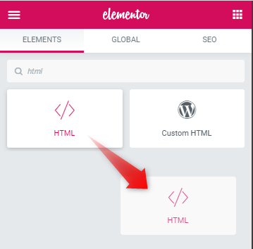
Copy paste the following code in it to make the tabs horizontally scrollable.
Here is the code for the old tabs element:
<script>
/* Please login to get the code
 * The code will be for the Create Elementor Tabs With Horizontal Scroll For Mobile Users tutorial
 * Found at this URL https://element.how/elementor-tabs-mobile-scroll/
 */
</script>
Here is the code for the new tabs element: (the one container based)
<script>
/* Please login to get the code
 * The code will be for the Create Elementor Tabs With Horizontal Scroll For Mobile Users tutorial
 * Found at this URL https://element.how/elementor-tabs-mobile-scroll/
 */
</script>
I also added the code to make the tabs titles sticky. You can delete it if you don't need it.
If you keep it, and it's not working, see this tutorial : Debugging CSS Position:sticky not working.
Finally, enjoy your new auto centering, horizontally scrollable tabs element!
That's right, the code also includes JavaScript that will automatically center the active tab!
Cheers!
128 Responses
That's brilliant, thanks
Welcome!
You are my hero. Thank you!
Thanks!
Do you have the code for this with ElementorsKit tab?
No I don't.... Send me the URL I might be able to get it for you
Hello, thanks for the code. Is this supposed to allow us to scroll horizontally by finger swipe on mobile? if so, i can't seem to get it to work on my mobile phone (iphone 7plus)
my bad, it actually works. didn't know it was just for the title in the tabs. is there any way i can make this work with the contents in the tabs?
Cool,Thank you
Thanks!
Thats pretty cool. But it seems like its not working if the page is a User restricted Area.
If i create a new "page" it works fine. On my template sections in the user area it is not working.
I have no idea why that might be...
Hi Maxime,
LOVE this tab swipe function but I am having a little trouble with it.
On one site is working perfectly and then on another, the swipe function is jittery and unresponsive.
Have you encountered this before?
PS - It works fine on computer in browser Dev (responsive) mode but not on my mobile. And also checked a few browsers on my mobile to rule out browser problem. Also checked on another mobile and same issue.
Seems to work fine for me... Did you test my demo above with your mobile phones?
Nope can't say I have... It might be some conflict with something on your other site.
Hi! I need to be able to scroll on desktop too, since there's too many tabs for the viewport. Is there a way to use this with a scrollbar or something like that?
Her Mercedes! I updated the code in the tutorial, now it works for desktop automatically as well!
Thank you very much for your work! Please tell me how to do this with Nav menu (elementor) ?
Can anyone suggest a solution to this problem?
This works: https://element.how/elementor-horizontal-scroll-section/
for mobile version
Thank you very much for these great tutorials,
Can you provide the code for Crocoblock JetTabs?
I tried to make it myself, but I couldnt 🙂
Here it is:
.elementor .elementor-element .jet-tabs__control-wrapper { display: flex; flex-wrap: nowrap; overflow-x: auto; -webkit-overflow-scrolling: touch; -ms-overflow-style: -ms-autohiding-scrollbar; margin-right: -10px; justify-content:start!important; } .elementor .elementor-element .jet-tabs__control-wrapper::-webkit-scrollbar { height: 0; } .elementor .elementor-element .jet-tabs__control-wrapper > div { min-width:140px; /* adjust to fit your needs */ } .jet-tabs.jet-tabs-position-top { display:block; }it worked perfectly. Thanks a lot :))
Oh how happy I was to find this comment, I have been trying to adapt the code for hours. Thank you for sharing this!!!
Welcome Elena! Glad you found what you were looking for!
Thank you very much for your code.
But, I have problem with tablet viewport @media (max-width: 1024px). The scroll tabs limited slide from left tabs, so some of tabs title are not visible.
May I know how to fix that?
I updated the code in the tutorial, now it should work for that scenario just fine!
Hi,
How to do it with desktop view?
UX UI isn't great on desktop if you add this. There will be an ugly scroll bar... This is really more for Mobile users.
I have been using this code for a while, but it does not work correctly on mobile if I use containers as there is an overflow and the content does not warp on mobile.
https://www.celmetro.com/home-test-page/
Appreciate if you can look into this.
BR
Hey Francis!
try this, under Advanced > custom CSS
selector .elementor-tabs-wrapper {
overflow: hidden;
max-width: 100vw;
}
Fixed it without the code 🙂
Layout/Items/Wrap selected no wrap.
Thank you for your help.
Thank you Maxime, the tab layout is fine now but the horizontal scroll does not work 🙂
Disregard the above comment 🙂
Awesome. Can you make the title tabs automatically slide/ swipe to right?
Yes that would be possible with extra code.
How can I disable it at desktop and use it only on mobile ?
Use this code for that. Old Tabs element only.
@media (max-width:1024px){ .elementor-tab-title.elementor-tab-mobile-title { display: none; } .elementor-tab-title:nth-child(odd) { background-color: teal; } .elementor-tab-title:nth-child(even) { background-color: crimson; } .elementor .elementor-element .elementor-tabs-wrapper { display: flex; flex-wrap: nowrap; overflow-x: auto; -webkit-overflow-scrolling: touch; -ms-overflow-style: -ms-autohiding-scrollbar; margin-right: -10px; } .elementor-tabs-wrapper::-webkit-scrollbar { height: 0; } .elementor-tab-title { flex: 0 0 auto; } .elementor-tab-desktop-title.elementor-active:before, .elementor-tab-desktop-title.elementor-active:after { width: 0!important; } }Hi, When I attached this code to the desktop part, but the title of the tag is still on the left corner, I need it to be centered like the initial setting.
Please help me, I'm not good at coding.
Thanks!
Is it for container or old one? Not working 🙁
Old one. I have instructions for the new one already lower down in the comment section.
See https://element.how/elementor-tabs-mobile-scroll/#comment-17542
Awesome. Can you make the title tabs automatically in center if i click it on mobile?
I added that feature!
Hello, does it work with widgets inside a section?
Greetings!
Not as it is no. Similar CSS will work for elements, but not exactly the same...
Try:
selector {
max-width:100vw;
overflow-x:auto;
}
Thank you (sorry for the late answer)
I love this so much, helps me a lot!
Glad you like it Miriam!
It would be great if you could update the code for new (nested) tabs
Greetings Jackimov,
I added the code for these in the tutorial!
Cheers!
I don't know why this isn't working.
Greetings!
I updated the code, should be working now!
Cheers!
Hello! How to center the active tab when swiping?
Example video: https://share.icloud.com/photos/00esMRGhfpqDm5M58qpZdn1Yw
Greetings Doro!
I added instructions for this in the tutorial!
Is there a limit to how many tabs can be used? I have 14 tabs and oddly 7 are visible in mobile portrait view and 9 are visible in mobile landscape view. I am using latest version of Elementor Pro with containers. Please advise. Thank you.
Forget my question. Looks like I had to set the tabs to full justify. That seems to display them all.
Thanks for sharing the solution!
This code doesn't work if you nest two tabs into one another. Can you provide a code for that situation?
Hey Jeffrey!
What version of the code are you using? What result would you expect that you don't have (ie, what does "doesn't work" mean?)
Thanks!
It's the updated code. If you nest 2 tab elements, the 2nd tab instance doesn't display. The fields show up, but the tabs are not displaying and don't function.
Thank you very much for this code! Elementor tabs should have worked like this in the first place and not like an accordion.
I added this extra css in the style tag to hide the scrollbar on mobile cause it was still showing for me using the above code as is.
.e-n-tabs-heading.e-n-tabs-heading::-webkit-scrollbar {
display: none;
}
Thanks for sharing!
Hello, i tried the code using html widget but is not displaying anything. could you look into it for me
Hey Tobi!
Look into what though... you haven't shared any URL! I can't look into it without a url...
Cheers!
https://codeaamy.com, i will forward a screenshot to email
You are using the code for the old tabs element, while you have the new tabs element in there. Add the code for the new element and it should work fine!
Cheers!
do i add the code to an html widget or custom css code for the nested tab widget
html element
is still not display anything, could help me test the code over there
Hey Tobi,
It's not supposed to display anything. The code is to modify the Elementor Tabs element, and make the tab title horizontally scrollable on mobile.
Thanks it worked
Thank you for this. One small issue is that the tabs are aligned to the left on desktop view and not the middle as I had it. Is it possible to avoid this please? I am useing the new tabs element and know zero coding. Thank you
Hey Edward!
To avoid this you can simply wrap the first part of the CSS code in between a media query for mobile only.
@media (max-width:1024px) {
// css here
}
Sorry to ne needy, I know nothing about CSS. Is there any chance you can please comment with the modified CSS?
Wrap this part of the code:
.e-n-tabs-heading.e-n-tabs-heading.e-n-tabs-heading.e-n-tabs-heading {
overflow-x: auto; /* enable horizontal scrolling */
display: flex;
flex-wrap: nowrap;
justify-content: start;
padding-bottom: 10px;
}
The rest stays as is! Cheers!
Hello, is there a way that when swiping across the content below the tab, the tab title also follows?
Hey Quoc!
Well then you would want more like a slider maybe...
Great code! But the line
.e-n-tabs-content .e-n-tab-title {
display: none; /* don't display mobile tab titles */
are "deleting" the nested tab (a tab inside tab).
How can I show the nested tabs again?
Hey Eduardo!
Add this CSS:
.e-n-tabs-content .e-n-tab-title .e-n-tab-title {
display: block;
}
Cheers!
Can you guide me on how to align the tabs to the center?
With my code, that's what will happen by default! For the new tabs element.
so do you mean that it is not possible to align the tab to the center?
How to make the heading tab title sticky when it scrolling down
Hey Umi!
For this, add this CSS:
.e-n-tabs-heading {
    position: sticky;
    top: 0;
    z-index: 9;
    background-color: #fff;
}
And if it's not working, see this tutorial : https://element.how/css-debugging-position-sticky-not-working/
Cheers!
OK thanks, I'll try the code, hope it works
Hello maxime desrosiers!
Thanks a ton for helping out, the code works like a charm
Welcome!
Hello Maxime!
Thank you very much for the tutorial, it works perfect!
I have the problem that when switching between tabs, it changes in the same scrolling position, and I would like to go to top.
This is the url: https://kahalabarcelona.com/carta-de-cocteles-2023-prueba
By the way, the auto centering is amazing! Thank you very much 🙂
Hey Kahala!
Glad you like the auto centering!
To go back to the top of the tabs element each tab switch, add this line:
navigationItem.closest('.e-n-tabs').scrollIntoView();directly below this line:
navigationItem.addEventListener('click',function(event){Cheers!
It works perfect! Thank you very much Maxime!!
so do you mean that it is not possible to align the tab to the center?
Great option to have thanks. it work's really well, one question, if i want to use it for a menu and always have a vertical (“accordion”) layout. I now that i can set it in additional settings in nested tabs but the limit is 1024px and down. Can i just change this code you provided? or is this a completely new custom code? I know elementor have accordion widget aswell but i think nested tabs is much better and easier to customize.
Hey Rickard!
Yea, I would just go with the native Accordion element. Soon enough they will make that one work the same as the new Tabs element does (ie able to add elements within it directly). So I'm not very much tempted to invest time working on a code snippet that will be obsolete in a few months.
Meanwhile you can also use the old shortcode method with the accordion element. Add a shortcode to a container template into each accordion content.
Cheers!
Hello, I'm having an issue with the tabs. It started behaving weirdly and showing errors. I tried recommended solutions from the theme developer and from Elementor tech support to no avail. I used this on the website https://mykosherfish.com/ to display products categories, but it doesn't work right. Could you please check it out? Thanks, I appreciate your help.
Hey Fausto!
Sorry I'm not Elementor support and can't help everyone who has a bug with this or that Elementor feature... This becomes paid work. Hope you understand.
Cheers!
Hello,
Thank you for sharing this code it's really helpful.
I am trying to create nested tabs but once the code is added the nested tab (a tab inside tab) will be hidden due to the css below
.e-n-tabs-content .e-n-tab-title {
display: none;
}
i tried changing it to block but on the mobile view there are duplicate title shown..
i cant find any selector to hide the duplicate title on the mobile..
can you please let me know how and achieve this..
Thanks in advance..
Hey!
Add this CSS:
.e-n-tabs-content .e-n-tab-title .e-n-tab-title {
display: block;
}
Cheers!
hello,
Thank you so much for your support, i tried adding the code given by you but it makes no changes, however if i change the display for none to block in the default css it shows all the nested tabs but in the mobile view tab titles are showing twice or duplicated please refer the screenshot attached..
https://privatebin.net/?c84ace17dc16fbd6#5AdqBmtEgvRkMPacB5WUKZePEJRCHw1eS89W9tXEdiae
https://privatebin.net/?470f29bdd6497ec7#C9RvEPNeMxa6S6rfLh9EhMA3VV9TairHtaQ8DfqKo7Di
You guys are amazing thanks in advance 🙂
You made my day, thank you so much, I spent days searching for something like this. YOU ROCK!
Cheers mate glad you enjoyed!
Hi, How to make the tabs heading sticky when scrolling down. Anyone have an idea for the below link tabs?
https://www.new.nostalgia.ae/menus/
Hey Scarlett!
This CSS should work:
.elementor-tabs-wrapper.elementor-tabs-wrapper {
position: sticky;
top: 0px;
background-color:#fff;
z-index:8;
}
However be aware that you will need some extra CSS, because you have elements with overflow-x:hidden; on your page. Position:sticky won't work. See this tutorial : Debugging Position Sticky Not Working
Hi there,
It works pretty great for me. I do have one question, i'm using the old elementor tabs and is it possible to use buttons to scroll instead of a scroll bar??
Hey Marvin!
This is possible but requires extra custom work, I don't have the code ready for this.
Cheers!
I fully understand that, would be awesome if there was someone that has code for everything ready to use haha. Can you tell me what i need to look for to achieve this? Is it like styling of the scroll bar that needs to be changed or is it some extra js i have to add?
Hey Marvin!
Essentially what needs to be done is, with javascript, insert two arrows exactly where needed in the DOM (before and after the tab titles), and then add a click action that will scroll according to the arrow clicked.
That said though, if you aren't quite familiar with JavaScript this won't be simple... You might try with chatGPT. You can also look at the code in this tutorial: https://element.how/elementor-horizontal-scroll-section/ which also has arrows scrolling a
Or hire a dev to get it done in an hour or so.
Cheers!
hi
thank you for the code
it was working fine till today
if u check this link https://candyjuicekw.com/
its working on the pc and tab but on mobile its not shown the tabs
i did try everything
i read all the comments searching for a similar issue but got nothing
thanks again
thanks fixed
i did chose the tabs settings > additional settings > break point
"mobile portrait (>767px)"
and it should be "none"
thank you again for the code
Hi Maxime - this was amazing and worked perfect on my tabs. I'm trying to do the same thing on my wordpress menu (not tabs) at https://cqlcorpstaging.wpengine.com/our-services/ecommerce-platforms/. I've got the scrolling to work, but it still won't make the active menu item visible on the page. Any ideas? I'm wondering if I can use your javascript but change the elements to work with the wordpress menu? (I'm not technical, so your tutorials have saved me a ton of time and work great!!)
hi maxime, there is a problem with the latest elementor version 3.16.0 today, the first mobile tab display is not aligned with the others, can you fix it
here is the screenshot : https://drive.google.com/uc?export=view&id=1x1cXTCYPfEKQdSi4yNj57k1tEaG1NeaB
Hi maxime, are you busy, elementor tab on mobile view is having problem after updating elementor latest version, can you fix it with latest code update. Please help, thanks in advance
here is the other screenshot : https://drive.google.com/uc?export=view&id=1L0O8ZFr4x6Sb-Hl1Ln4s5QzrPJJsmwHT
The latest Elementor update created all kind of issues, so I haven't updated yet. I have better things to do than to fix broken websites!
I will update when it is stable, and then I will find the fix for this.
OK, thanks in advance
Okay solved, you can just change additional settings in elementor tab -> change breakpoint to none. Anyone having the same issue with the latest elementor update can take a look at this screenshot to fix it : https://drive.google.com/uc?export=view&id=1iXgdu2PPT0fhCd3Ozn6fNWW8lFZl9B2F
thanks again for the code and feedback
Thank you Umi for sharing the solution!
Thank u so much 🙂 it's working very well
This is a great idea!
However, I didn't make the tabs element. Elementor did! So it would be better if you ask them directly, here: https://github.com/orgs/elementor/discussions/categories/feature-request
Cheers!
ım opened new content on link .
PHP
Maybe it will help you improve this. I couldn't make it
JS
jQuery(document).ready(function($) {
$('.tabs li').on('click', function() {
var tabID = $(this).data('tab');
loadTabContent(tabID); // Tıklanan tabın kimliğiyle içeriği yükle
});
function loadTabContent(tabID) {
$.ajax({
url: 'yukleme_script.php', // Tab içeriğini yüklemek için kullanılan PHP dosyanın yolu
type: 'POST',
data: { tab_id: tabID },
success: function(response) {
$('#' + tabID.replace('elementor-tab-title-', 'elementor-tab-content-')).html(response);
}
});
}
});
Fantastic, just got it working new version elementor and thats what I needed, a better mobile menu.
Thanks!
Welcome!
hi maxime ım using wordpress menu element and ım try to add scroll feature. can u check it ı cant solve it
document.addEventListener('DOMContentLoaded', function() {
let menuItems = document.querySelectorAll('.elementor-nav-menu');
menuItems.forEach(function(menuItem) {
menuItem.addEventListener('click', function(event) {
// Tüm menü öğelerinden 'elementor-item-active' sınıfını kaldırma
menuItems.forEach(function(item) {
item.classList.remove('elementor-item-active');
});
// Tıklanan öğeye 'elementor-item-active' sınıfını ekleme
menuItem.classList.add('elementor-item-active');
// Tıklanan öğenin scroll işlemi
menuItem.scrollIntoView({ behavior: 'smooth', block: 'start' });
});
});
});
Greetings Osman!
I have this included in my tutorial here: https://element.how/elementor-horizontal-scroll-menu-taxonomy-tabs-extra-features/
Cheers!
Hello, I tried pasting the code into an HTML blog on the page, below the tabs section. Unfortunately, it seems to disappear every time. Nothing on the page changes and the HTML block is missing when I go back to remove it. I've tried 3x. SOS.
Hey Micayla!
Are you logged in as an Admin? If not, that might be the issue.
If you are, then are you using something like WordFence? Maybe try deactivating it temporarily, and see if it works then.
Cheers!
Hi!!
Very great tutorial!! may i ask you how can fix the scrollbar? actually i can't see it even on mobile (i made some change on the media query to make it appear on all devices)
https://staging.serotonina.agency/boutic-sito/negozio/
Greetings!
On mobile, the browsers and OS takes control of the scroll bar styling, and we can't really style it as we wish.
There are advanced methods to force a scroll bar to show up, with our own styles, but it's complex. I will create a tutorial about this soon.
Cheers!