
In this tutorial you are going to learn how to troubleshoot position:sticky elements that just won't stick as they are expected to.
Why isn't position:sticky working?
The first step is to understand the issue. 90% of the time, position:sticky isn't working because an ancestor element is set to overflow: something other than 'visible'.
Sometimes, it's because the position:sticky element has the same height as its parent. More on this below.
Getting technical
If any parent element of a sticky element has its overflow property set to auto, scroll, or hidden, it establishes a new scrolling context.
In this context, the sticky element's sticky behaviour is restricted to the bounds of this parent element, the one with the scrolling context.
This is true even if that parent element with overflow:hidden (or the likes) does not have any scrolling at all! It's still a new scrolling context, and the position:sticky element will now rely on it rather than the viewport* to try and 'stick'.
*Technically, the root element's own scrolling context. position:sticky is always relative to some scrolling context. The closest one, when going back up the DOM tree.
How to fix position:sticky not working?
To troubleshoot this, simply go into your page where you have a problem, and copy paste this code in the Devtools console (F12). Then press 'Enter'.
// Step 1: Get ALL elements on the page
let allElements = document.querySelectorAll("*");

// Step 2: Find elements with position:sticky
let stickyElements = [];
for (let element of allElements) {
let computedStyle = getComputedStyle(element);
if (computedStyle.position === "sticky") {
stickyElements.push(element);
}
}

// Step 3: Check parent elements for overflow styles
for (let stickyElement of stickyElements) {
let parent = stickyElement.parentElement;
while (parent) {
let parentComputedStyle = getComputedStyle(parent);
if (parentComputedStyle.overflow !== "visible") {
console.log(
"This ancestor of a position:sticky element has overflow set to something other than visible, so it might cause problems."
);
console.log(parent);
}
parent = parent.parentElement;
}
}
The code automatically looks for all elements on the page with position:sticky, and then goes up through their ancestors to see if any has overflow set to something other than visible.
That will return you a message like this:
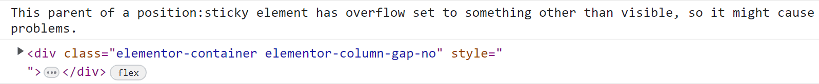
Pointing you to the exact element(s) that have overflow set to something other than visible.
The actual fix
Now, to fix the issue, simply adjust your CSS so that these elements have the default overflow value of overflow:visible, instead of something like overflow-x:hidden;
Often, the culprit is CSS that looks like this:
body {
overflow-x:hidden;
}
You will want to delete that CSS for position:sticky to work on your page.
You can either delete the CSS you will find, or if you can't delete it (ie if it comes from a theme or plugin) you will need to override it:
html body {
overflow-x: visible;
}
And you will need to find another way to fix your horizontal scrolling issues, see that tutorial for help with that.
When the problem is the height of the position:sticky; element
If the above didn't fix your issue, then the problem might be that the position:sticky element is the exact same height as its parent element, so there is no 'room' for it to stay sticky in.
The whole point of position:sticky; is that the element becomes sticky in the 'available space' within its parent.
This issue is usually because the parent element is set to display:flex;, but isn't set to align-items:flex-start; . The default of "stretch" will be applied, and the sticky children element won't have any room to be 'sticky' in.
Fix: set the parent element to align-items:flex-start;
Conclusion
I hope you found this helpful!
Cheers!
15 Responses
Thank you for your great work.
I have a small issue, it doesn't work on Chrome, although it works on Chrome but only in private mode! and doesn't work on android in any mode, although it works on iPhone!
Any ideas?
Thank you
Sounds like some cache issue...
Do you get any message when you copy paste the code in the console, as in the tutorial?
What's the URL?
Cheers!
Hi Maxime,
Thank you for taking the time to look at my problem.
I am not getting any message in the console.
But! My bad... It works also in desktop Chrome, i was logged in my site and the bar of wordpress admin apparently has something to do with the height of the sticky tabs and they were going above the screen.
Hmm i need to check if that happens to users also.
About mobiles, In two different models iPhone works perfect in Safari and Edge but not in two different models of Android Brave, Chrome, Firefox, Edge, Samsung stock browser as i tried all those.
When you swipe down it seems that the sticky tabs go just above the screen because when you swipe down the sticky tabs are showing again as you go up.
P.S. you have a type error at this page in your code,
html body {
overflox-x: visible;
}
at the overflow its overflox.
My site is
https://thegreeks.com.au
Thank you again for your work and your time.
Greetings!
[...]because when you swipe down the sticky tabs are showing again as you go up
Okay, in this case, the bug is elsewhere... position:sticky; is working, and the information I present in this tutorial won't help you further.
I had a look and the issue is some kind of overflow on the page. You can scroll to the right.
Debugging further it looks like the problem is from the "Search our Classifieds" form. The "search" button overflows on the right, and creates the issue you are seeing with the sticky nav bar.
Fix this overflow and the issue should resolve.
at the overflow its overflox.
Thanks for this! I fixed it.
Cheers!
Thank you Maxime,
Overflow of the classifieds did the trick!
I just set it to hidden at that section and its perfect now.
Cheers
Maxime, out of curiosity, would it be possible for the sticky tabs to stick to the bottom part of the screen at mobile phones?
The reason for that is, with the screen size of new phones, it's quite an adventure for your thumb to stretch to the top of the screen to change tab 😀
For desktop is good with the mouse.
Cheers.
Greetings,
Yes, add this below the custom CSS you currently have to make the tabs title sticky:
@media (max-width: 767px) {
.e-n-tabs-heading {
    top: calc( 100dvh - 30px );
}
}
Cheers!
Hi Maxime
Thank you for that but doesn't do anything! The tabs are still sticky to the top of the screen and not at the bottom.
Am I doing something wrong?
Kind Regards
Not certain... worked for me when I added it to the front end of your site in the devtools, where did you add it? Where are you looking? On a very old browser it won't work as it won't support the dvh unit, but that's unlikely the issue here...
I added to the themes customize css and i checked it at an android phone samsung galaxy note 20+ and an iPhone 12, both chrome and edge.
Cheers
But is it directly below the other similar CSS you had already for that element, to make it sticky?
I added to themes Additional CSS like this:
html body {
overflow-x:visible;
}
@media (max-width: 767px) {
.e-n-tabs-heading {
top: calc( 100dvh - 30px );
}
}
You mean to add it to the original script that goes inside the page?
Yes, add it here: https://pasteboard.co/tldGTNdnu7a7.png
Ah yes,
Now it's working perfectly.
Cheers Maxime!
Thank you so much for your time and effort.
Welcome!