Create an Elementor Read More Button The Simple Way
No extra plug-ins required! Elementor Free Compatible!
Here is how to transform the toggle or accordion element into a 'read more' button, with a nice and smooth animation. It will work for every toggle element on the page that has the class name 'readmoretoggle' added.
Read More
Indeed, it works just fine! and the read more trigger disappears, acting like a true ‘read more’ button, rather than a toggle element.
Read More
Using CSS, you can also style it to look exactly like a button… CSS provided below to get the same look as the button you clicked.
Read More
This one is like the regular toggle element, but the text stays above the button, acting closer to a proper ‘read more’ and ‘read less’ button.
I also have a premium tutorial about a featured filled expand and collapse toggle button for Elementor, in case you can't achieve what you want with the current tutorial.
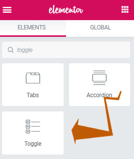
To begin with, insert the toggle element where you want the 'read more' to show up
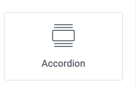
This also works with the new updated Accordion element
The instructions are the same for both, and you will find the code for each of them below.
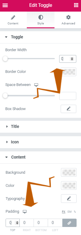
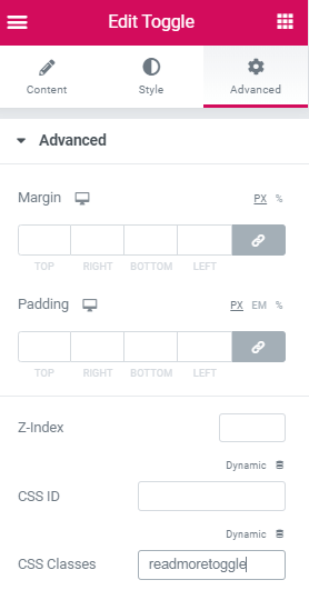
Then, style it properly, and give it the class name 'readmoretoggle' under 'Advanced'
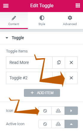
Keep only one toggle, and remove the icon (if you want). If you prefer the 'button' styling, remove the icon and use the CSS provided below. You will still need to remove the border and padding.
You can style it to look the way you want, but you will most probably want to remove the border and the padding, so that it looks consistent with the paragraph that was above.
Add the CSS class 'readmoretoggle'
Finally, add this CSS on the same page as is the read more toggle element(s)
If you want this only on one page, you can add the custom CSS to the Page Settings > Advanced > Custom CSS . Page settings are at the lower left gear icon.
If you want the same behavior across your entire website, simply add the CSS in the theme customizer > Additional CSS (from WordPress > Appearance > Customize, then Additional CSS)
body:not(.elementor-editor-active) .readmoretoggle .elementor-tab-title.elementor-active{
display: none;
}
Code for the New Accordion element
body:not(.elementor-editor-active) .readmoretoggle .e-n-accordion-item[open] .e-n-accordion-item-title {
display: none;
}
To center it, use this code instead (old toggle element code)
body:not(.elementor-editor-active) .readmoretoggle .elementor-tab-title.elementor-active{
display: none;
}
.readmoretoggle .elementor-toggle .elementor-tab-title {
display: flex;
justify-content: center;
}
Center code for the New Accordion element
.readmoretoggle .e-n-accordion-item .e-n-accordion-item-title {
display: flex;
justify-content: center;
}
If you prefer the read more to look like a button, use the CSS below instead (old toggle element code)
body:not(.elementor-editor-active) .readmoretoggle .elementor-tab-title.elementor-active{
display: none;
}
/* button styling below */
.readmoretoggle .elementor-tab-title a{
display:inline-block;
padding:0.4em 1.6em;
margin:0.14em 0 ;
border:0.16em solid rgba(0,0,0,0);
border-radius:2em;
font-weight:300;
color:rgba(255,255,255,0.9); /* button text color */
text-align:center;
background-color: rgba(0,0,0,.71); /* button color */
transition: all 0.34s ease;
}
/* hover button styling */
.readmoretoggle .elementor-tab-title a:hover{
color:rgba(255,255,255,1); /* change color of text when hovering */
transform: scale(1.03); /* delete to remove the zoom in effect */
}
Button code for the New Accordion element
body:not(.elementor-editor-active) .readmoretoggle .e-n-accordion-item[open] .e-n-accordion-item-title {
display: none;
}
/* button styling below */
.readmoretoggle .e-n-accordion-item .e-n-accordion-item-title {
width: fit-content;
padding:0.4em 1.6em;
border-radius:2em;
text-align:center;
background-color: rgba(0,0,0,.71); /* button color */
transition: all 0.34s ease;
}
/* hover button styling */
.readmoretoggle .e-n-accordion-item .e-n-accordion-item-title:hover {
background-color: rgba(0,0,0,.71); /* button color */
transform: scale(1.03); /* delete to remove the zoom in effect */
}
You can adjust the styling of the Elementor Read More button by modifying the CSS code to fit your needs.
Also note that the 'Read more' text will still show up while in editor mode. This allows for easier editing of the styling.
Finallly, to get the 'Read More' button becoming 'Read Less', use the code below instead of any code above.
You can change the 'Read Less' text to anything you want by modifying the code.
You will also have to enter the styling for the 'Read less' text directly in the code, as what you set up under the 'Styling' tab won't apply automatically.
In short, change the first part of the code to what you want the 'Read Less' to look like.
Old toggle element code:
.readmoretoggle .elementor-tab-title.elementor-active::before {
    content: 'Read Less';
    font-family:roboto;
    font-weight: 400;
    font-size: 16px;
    color: #000000;
    }
.readmoretoggle .elementor-toggle-item {
    display: -webkit-box;
    display: -ms-flexbox;
    display: flex;
    flex-direction: column-reverse;
}
.readmoretoggle .elementor-tab-title.elementor-active a{
    display:none;
}
Read more / Read Less code for the New Accordion element
.readmoretoggle .e-n-accordion-item[open] .e-n-accordion-item-title::before {
    content: 'Read Less';
    font-family: lexend;
    font-weight: 400;
    font-size: 16px;
}
.readmoretoggle .e-n-accordion-item .e-n-accordion-item-title  {
    position: absolute;
    z-index: 1;
    bottom: -30px
}
.readmoretoggle .e-n-accordion-item[open] .e-n-accordion-item-title .e-n-accordion-item-title-header {
    display:none;
}
Conclusion: enjoy your new Elementor Read More element!
I hope you have found this tutorial helpful.
Cheers!
105 Responses
What difference does this extra css make? I set this up without it and it seemed like it worked pretty similar to with it. Also, is there any way to have a "Read Less" option that collapses the content back?
The CSS is there to make the toggle title disappear after being clicked. The other CSS snippet styles the toggle title to look like a button.
Good job
Thanks!
How can I center this button?
Add this to your CSS !
.readmoretoggle .elementor-toggle .elementor-tab-title {
display: flex;
justify-content: center;
}
Maxime Desrosiers thanks!
how to close the read more after reading?
With this design, you can't... but then, you chould just use the normal toggle element, without any added CSS for that!
Now you can use the new 'read more' and 'read less' option for this!
Can I use this css code for my archive "read more" button?
No, this won't work there...
Brilliant... on e question... is it possible to smply invert the toggle? Therefore the toggle title ends up at the bottom of the screen for when they finish reading. The toggle title can read "see more/less".
Is this possible?
Thanks!
Hey John!
Good idea! I added the code for this in the article!
I finally found your solution and was very happy with the "Read Less" button. But for some reason it stopped working for me on the published page.
When i am on elementor editor, it works fine on the preview, but when a visualize the published page, the "Read Less" button doesn't show. Tested on two different elementor instances.
Try refreshing your servers, regenerating CSS, and a full browser refresh (CTRL SHIFT R)
Maxime Desrosiers thank you for your answer. Actually I had sent a ticket to the elementor team and they answered me this:
"I'm afraid the read less button doesn't appear in the live site because Elementor hides this when the toggle is active, please try to add the following custom CSS in the advanced tab of the toggle widget and let us know if this helps:"
body:not(.elementor-editor-active) .readmoretoggle .elementor-tab-title.elementor-active {
display: block !important;
}
For what I could see the only thing different from your code was the "block !important;" section.
Now it's working.
Many Thanks!
Douglas Dinarte
where did you put that code? I mean after which line?
I am trying your solution but still getting the same thing.
That is, it is not working in published page but working fine in elementor editor.
Akshay Kedari Yup facing the same issue
Hi, thanks for the code, helped alot! My question is: can you add a hover effect to the 'Read less' text? Without a proper change of color on hover it may be unrecognized as a clickable text by the user... Thanks in advance!
Yep! Use this CSS:
.readmorechanging .elementor-tab-title.elementor-active:hover::before {
font-weight: 900;
color: #767676;
}
Thank you so much for this!
Do you know if it's possible to make the text stretch out and float over the section below it once "READ MORE" is clicked instead of behaving like an accordion within the section it is in?
Hmm.. well you could try setting position:absolute to it, under Advanced > Positionning
Can I do this only on mobile and not on desktop? And if so, how?
Great idea! You should still create that extra content following the instructions above, and then simply add this code. It will display as normal paragraph on desktop, and have the 'read more' on mobile.
@media (min-width:767px){
.readmoretoggle .elementor-tab-title{
display:none!important;
}
.readmoretoggle .elementor-tab-content{
display:block!important;
}
}
how to add nested readmore button, like one after another?
No simple way. You could get there with this instead : https://element.how/elementor-show-hide-section/
Maxime Desrosiers Thank you for it.
For some reason I can't get the "Read less" button to show up...
I put the css under the advanced tab of the toggle widget.
I got it to work as it should. I removed this bit of css, since it hide the whole title element and also the Read less link:
body:not(.elementor-editor-active) .readmoretoggle .elementor-tab-title.elementor-active{
display: none;
}
Hi! First off, thank you so much for making this. It is a great help! However, I've tried implementing both the "Read More" button and the "Read Less" button and I am expereinceing issues on both. The text of the "Read More" Button is just not showing up and the "Read Less" function works fine in the editor, but doesn't work on the actual page. I've linked the page in question and a photo of the code so that you can help me see where I wen wrong. Thank you!
https://universalaccountingschool.com/meet-our-team/
https://imgur.com/gallery/YqdWF5T
Hey Ryann!
When we inspect the read more buttons on your page, we see that there is no text at all there... it looks like this
instead of
Read more
I don't know why that is... but it's not because of my code, as CSS doesn't even have the ability to add or remove HTML on a page...
Maybe some plugin conflict? Maybe refresh your servers? Not certain what's the problem ....
Does anybody know if you can have different margins and padding for the toggle title and toggle content when its open and closed?
Thank you so much for your help!
One question - if I have more than one Toggle Widget on the page, it affects the other Toggles too, which isn't suitable for my FAQ section, which now is composed of buttons instead of just questions.
Even though I specifically used CSS class "readmoretoggle" on the correct toggle, the other FAQ Toggles are affected too by the change.
How can I overcome this?
Welcome!
This really should not be happening... All the code I provide in the article have the specifier class 'readmoretoggle' . So unless the toggle element itself has that class, or a parent of the toggle element (like the parent section) has it, then the CSS would not modify these.
Maxime Desrosiers Thank you for your quick reply! Yeah I figured it shouldn't happen... I inserted the CSS code into WordPress > Appearance > Customize, then Additional CSS as you suggested to make this run on the entire site, maybe I should just put it under Additional CSS for the specific Toggle Widget?
The FAQ Toggle doesn't have the readmoretoggle class in it's Advanced properties, nor the parent section.
Can you please have a look in the code I inserted? and maybe you will find something I missed? I'm a newbie in CSS so I wouldn't be surprised...
/** Read more toggle **/
body:not(.elementor-editor-active) .readmoretoggle .elementor-tab-title.elementor-active{
display: block !important;
}
.readmoretoggle .elementor-toggle .elementor-tab-title {
display: flex;
justify-content: center;
}
/* button styling below */
.readmoretoggle .elementor-tab-title.elementor-active::before, .elementor-tab-title a{
display:inline-block;
padding:0.4em 1.6em;
margin:0.14em 0 ;
border:0.16em solid rgba(0,0,0,0);
border-radius:2em;
font-weight:300;
color:rgba(255,255,255,0.9); /* button text color */
text-align:center;
background-color: rgba(23,84,62,.71); /* button color */
transition: all 0.34s ease;
}
/* hover button styling */
.readmoretoggle .elementor-tab-title.elementor-active:hover::before, .elementor-tab-title a:hover{
color:rgba(255,255,255,1); /* change color of text when hovering */
/*transform: scale(1.03); /* delete to remove the zoom in effect */
}
.readmoretoggle .elementor-tab-title.elementor-active::before {
content: 'Close';
font-family:rubik;
font-weight: 400;
font-size: 16px;
color: #FFFFFF;
}
.readmoretoggle .elementor-toggle-item {
display: -webkit-box;
display: -ms-flexbox;
display: flex;
flex-direction: column-reverse;
align-items: center;
}
.readmoretoggle .elementor-tab-title.elementor-active a{
display: none;
}
/** End Read more toggle **/
on the mobile version, the read more button disappears after clicking on it, so I can't cloase the drop down anymore afterwards. (I haven't put in the "read less"-css). Can you imagine, where the bug could be?
just figured it out, just changed display: none to display: flex 🙂
Julia Rüpschl Awesome, good work and thanks for sharing!
Hello Maxime! Do you know how i can add text on the button and make the text white? Thank you in advance!
Hmm... just write in the text you want as the toggle title ? Then you use the styling options to make the text white? I'm not certain what you are asking here...
Maxime Desrosiers Thank you Maxime! I fix it!
Is anyone having issues on the focus on Safari browsers? When I click on the "Read Less", it does not focus on "Read More" anymore.
please how can i make the words to open at the top instead of bottom when i click on the read more button
I already have the instructions for this...
Hey I've added the CSS for Read Less but it doesnt seem to be showing up for some reason.
Is there a way to decrease the margin between the text and the Read Less button?
Add a negative top margin, like this :
.readmoretoggle .elementor-tab-title.elementor-active::before {
content: 'Read Less';
font-family:roboto;
font-weight: 400;
font-size: 16px;
color: #000000;
margin-top:-10px;
}
.readmoretoggle .elementor-toggle-item {
display: -webkit-box;
display: -ms-flexbox;
display: flex;
flex-direction: column-reverse;
}
.readmoretoggle .elementor-tab-title.elementor-active a{
display:none;
}
Hi there Maxime,
Thank you for this implementation!! I use this in a toggle and it works great.
I also made the Toggle title staying on top, by removing the appropriate section.
That way it doesn't throw off in any way the readers.
I would like your input if you could pls on the following:
1. How can I have a 'Read More' appear under the title of the Toggle so that ppl know there's more content, (i've removed the Toggle icon)?
2. Finally, how can I transfer the 'Read Less' appear UNDER the content, not on top of it??
Thank you for any suggestions, I really appreciate your time:-)
Hey ! I think I understand what you are after, but unfortunatelly there is not simple way to achieve this, just by modifying slightly the 'toggle' element (Which is what this tutorial is about)
To get the kind of customization you want, you would be better to just code directly precisely what you need, using JavaScript.
Maxime Desrosiers Thanks for getting back to me - I really appreciate it. I was afraid this may be the case...I may just stick to what I achieved so far 🙂
Maxime Desrosiers Hi again, just to let you know I was able to put the 'Read Less' at the bottom of the expanded content by just placing an 'after' on the .readmoretoggle .elementor-tab-title.elementor-active::after { ....piece of code:-) Cool...!
Andonis Radistis Indeed that should work! I didn't think of it. Good work!
Is there any way to make centered "Read more" / "Read less" button? Basically it is the combination of codes you mentioned in article, but somehow I can't make it work.
Just adding this should work :
.readmoretoggle .elementor-toggle .elementor-tab-title {
display: flex;
justify-content: center;
}
please how can i make the words to open at the top instead of bottom when i click on the read more button
The read more CSS below works fine for me, but what additional CSS I have to use for multilanguage? (I need only one more)?
In other words, how can I change content: 'Read Less' depending on lang(it) or lang(us)?
.readmoretoggle .elementor-tab-title.elementor-active::before {
content: 'Read Less';
font-family:roboto;
font-weight: 400;
font-size: 16px;
color: #000000;
}
.readmoretoggle .elementor-toggle-item {
display: -webkit-box;
display: -ms-flexbox;
display: flex;
flex-direction: column-reverse;
}
.readmoretoggle .elementor-tab-title.elementor-active a{
display:none;
}
Hey Ezio! For this, you will need to right click > inspect your page, and see what class name is added to the <body> tag element, that specifies the current language.
Then, write the CSS like this :
.fr .readmoretoggle .elementor-tab-title.elementor-active::before {
content: 'Lire moins';
}
.en .readmoretoggle .elementor-tab-title.elementor-active::before {
content: 'Read Less';
}
After trying some plugins that didn't work well, I finally found your solutuin, which is simple and perfect for me. Thank you!
Welcome Tirtsa!
Thank you! It works! It was really worth buying!
Thanks Kristof and thank you for the purchase!
Thanks! Helped me!
Cheers!
how to get the page to scroll up when read less is clicked to view read more
Some JavaScript would be needed for that.
Hi, can i know how to put button like 'read more' to 'read less'? because i have tried to change the codes but it seems i cant figure it out how to make button for read less
Hey Diana!
Try simply downloading and importing the template. That's why it's there... to make it even easier for readers!
Hello Team,
Its worked, thank you for share valuable tips for read more in elemenotr without using third party plugin or code, i have used for my site
thank you
Thanks for this tutorial. i noticed that the space between the read more and the content is too wide, how can i close this space please?
hello ..
i have a problem with toggle the RTL text not align to the right when changing the language
hi, i have a little problem,
i add this in my website.
irwriter.ir
but when i click on it when i go in private mode browser, it didn't open the rest of content, it's just reload the page.
it works well till yesterday but now it didn't work well.
this is the picture: (that black button)
https://s6.uupload.ir/files/sshot-1_da9.png
the code:
.readmoretoggle .elementor-tab-title.elementor-active::before {
content: 'بستن';
font-size: 16px;
color: #ffff;
}
.readmoretoggle .elementor-toggle-item {
display: -webkit-box;
display: -ms-flexbox;
display: flex;
flex-direction: column-reverse;
}
.readmoretoggle .elementor-tab-title.elementor-active a{
display:none;
}
hi i found the solution,
it was bcuz of rocket plugin.
tnx.
Thanks for the update!
Amazing tool!
For some reason it only works when signed in, I tried in incognito, and when I press the Read More button the page just jumps, please advise.
https://roosterworkspace.com/
Manged to fix it, it was because of Defer Render-blocking JavaScript
Thanks for sharing!
How do i make the read less style (font and colour) match my read more button, they're now completely different
No worries, found it 🙂
Glad to read that Cherie!
When I open the page, the text is showed and I can press "read less" to close it.
How can I make the text to be not-shown on start?
That should be the default...
Great tips. Thanks for a very easy "read more" option. Works a treat.
Cheers
Welcome!
Very nice, thank you so much!
I added a line-height rule to the 'Read Less' label to control its distance away from the revealed body text above it:
.readmoretoggle .elementor-tab-title.elementor-active::before {
content: 'Read Less';
Font-family: poppins;
font-weight: 600;
font-size: 24px;
color: #FF0097;
line-height: 2.5em;
}
Good idea! Thank you for sharing!
Is there a way for the toggle to include other elementor elements? For example the article includes multiple paragraphs, images, a video and a colored section with a table. I want the Read More to hide everything but the first paragraph until clicked and then display the rest all at once.
Hey Eugenia!
While possible, it's not ideal. Soon Elementor will add the possibility to add elements directly within the toggle element's content. It's not released yet though.
Meanwhile, I suggest this : https://element.how/elementor-premium-expand-collapse-toggle/
Cheers!
when i click on the toogle it refreshes the same page , please help with fixing this
Greetings !
I have seen this issue before... it was because the user had custom Javascript code on their site that made a redirection whenever a <a> element was clicked. Find the faulty JS and remove it, and this should be fixed.
Note to others: this is unrelated to the tutorial and has nothing to do with the code provided here. This issue will happen for him on all toggles, regardless if they have custom CSS or not.
Thank you, it worked as I wanted it to!
Welcome Sania!
Great code. Thank you very much! My only layout problem is in a two-column section where an image is in the left column, and the text is on the right. I have to move the "Read more ..." title by 563 px to the right to appear below the text column, i.e., about the middle of the page. The toggle content appears correctly flushed to the left. However, "Read less" is underneath the text, but in the middle of the page. It would be nice to have the "Read less" flush to the left as well, below the preceding text, but I am asking perhaps too much. Or perhaps this could be doable, as a new class, e.g. readmoretoggle2, and an extra CSS code in page settings?
Hey Mundi!
Sorry I must admit I don't understand exactly what you are trying to explain... maybe a URL would help.
Cheers!
Sorry I could not explain it better. It is the second dropdown here: https://mundi.com/.
However, the drop cap issue is more important to me, which is the 6-th paragraph from the top.
Can I add a drop cap to the Elementor toggle widget? What would be the CSS code? Thank you very much if you can help, Maxime. My text widget has a nice drop cap, and without a drop cap in the toggle widget visual effect is spoiled.
I need to take that css course with you as soon as I finish major corrections on the site.
Sorry, there is no button to delete a previous comment. I fixed the problem with one (small) exception - the third toggle on https://mundi.com. There is no space after the first item.
Just had a look, looks all good to me!
Is there updated documentation now that there is no toggle widget?
I am looking to have 20 faq's on a website but to only show 5 and then a read more to see the rest
Hey Gershy!
What version of Elementor are you running? I'm with 4.1 and I still have the toggle element...
You might also want to have a look at this tutorial : https://element.how/elementor-premium-expand-collapse-toggle/
or this one: https://element.how/elementor-show-hide-section/
They should work fine for the read more.
Thanks!
I have the plugin 3.16.0-cloud1 and all the features activated, and no toggle widget
Nice hack. Please update for Elementor 3.15 or higher
I just updated the tutorial with the codes for it!