
In this tutorial, you will learn how to close the Elementor nav menu drop down on click outside, and have a nice overlay on the page content, while the menu is opened.
Clicking the overlay, outside the drop down menu content, will close the Elementor nav menu drop down.
Finally, I will also show you how to position the drop down anywhere on the page, to have a unique layout (this is rather for desktop and tablet only).
Watch the video for the instructions!
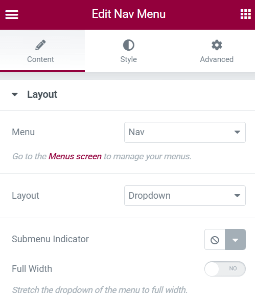
Importantly, have the "layout" set to "Dropdown" and the "full width" option disabled
This only applies if you want the fancy dropdown on desktop.
If all you want is the overlay on mobile, while the dropdown is opened, then skip this part.
Having the layout option set to "dropdown" is only needed if you want the design of a sticky, positioned wherever you want, drop down on desktop and tablet.
The "full width" option needs to be disabled, otherwise this won't work well. In the video I show how to still have a full width sub nav on mobile.
Code required
If you just want the overlay & close on outside click, add only the part /* Overlay */ and everything below.
Copy paste this code under Advanced > Custom CSS :
<script>
/* Please login to get the code
 * The code will be for the Elementor Nav Menu Overlay Page Content While Opened tutorial
 * Found at this URL https://element.how/elementor-nav-menu-overlay-page/
 */
</script>
Overlay for the new mega menu element
Elementor has a new mega menu element and many features are still lacking, the option of adding an overlay being one of them.
Add this CSS so that you have an overlay when your mega menu is opened:
<script>
/* Please login to get the code
 * The code will be for the Elementor Nav Menu Overlay Page Content While Opened tutorial
 * Found at this URL https://element.how/elementor-nav-menu-overlay-page/
 */
</script>
Overlay for the desktop menu layout
You can also have an overlay on your desktop menu items, for those that have sub menu items only, like this:

For this, simply use this CSS
<script>
/* Please login to get the code
 * The code will be for the Elementor Nav Menu Overlay Page Content While Opened tutorial
 * Found at this URL https://element.how/elementor-nav-menu-overlay-page/
 */
</script>
Finally, enjoy your new Elementor fixed background on mobile design!
You should now have a fully working fixed background image on mobile, as well as desktop and tablets!
Let me know if everything worked well for you.
7 Responses
Hi there,
I was working with the mega menu css code but noticed the css selector has changed thus it didn't work.
You can fix it with the following code:
.e-n-menu-content::after {
content: "";
width: 100%;
height: 100vh;
position: calc(100vh - 300px);
left: 0;
top: 300px;
background-color: transparent;
pointer-events: none;
transition: background-color 0s;
z-index:-3;
}
.e-n-menu-content:has(.e-active)::after {
background-color: #00000044;
transition: background-color 0.3s 0.13s;
}
Thanks for sharing!
I've tried this and it stops all the buttons above the fold on the main page from being clicked when the drop down nav is inactive. Using mega menu (and the adjusted code from the comment above) - Any ideas why?
Greetings Louise!
If you have the rule:
In there, this really should not be happening...
Would you have a URL to share I could look at?
Hi, can someone help me?
Overlay for the desktop menu layout - it works great
Overlay for the new mega menu element -doesn't work
.e-n-menu-items-content:has(.e-active)::after {
background-color: #00000044;
transition: background-color 0.3s 0.13s;
}
expected rparen col 29 at line 14...
Thank you for your help 🙂
Greetings Simon!
Keep in mind that starting Elementor 3.23 this will change as Elementor has restructured this element. So maybe come back here then, I will update the tutorial for 3.23.
Thank you for your help