
A pretty full screen navigation goes a long way to wow your visitors, and let them know you have good taste.
This tutorial will show you how to easily create a pretty full screen navigation with Elementor, WITHOUT using popups! Which is very important, because Elementor pop ups aren't good for SEO.
Here is what we are creating. Get the template for free!
How to create your full screen Elementor navigation
First, import the template on your page.
You can have as many nav toggles as you want, both within and without the full screen navigation. Give them all the class 'navicon'.
To edit the content of the navigation, open the Navigator, find the navsection, and edit it's CSS ID.
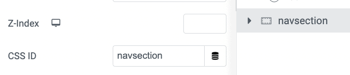
Add a letter, (i.e. make it navsectione) it will break the CSS temporarily, and you will be able to edit it easily. When done editing it, don't forget to change back the CSS ID to 'navsection'.
Finally, enjoy your new Elementor full screen split navigation!
Enjoy your new Elementor full screen split navigation! Watch the video for more instructions, there are a few exclusive goodies in there!
41 Responses
Hi
Thank you for the detailed explanation and the code. I really liked the full screen effect!
I tried to create such an effect and faced one problem (at least for now): I don’t have access to the sub menu. I can see the little arrow signifying that there is a sub menu, but when I click on it nothing happens.
I the editing mode of Elementor I can see the sub menu (when clicking the little arrow) – it on the left-hand side of the right column (I’m using Hebrew on my website, so it’s right to left).
Can you kindly help me solve that issue?
Will greatly appreciate your help.
Thanks
Hi there
I am facing the same problem. And the close button on the menu section doesn't work either, so once the menu is shown I can't close it. Is there a workaround for this problem?
Thank you
Hey Robert! Could you share with me your page URL so that I can have a look at both of these problems?
Hi Maxime,
It turned out that the browser cache was the problem. It works perfectly. Thank you
Hi Maxime
Please check the following URL: miniyut.org/test
I realized what the problem is, but I wasn't able to completely solve it. It seems that the sub menu was hidden by the picture on the left. I changed the z-index of the section to 9000 and set the z-index of the right column to 9999. I was able to see the menu on top of the left picture. However, it is very far from the main menu (it starts on the left edge of the right column). It can be seen in desktop mode (although it doesn't look nice since it's too far from the main menu), but I can't see it in mobile mode. I think that it's because of the wide gap between the main menu and the sub menu.
Any idea how I can fix it?
Thank you in advance for any support.
Yes, simple: for the nav element, go under advanced > positioning > width > inline(auto).
Cheers!
Perfect! Now, it works like a charm. Thank you!
This is really cool. As another person mentioned, it doesn't seem to account for a Sub-Menu or nested menu. Any workarounds for that? Many Thanks
In the other comments you will find the solution for this as well.
Here it is again : Increase the z index of the column with the nav menu, and / or for the nav element, go under advanced > positioning > width > inline(auto).
Hi there, what is the code for close the popup by keyboard key(ESC)?
Thank you
Good question! I added the code for this!
Thanks first for the great tutorial! It works great, I just have a problem with the links (anchor on onepager) . When I click on a menu item the split menu does not close. Would be very happy about an answer. Thanks!
Hey Eve! Welcome!
Add this code
$('#navsection a').click(function(){
navicon.eq(0).click();
});
right after this line:
document.addEventListener("keyup", keyPress);
Let me know if it works!
Hi, thanks for the code!
I have the same problem as Eve. The new line of code is not working.
Any idea how I can fix it?
Thanks
Kamil
Hey!
Thankyou so much for creating this navigation tutorial its so sleek and you did a great job of explaining how to accomplish the finish effect.
I have one issue though everytime i click on a menu item it refreshes the menu it doesnt create a drop down of the sub menu items.
You can check it out on...
aphrodites.uk
Thanks
Kim
This is a great solution for an SEO friendly flyout menu - I do have a question though. Is there a way to have a transparent overlay instead of the image column that will still show the site behind it? I tried just putting a transparent gradient background instead of the image. It shows while behind the transparency and not existing content. (Which makes sense from reading the code above).
I'm currently using the popup option (build a popup in elementor and link the hamburger menu icon to the popup) and after reading about how SEO unfriendly that is, I'm trying to find a "look alike" workaround for a client site. They are crazy about the gradient I used with their brand colors as the transparent overlay to the site when the menu popup is open.
vistaonlinedemo.com is the example site.
Hey !
In the code, you will find this:
#navsection.active {
transition : background-color .6s ease, opacity 0s;
background-color: #000000;
opacity: 1;
pointer-events: all;
}
#navsection .elementor-column:not(.elementor-field-group){
transition : transform .6s ease;
}
#navsection .elementor-column:not(.elementor-field-group):nth-child(1){
transform: translateX(-101%);
}
#navsection .elementor-column:not(.elementor-field-group):nth-child(2){
transform: translateX(101%);
}
change to
#navsection.active {
transition : background-color .6s ease, opacity 0s;
background: *gradient here*;
opacity: 1;
pointer-events: all;
}
#navsection .elementor-column:not(.elementor-field-group){
transition : transform .6s ease;
}
#navsection .elementor-column:not(.elementor-field-group):nth-child(1){
transform: translateX(-101%);
opacity:0;
}
#navsection .elementor-column:not(.elementor-field-group):nth-child(2){
transform: translateX(101%);
}
Hi Maxime,
Thank you so much for the awesome explanation and code.
I tried and works perfectly, managed to change transition to vertical instead of horizontal as well.
I just wanted to ask, is there anything that can be tweaked in order to add a fade out to the columns when press X or Esc to close?
As I am using big type on the left half and when closing with X/Esc the letters stay on screen longer than the column background itself, so they overlap whatever is underneath the split screen :'D
Thanks again!
Iv
Hey Ivona!
Try changing this line of code
transition : background-color .6s ease, opacity .4s ease .6s;
to
transition : background-color .6s ease, opacity .4s ease;
Tremendous video. I've implemented what you've explained and it works great! However I have an issue, I would want the menu to be scrollable on mobile. I have a menu with links that opens toggles (dropdowns), however when several open the content, it goes over the screen and people can't scroll down to reach it. They have to close the toggles for the content to appear in ther screen. This is the site https://footballgoals.store/
Hey Alex!
If I may, I would suggest my premium version of this tutorial, where this is possible, and much more!
Cheers!
Hi Maxime
Great Video. I'm been searching for a SEO friendly full screen menu for some time and this definitely seens to be the answer.
Do you happen to have a solution to allow the overlay to be scrollable? At the moment I have two columns - one with my logo and menu in, the second with direction links, and booking buttons. I'd like on mobile to keep both columns but allow the user to be able to scroll. At the moment the solution seems to continue scolling the website in the background.
Hey Tom!
If I may, I would suggest my premium version of this tutorial, where this is possible, and much more!
Cheers!
Hi Maxime,
Thank you so much for this great full screen menu! Most importantly, that it's SEO friendly too!!!
I was able to implement everything but there's one thing I noticed (always something right?)
While I chose the 'None' for the Tablet and Mobile breakpoints for hamburger menu, it still showed up in my header.
I then went and assigned it the class of 'navicon' and that worked. So basically, I'm using this to trigger the full-size menu, but, I noticed, that despite opening the beautiful menu I made, it also opens the default menu that would normally open with the hamburger menu ( I can just see it for a split second in the background)!
Any ideas?
It may be something really simple I'm missing right now..!?
Thank you so much Maxime!!
Hey Andonis!
Hmm you should not be seeing your default mobile nav... I can't say what's the problem though, not without seeing the page.
Hi Maxime,
Great solution. My gratitude is great.
One small issue. When the page with menu is loading, the hidden section is still visible for a split of a second. I've tried several things but can't find a way to solve this. Any idea?
Hey Tanya!
Try moving all the CSS (part in between the <style> tags) to the customizer > Additional CSS.
That should fix this!
Thank you for this tutorial! This is an amazing nav menu I'm trying out. It was easy to follow step by step. However, I have one question, when I view it in Inspect and on Apple Iphone setting, the menu icon goes under my logo instead of staying on the top right corner. Do you have a solution?
z index can be though, particularly on Safari / iOS, which doesn't manages quite the same way as Chromium based browsers.
I would need to see your site to help you out here.
Hi Maxime,
I'm not entirely sure why, but I've created the menu according to the tutorial... but when the menu opens it opens full width as opposed to the percentages chosen. Is this due to the new containers?
https://theshoulder.jemclient.co.uk/
Thanks,
Millie
Hi.
thanks a lot for your wonderful tutorial's 🙂
something weird, if i open the nav menu in page, and close it by the close icon, i cant scroll the page at all, till I refreshing the page (talking about mobile).
I tried to create everything in new page, I turned off all possible plugins and none...
did you heard something like that? any idea for this issue?
THANK YOU
Hi Maxime,
Are there any changes required in the CSS code, if working with flex containers and not with sections and columns?
I’ve changed my header to containers and it messed things up.
Thank you in advance.
Hey Litmol!
Yes the CSS needs a lot of changes to adapt it to containers. I'm not certain when I will be able to update it though...
OK.
Do you think that there is any harm in keeping my header with sections and columns and not upgrading it to containers?
Thanks
Not really... should be fine. The small difference in markup savings from the Containers is very small indeed here, in a header with only one or two sections, so should be okay!
Thank you.
I appreciate you deep knowledge and generosity
Hi Maxime,
Thanks for this amazing menu!
Im building a site and using it. But it seems the menu does not function correctly on a mobile. When I try a mobile screen on the pc, it works fine. but trying it out on iphone safari but also google browser, it didnt open it at all.
On a samsung device it was the same problem. after multiple clicks on the icon it opened the menu up one time. but after closing it, I want able to get it to open again. Any idea what is causing the issue?
Looking forward hearing from you and again many thanks for this awsom menu.
Hi Max! Any chance to update this one for Flex Containers? That would be amazing!
I would like to bump this request. Now that more and more elements are becoming "flex-friendly" it would be great if this could be updated for a more recent version of Elementor.
Greetings!
I updated the tutorial to work with containers!
Cheers!
Hey Mike!
I updated the tutorial to work with containers!
Cheers!