After creating a beautiful section on your PC using the fit to screen option this may look good on desktop but may not look like how you want it to be on mobile, this tutorial will teach you how to create a fit to screen option that will fit well on desktop and on mobile
First, click on the section, the double vertical three dots
To create an elementor fit to screen section that will also look good on mobile, click on three vertical dots this will bring you to the next step that will be explained in the next screenshot.

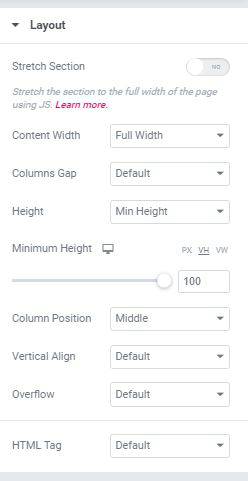
Set the Elementor section height to 100VH
In the Elementor section height settings instead of using Fit to Screen use Min height and set it to 100VH as shown in the screenshot below, if you follow this it should solve the problem you are having with creating a fit to a screen section on mobile.
You can adjust for different devices, if you don’t need this for all of them! Just click the little monitor icon.

Finally, check if the fit to screen works on mobile
You can check the page on mobile to see if there are no issues.

8 Responses
it too long
is that on iOS devices ? or Android also ?
Maxime Desrosiers I have the same problem with an IOS device
William Brobston iOS & Safari, or iOS & chrome ? Or both?
Hi! But it remain scrolling because brownser "header". What should I do to fix it?
is that on iOS devices ? or Android also ?
Works perfectly! Thank you loads 🙂
Welcome!