
The back to top arrow button is a simple but very effective tool which helps in the navigation of a website . It reduces the burden of scrolling up or laboriously dragging the scroll bar all the way back to the top.
Now let's see how to easily implement Back To Top Arrow Button feature with Elementor in a matter of minutes.
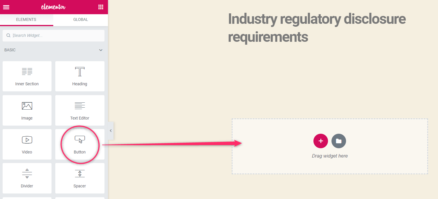
Step 1. Insert a button element in the page or the footer template
Adding the Elementor back to top arrow button to the footer template will ensure that the button will be added throughout the website wherever the footer template is used.
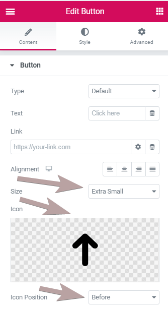
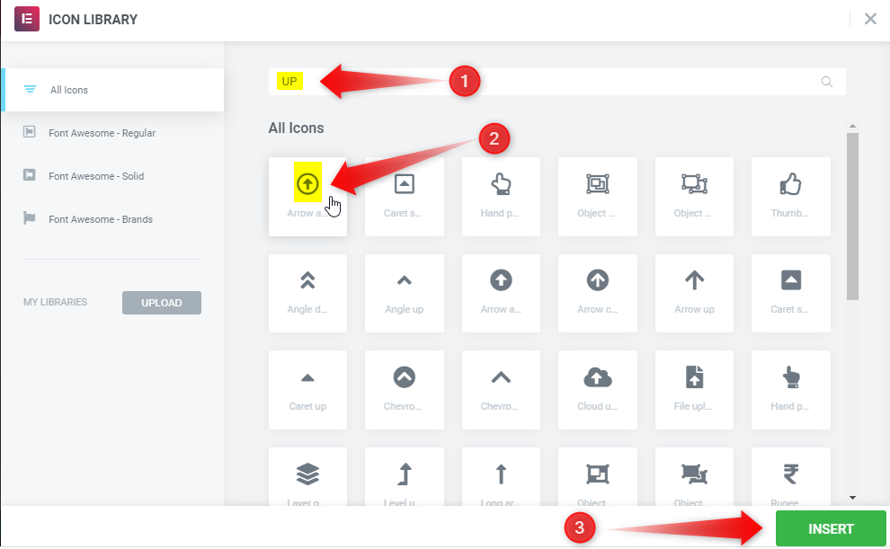
Step 2. Add the up icon to your Elementor back to top button
You can also adjust the styling as you wish. You will probably want to set the size to Extra Small, and adjust the icon color and button color to your liking. Choose transparent, if you just want an icon to show up. You can choose the icon you want.
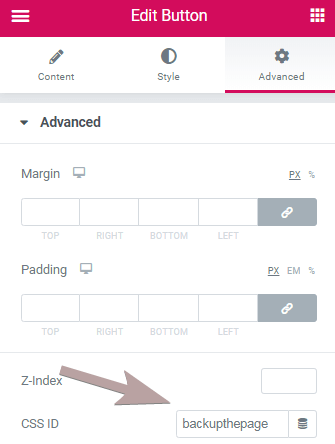
Step 3. Give your Elementor button the CSS ID 'backupthepage'
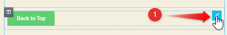
Step 4. Make the Elementor button stick to the bottom right of the page.
1. Go to the "Edit Button" icon which pops up on hovering over the button.
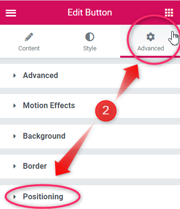
2. Then navigate to the "Advanced" Tab and open up the "Positioning" drop down.
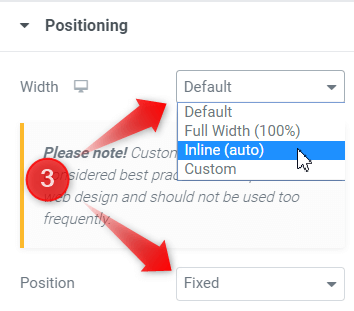
3. Change the "Position" attribute to "Fixed" and the "Width" to "Inline (auto)".
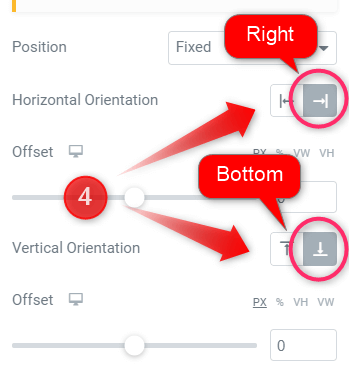
4. Finally, set the "Horizontal Orientation" to "Left" and the "Vertical Orientation" to "Bottom". Adjust the offset values slightly, to get it right where you want.
Also adjust the positioning for tablets and mobile!
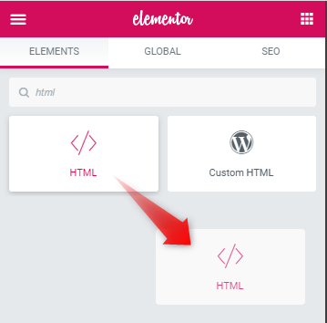
Finally, add this code to an HTML element anywhere in your footer template or in your page.
You can adjust the '1310' value you will find toward the beginning of the code to any value you want. It represents the point in the page where the back to top arrow will become visible.
<script>
/* Please login to get the code
 * The code will be for the Easy Elementor Back To Top Arrow Button tutorial
 * Found at this URL https://element.how/elementor-back-to-top-arrow-button/
 */
</script>
That's it! Enjoy your new Elementor Back to Top Arrow Button!
Alright! Now the back to top arrow button has been successfully implemented! Let me know if this works fine for you!
15 Responses
Thanks for this tutorial. It helped me.
Thanks a lot!
To make it even better I added fadeIn and fadeOut animations:
$(window).scroll(function(){
if ($(this).scrollTop() > 500) {
$('#backupthepage').fadeIn();
$('#backupthepage').addClass('showtoTp')
} else {
$('#backupthepage').fadeOut();
$('#backupthepage').removeClass('showtoTop')
}
});
Hope it helps 🙂
Thanks for sharing!
And in fact, you could just have this code :
$(window).scroll(function(){
if ($(this).scrollTop() > 500) {
$('#backupthepage').fadeIn();
} else {
$('#backupthepage').fadeOut();
}
});
And it would work fine. (No need to add or remove any class, as the jQuery is changing the display property directly with those fadeOut() and fadeIn() methods.) You could also then delete that CSS :
#backupthepage.showbackupthepage{
display: block;
}
This is so usefull.
Can you share the complete code so the button does the following?
On scroll down after Y amount on space
Slides in and fades in
On scroll Up near top
Slides out and fades out
Thanks for this, it works great!
Is there a way to hide it when scrolled to or past a lower section like the footer?
I am using this method in a test website for a client. For some reason I cannot figure out why the up arrow does not show up on the news and contact page. Same for Mobile footer.
Check the site here: https://test246fresh.brandis.nl
Many thanks for your thoughts on this.
Not certain... I checked, could not find any problem on these pages.
Nice! Thanks!
Hi there,
How to manage the responsive properly?
Hide mobile? Via Jquery? CSS?
The following is working properly but I just wonder how you would do it?
document.addEventListener('DOMContentLoaded', function() {
jQuery(function($){
$(window).scroll(function(){
if ($(this).scrollTop() > 600) {
$('#backupthepage').fadeIn();
} else {
$('#backupthepage').fadeOut();
}
});
$('#backupthepage').click(function(){
$('html, body').animate({ scrollTop: 0 }, 'slow');
return false;
});
}); });
@media (max-width: 767px) {
#backupthepage{
display: none !important;
}
}
Thanks
Hey Jivaneo!
What you have is alright. Slightly better practice would be to run the JS only if the viewport is above 767.
if (window.innerWidth > 767) {
//all the js here
}
hi there
Thanks for this
how to fix lighthouse error "button, link, and menuitem elements do not have accessible names."?
Greetings,
Sorry this isn't related to the current tutorial... And I don't have any tutorial about this topic yet. Try Google maybe!
Cheers!
ok tanks
First, I googled and because I did not get the result, I asked here. Thank you anyway.
Awesome, Max! Thanks so much!! 🙂
Hi,
Useful code as always.
Is there a way to show the icon after scrolling a certain percent of the page instead of a fixed number of pixels?
Thanks