Today, We will show you how to create an Underline Overlay Effect on your text in Elementor. This something many people are looking for, I now want to give you the solution without using any 3rd party plugin, and it’s pretty much easy to implement. Do share this article if it helps you in any way.
Adding Text on your Page
To begin with this, take any text or heading widget from your Elementor widget menu and type your desired content. For this tutorial we will be using the text “Elementor is The Best WordPress Builder”.
Adding Class to Elementor Text Widget
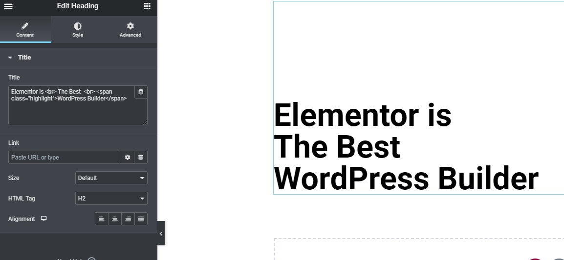
Now, this is one of the key step for this design to work, add the class “highlight” to span tag before and after the text where you need this highlight effect. As shown in image below.
					Elementor is <br> The Best  <br> <span class="highlight">WordPress Builder</span>

<! --Please note here the tag "br" is given to add line breaks you can avoid that if you need your heading in one line -->

Adding the Custom CSS to Class
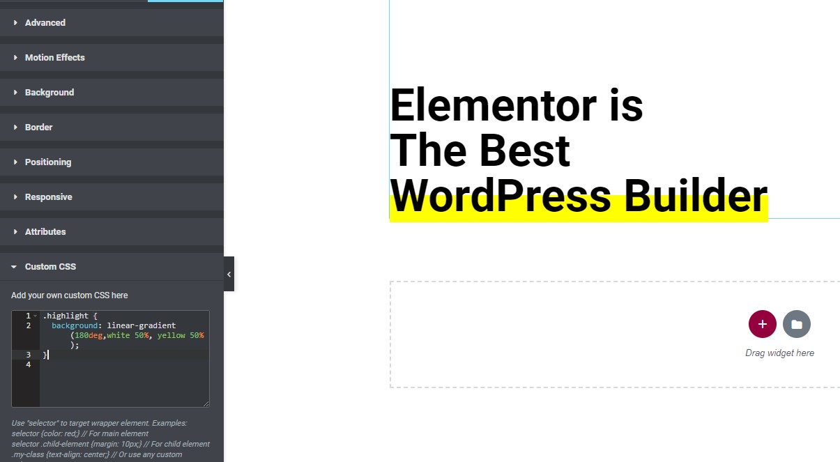
And here comes the final nail to achieve this in display, so to get the effect add the code below using custom CSS if a pro user or simply an HTML block if on the free version of Elementor.
(Don’t forget to add “style” tags in HTML for this CSS to work in HTML block)
					.highlight {
  background: linear-gradient(180deg,white 50%, yellow 50%);
}

<!--Use this if using HTML Block -->

<style>
.highlight {
  background: linear-gradient(180deg,white 50%, yellow 50%);
}
</style>

Playing More with the Design
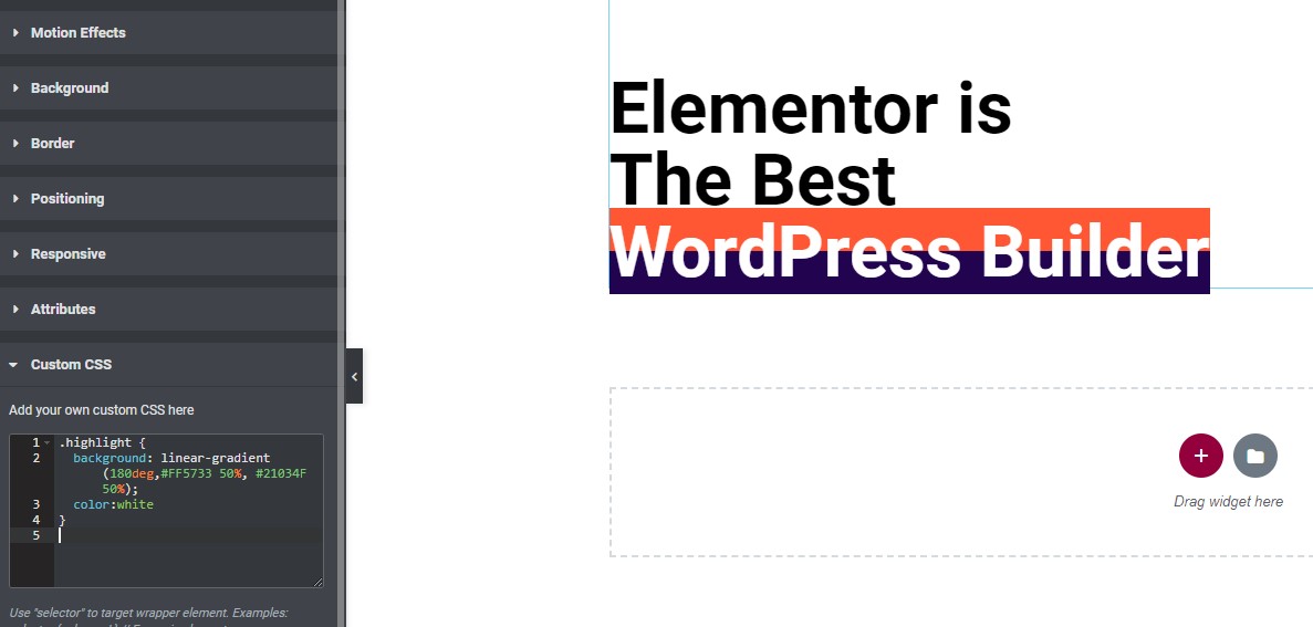
You can even play with the code to achieve more awesome designs.
					.highlight {
  background: linear-gradient(180deg,#FF5733 50%, #21034F 50%);
  color:white
}

End Note
That’s all, yes this was this easy to achieve. I hope you found this tutorial helpful. Feel free to ask anything in comments if you face any issue.


10 Responses
Great!!! Thanks for the trick ????
Welcome!
this is amazing thank you Maxime
Welcome!
Thanks for the trick, Maxime. One question, with this method, the underline applies to the whole width of the widget, not only to the text.
Is there a way to limit the underline to the text only?
Merci.
Hey Francois!
Yes, simply go to Advanced > Positioning > Width > Inline (auto).
👍 Worked perfect on my site! Thank you!!
Loved this Maxime 😍, thank you so much. I needed this effect so much.
Please keep on adding such Elementor hacks. Cheers
Welcome!
On the desktop view it looks really very good, unfortunately not so on mobile. What do I need to adjust so that it looks the same on mobile as it does on desktop? On mobile only the bottom line is underlined, not the headline itself. Thanks for your help. Many greetings, Helga