In this tutorial you are going to learn how to create a sticky at the bottom navigation bar with Elementor.
We will be using the new flex containers for this, as well as the Nav Menu element from Elementor Pro.
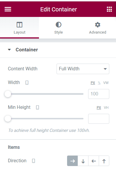
First, add a new container to your Elementor page
Set the width to Full Width, and the flex direction to "Row".
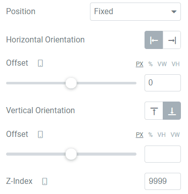
Under the Advanced tab, set it's Position to "Fixed", change the Vertical Orientation to Bottom, and add a Z-Index of 9999 (or whatever you need).
You can also toggle the Responsive visibility for this container for what you need. If you want this only on mobile, then hide it on desktop and tablets.
Then, add your Elementor Nav Menu inside that container
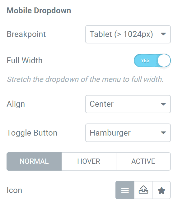
Under the Mobile Dropdown options, enable "Full Width".
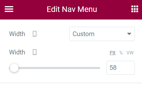
Under Advanced, give it a width of ~60px. This will allow us to easily add other icons in a row in this navigation bar later.
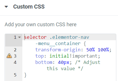
Add this custom CSS to make the Elementor navigation open upwards
Add this CSS under Advanced > Custom CSS.
You will want to keep it as it is, except for the bottom value. Adjust this as needed, it should be about the height of that sticky container.
With the code in place, open your navigation, then play with the value to see what you need.
<script>
/* Please login to get the code
 * The code will be for the Elementor Sticky Mobile Navigation Bar + Open Nav Upwards tutorial
 * Found at this URL https://element.how/elementor-sticky-mobile-navigation-bar-open-nav-upwards/
 */
</script>
Now, add other icons / UI element in the sticky mobile navigation bar
You can now add whatever else you want in there! Home icon, social media, lead forms, my account, etc.
Finally, enjoy your new Elementor mobile sticky navigation bar!
I hope you hâve enjoyed this tutorial. Let me know in the comments!
Cheers!

