
The new Elementor flex container is out, and in the dev version. I tested it out, and you can too by installing this plugin: https://wordpress.org/plugins/elementor-beta/ (DON'T install this on a production website, just on a testing environment)
In the video you will learn the changes it made to the DIVception, the basics of using it, 3 different designs.
Here are my thoughts and observations on it.
Elementor Container: What you get
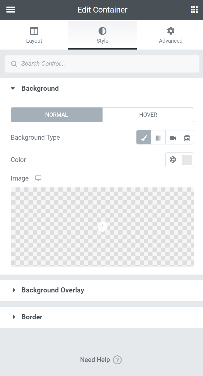
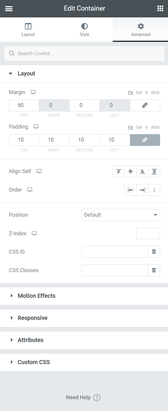
In case you don't want to bother installing the dev version to test it out, here is a quick preview of all the settings it has (at least for now).
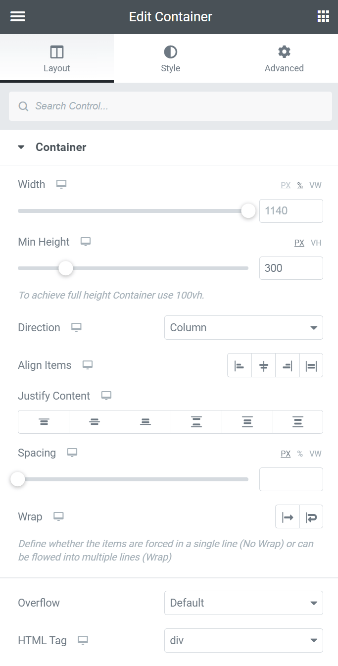
Interestingly, no more shape dividers under Style. I'm not certain if this is temporary or not, I would say likely they will be back...
DIV saved by using the new Elementor Container
Compared to the old DOM (pre Elementor v3), we will be saving 4 or 5 DIVs for a single column section, and 5 or 6 DIVs for a two column section.
Compared to the new DOM (post v3 with experiment ‘Improved DOM’ active), we will be saving ~2 or 3 divs for a single column section, and 2 to 4 for a two column section.
The savings are even more drastic if an inner section (or god forbid, an inner section within an inner section!) was needed. Then the savings are twice as many divs, so 4 to 8 for the new DOM.
Pretty significant!
Ease of use
That’s the greatest change that comes with this flex container. With it, Elementor goes from being a super easy, ‘done for you’ page builder, to a ‘Got to know what ya doing’ one.
Not a change I ever expected from Elementor to be frank. It looks like there will still be the option to have the old ‘Section and columns’ available though, so they aren’t throwing the baby out. I think that’s smart.
Let’s face it, a good portion of Elementor users are using it exactly because it’s so simple and easy. Keeping both options is probably the way to go: casual users get the ‘Easy mode’, and freelancers and agencies the ‘Advanced mode’.
On that note though, it will ‘force’ some freelancers to up their game and learn the basics of flexbox. That’s fine as Elementor is based on flexbox, and ideally, every advanced user should know about it.
Improvements still needed
The width options for the elements are now an integral part of how we will be using this flex container. We need to have full control, not just PX, % and VW. We need a ‘custom’ option where we can enter calc(), min(), max(), clamp() values.
We also need options for auto width, flex grow, flex shrink, and flex basis for flex child elements
The overflow options also need to be improved. ‘Auto’ should be added to ‘Default’ and ‘Hidden’, to allow for super easy horizontal scroll. Ideally, even overflow-x and overflow-y separate control. I show how to add a horizontal scroll section in my youtube video, and it requires a bit of custom CSS, for little good reason.
And as it’s prerelease, there were a few bugs, I won’t add them here as they are likely to be fixed before 3.6 is officially out.
A question worth thinking about
Is it worth it to go back, and update all our websites with this new Flex container, instead of sections, columns and inner sections?
No I don't think it is. Unless the website is in a very, very competitive market, or it’s very slow, it’s likely not worth it. At 3~4 DIVs saved per section replaced, the difference is unlikely to be worth the trouble. However it’s totally awesome to have this lighter DOM going forward.
An exception to this would be for those using Custom Loops. These tend to get very deep in the DOM, and have several useless DIVs… and then they are repeated for every single related element, most often a Post in a Post Grid. Replacing custom loops sections with flex containers will definitely lighten up these pages tremendously.
Elementor Flex Container Horizontal Scroll Code
Here is the code I used in the video to make the flexbox an horizontal scrolling container.
<script>
/* Please login to get the code
 * The code will be for the Elementor Flexbox Container Observations & Walkthrough tutorial
 * Found at this URL https://element.how/elementor-flex-container/
 */
</script>
Conclusion
I'm really glad Elementor is stepping up their game and adding this Container. It is solving so many problems Elementor had, the Divception being the foremost of them.
We can finally create more complex layout without needing a lot of CSS, and without JavaScript to create DOM elements. More power to the users!
I hope you have enjoyed this overview and observations.
What are your thoughts about the new Elementor Container? Did you have a chance to play with it yet?
4 Responses
I made the orizzontal scroll section, work on backend but not work on preview mode
.
Solution?
"Divception" I am looking forward to this improvement in DOM. I have many complex layouts for clients who require the design to include many nested DIVs. Although the client is happy with the design layout on desktop, tablet, and mobile, the CORE vitals from Google kill the performance. Even though I have my own dedicated AMD EPYC 128 GM Ubuntu with LiteSpeed Enterprise ann CyberPanel server using LiteSpeed cache with Redis, I can only optimize so much to improve the CORE VITALS. Hopefully, the improvement will be easy to implement to re-create my designs with Elementor.
Thank you for this update and YouTube video! All Hail Maxime Desrosiers!
wow! thank you so very much, this is so helpful =)
Welcome!