Easy Elementor Centered Logo Header!
This is how you can easily create a header navigation menu with a centered logo in the middle of the menu items.
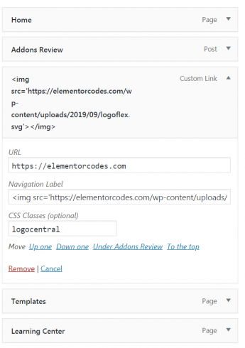
To begin with, go into WordPress and create a new menu. Before adding items, change the Screen Options to enable CSS Classes.
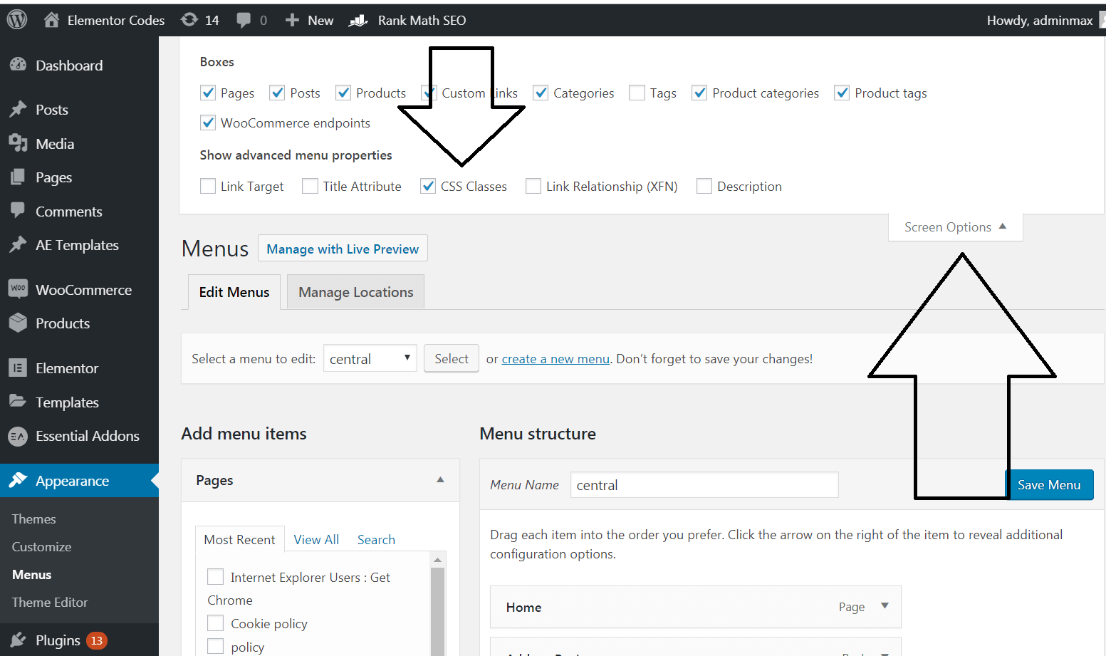
Then, add your items, and in the middle item, give it the class ' logocentral ' and in the 'Navigation label' area, enter the link to your logo.
To get the link to your logo, simply go in the media library, open the file, and it is right here
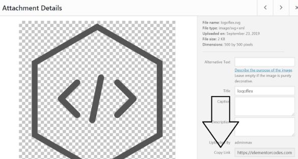
Place that link in <img> tags
<img src=’https://element.how/wp-content/uploads/2019/09/logoflex.svg’></img>
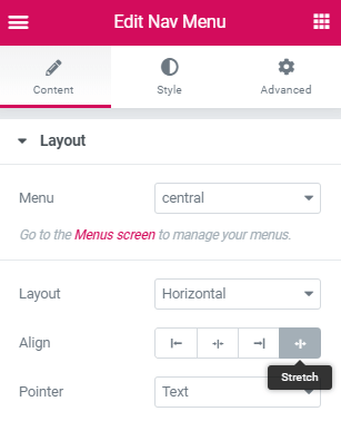
Now, back in Elementor, in your header template, create a new section and place the nav menu element in it. Set the Align option to 'Stretch'.
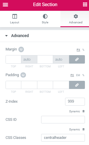
Give the section containing the nav menu the CSS Class ' centralheader ', and a z-index of 999
Finally, add this CSS in the Header Settings Advanced field
If you want a fixed header at the top though, as in the example on this page, keep reading.
Gear icon in the lower left gets you to the header settings.
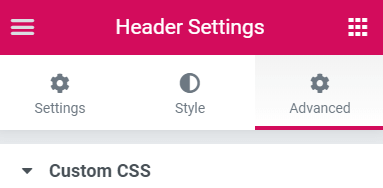
no used yet , option for sticky from elementor
<style>
.logocentral{
width: 130px;
transition: all .4s ease;
}
.elementor-sticky–active .logocentral{
width: 74px;
}
.elementor-nav-menu>li {
align-self: center;
}
</style>
.logocentral {
width: 74px;
/*adjust this value to your preferred size */
}
.elementor-nav-menu>li {
align-self: center;
}
.elementor-nav-menu a, .elementor-nav-menu li {
flex: 1 1 0;
justify-content: center;
}
/* remove logo from mobile menu */
@media (max-width: 767px) {
.elementor-nav-menu .logocentral {
display: none;
}
}
.elementor-nav-menu–dropdown.elementor-nav-menu__container {
margin-top: 0;
}
.elementor-nav-menu–main .elementor-nav-menu a,
.elementor-nav-menu–main .elementor-nav-menu a.highlighted,
.elementor-nav-menu–main .elementor-nav-menu a:focus,
.elementor-nav-menu–main .elementor-nav-menu a:hover {
padding: 4px;
}
If you want your header to be fixed at the top of the page with the logo changing size when scrolling down, keep reading and use the code below instead
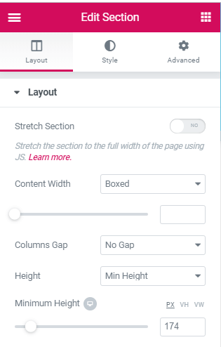
Create another section in your header template, above every other sections, and give it these settings. Adjust the min-height to the height of your fixed header.
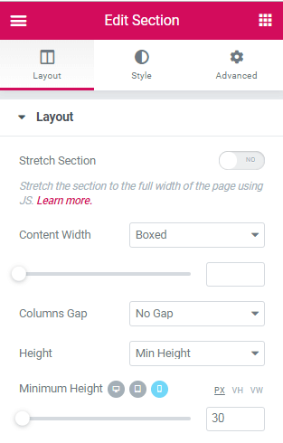
Also adjust the min-height for mobile devices
Then, add all of the code below in an html element in a section set to 'no gap' at the bottom of your header
I added comments in the code so that you can adjust to your preference.
<script>
/* Please login to get the code
 * The code will be for the Easy Elementor Centered Logo Header! tutorial
 * Found at this URL https://element.how/elementor-centered-logo-header/
 */
</script>
Important: this does not use the Elementor Pro Sticky options. It is made sticky at the top by using CSS, and this allows for a smoother animation. (No ‘jumping’). For this reason, it will only work for headers that are at the top of the page to begin with, not those that sticks at the top after you reach them. This tutorial can be made to work with these also, but then the code required is different.
Hello,
unfortunately does not work for me! Menu fonts are moved when scrolling, but the header and especially the logo remain the same size.
Thanks for the comment! For other readers, Michel messaged me privately and the problem was that his SVG had a predefined height and width settings. using 'max-width' (for logocentral and smallernow CSS), instead of 'width', fixed the problem!
How do you keep the logo inline with other menu items ? I addded an a href att to the logo and it goes down .
Hope you can help me with this one . Thanks .
do you have a link you could share?
Big thanks! Exactly what I needed. However, I need a way to keep the menu section transparant until the user starts scrolling. When the scrolling starts I want the background to change to a color. Is that possible ?
Hey Dirk! Yes it is possible, however it is a bit beyond the scope of hte article here! Essentialy you would mix that tutorial with this one https://element.how/elementor-transparent-header.../
Hey! Thanks a lot, I managed to get the logo centered the way I wanted. I was hoping to aling evertyhing vertically to the top, with the logo going over the navbar it it would be possible. Do you thing i could edit the code to align things to the top, with a litte padding ?
Hi! thanks a lot, really helpfull.
I would like to ask a question: I am using the "underline" option in layout/pointer in my navigation menu, but I would like the logo not to have it when I am at home page. Is it possible to exclude the logo from the "active" format, so that it does not show the underline?
Thanks in advance!
Hi Carlos, I'm facing the same issue - did you manage to get it resolved? Much appreciated.
Many thanks!
Heather Cunningham Hey Heather! Can you send me your page, I will get you the code for this!
Maxime Desrosiers - Thanks a million Maxime - I was just trying it out on a header, but since decided to keep said header as is. But about to start a project which I believe this will be perfect for. When I'm on my way I'll be in touch! Thank you so much 🙂
Is there any way to do without having elementor pro?
Buy elementor pro! Or some other plugins that allows you to create a header and footer would also work. There are free plugins that allow this!
Hey Maxime!
Thank you so much for this tutorial. Unfortunately the header remains the same size. I did change 'width' to 'max-width' for logocentral and smallernow CSS as you recommend in your answer below. But it still does not work. Could you please help me?
Also, it is possible to move the menu items closer to the logo? I'm just building my website, so I don't have that many items yet and I wish I had everything a little closer together.
Thank you so much!
To bring the menu items closer, decrease the section width under section settings > Content Width
: boxed
For the other same size problem, I would need to have a look at the page.
Hello, thank you so much for this tutorial.
I just have one question. Do you have any idea why the picture doesn't appear?
Thank you for your help!
It could be many reasons... even more reasons if you are using a SVG. I would need to see your page to find out why it's not showing.