In this tutorial, I'm going to show you how you can easily and quickly align Elementor buttons to the bottom of your containers or columns, or your Elementor CTA buttons or pricing tables buttons. you will learn how to align any of these buttons to the bottom, for when you have available free space.
This works with Elementor free and pro.
See demos here for containers and CTAs, and keep in mind it also works for Pricing tables and columns.
Elementor bottom aligned buttons for Containers
We will see two methods for this: one without CSS, and the other with CSS.
Containers bottom aligned buttons without CSS
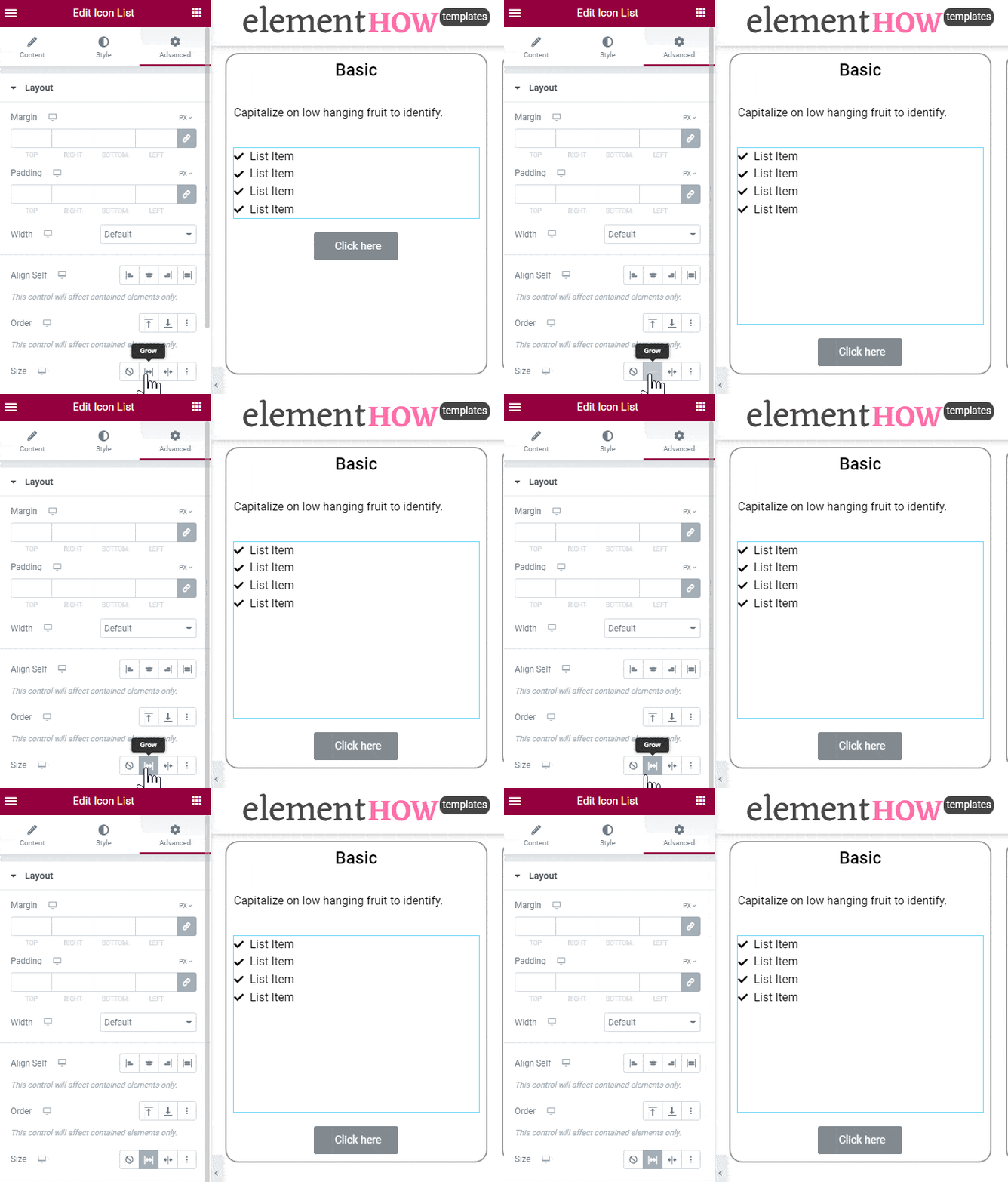
This one is pretty simple: go to the element that's just before your button, in the Advanced tab, and set its Size to Grow.
That element will now occupy all the available space, pushing your button to the bottom of the container.
Con of this method? If you add another element above the button, then you have to go back, unset 'grow' on the prior element, and set it again on the newly added element.
CSS method of aligning buttons to bottom for Elementor containers
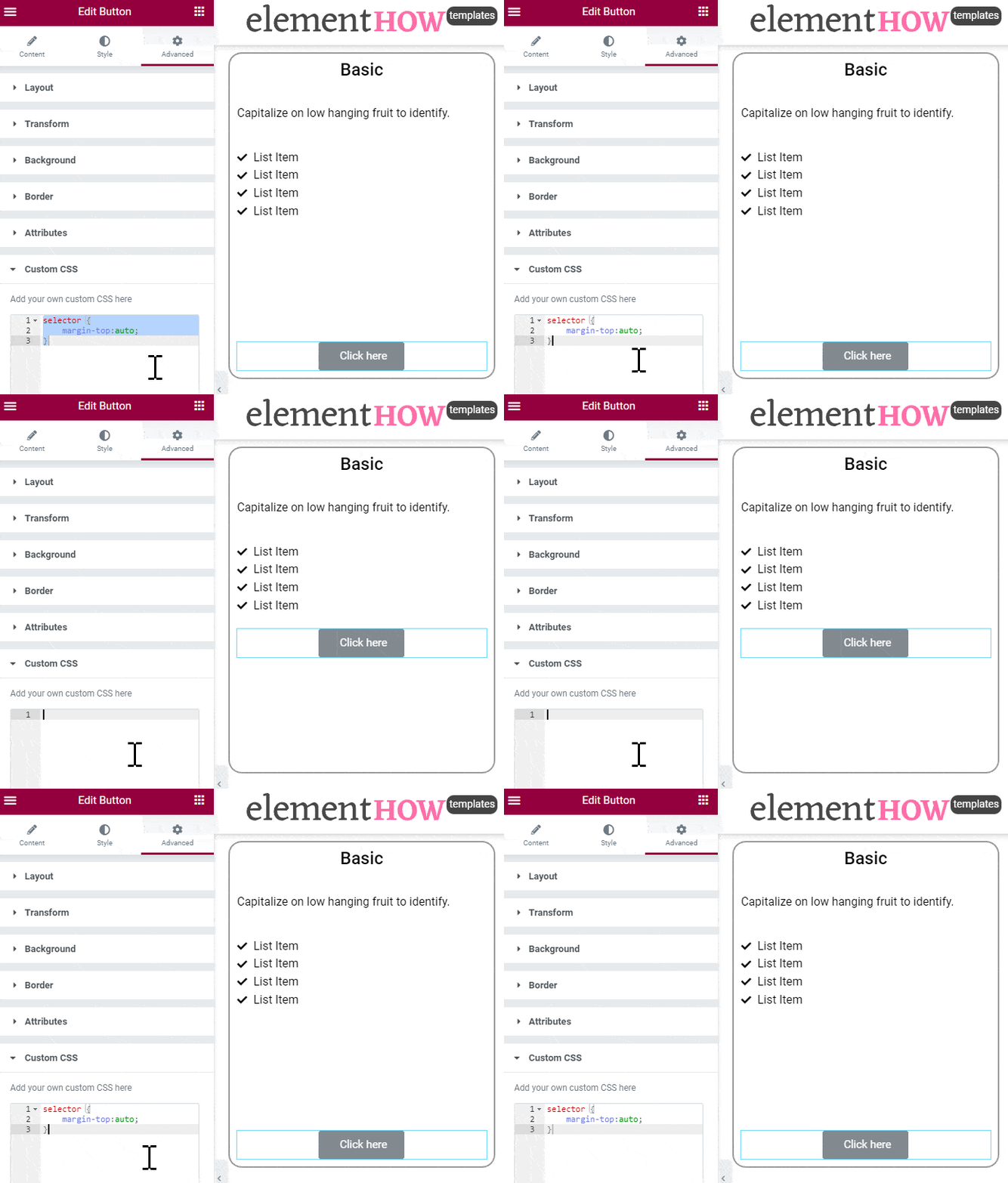
With CSS flexbox, there is an even better way of achieving this, that does not require you to change the settings of other elements. You simply set the margin-top of the button element to "auto".
Unfortunately, with Elementor, this requires custom CSS. For now at least, there is no other way to add a margin-top of "auto", even with the new "custom" option for the margin. The problem there is that the margin gets added to an inner wrapper element, and not the outer element, where it needs to be.
So we have to use CSS.
Add the following CSS in the button Advanced > Custom CSS field:
<script>
/* Please login to get the code
 * The code will be for the Elementor Align Buttons To Bottom Easily tutorial
 * Found at this URL https://element.how/elementor-align-buttons-to-bottom/
 */
</script>
Aligning Elementor buttons to the bottom of columns
Copy paste the code under Advanced > Custom CSS for the column.
<script>
/* Please login to get the code
 * The code will be for the Elementor Align Buttons To Bottom Easily tutorial
 * Found at this URL https://element.how/elementor-align-buttons-to-bottom/
 */
</script>
If you have the free version of Elementor, replace ‘selector’ by your own CSS class you gave the columns under Column > Advanced > CSS classes. Then, you can add the CSS to your theme Customizer ‘additional CSS’ area. Example code for Elementor free users
<script>
/* Please login to get the code
 * The code will be for the Elementor Align Buttons To Bottom Easily tutorial
 * Found at this URL https://element.how/elementor-align-buttons-to-bottom/
 */
</script>
Aligning Elementor CTA element buttons to the bottom
Use this code to align Elementor Call to Action elements. Add the CSS only one time on your page. This will work for when you have three (or so) CTAs in a row, in a container.
<script>
/* Please login to get the code
 * The code will be for the Elementor Align Buttons To Bottom Easily tutorial
 * Found at this URL https://element.how/elementor-align-buttons-to-bottom/
 */
</script>
Aligning Elementor Pricing Table element to the bottom
Use this code to align Elementor Pricing Table element buttons to the bottom.
You will need to have only the pricing tables in your container or columns. If you have other elements above or below, results may vary. Wrap in an inner section in these cases.
<script>
/* Please login to get the code
 * The code will be for the Elementor Align Buttons To Bottom Easily tutorial
 * Found at this URL https://element.how/elementor-align-buttons-to-bottom/
 */
</script>
Finally, enjoy your Elementor bottom aligned buttons !
I hope you have enjoyed this tutorial. Cheers!


37 Responses
thank you. you help me 🙂
how can i make this work for inline buttons? (more then 1 button next to eachother)
Good question Kurt. I would need to see your page to have a play and see if I can manage!
The first method only seems to work if the column widths are equal. Is this correct or am I doing something wrong?
Thanks for this helpful solution. It's working on one of my sites but not others. I can't see any differences in how I've applied the solution. Have you seen this before? Thanks for your help.
I tried using your second method with the myalignedcolumn class and that works fine. I'll stick with that. Thanks again.
Cheers welcome!
Thanks for this code, I used method 1 and the button is now aligned to the bottom, but it is not center aligned and everything I tried has not worked to center align it
Try adding this CSS
.myalignedcolumn .elementor-widget-wrap div:last-child {
margin-top: auto;
margin-left: auto;
margin-right: auto;
}
I tried the CSS for the CTA solution but it did not work.
Thanks for letting me know. I updated the code. Probably some Elementor update changed the markup of this element.
Now it should work. If not, enable 'Optimized DOM' experiment.
This is not working for Call To Action widget when you have them in one column and inline next to each other.
hi maxime can this method be use to align the description text of icon box to bottom like shown in this screen shot. https://imgur.com/a/knvtqTv
thank you!
FYI - free elementor version does not work. Just for anyone looking for a solution and came across this via google search.
Thank you, thank you!
So simple and so useful in so many ways
Welcome!
i have tried everything, nothing seems to work for me, not sure if theres somenthing im misssing
I think this is too stressful.
Here is an easy way;
1. Click the widget
2. Go to the Advanced Tab, and set the positon to Absolute.
3. Click either of the vertical orientation buttons depending on where you want the widget to be positioned in relation to its container (Column)
4. Adjust the vertical offset as you wish.
Here's a screenie >> https://paste.pics/c106f709b5ba4dd4e34b8062f4aecf0d
That's all.
This work but would be considered poor practice and not a great use case of position:absolute;
Essentially this is opening up for problems in the layout and structure, and adding weak points.
It's better to keep the buttons in the normal flow, and use advanced layout properties such as flex or grid to get the result wanted.
No, it’s not poor practice. It becomes poor practice if you over-rely on it and use it too often.
This solution was what I was looking for!! Stop fighting with margins and padding for sections method.
Thanks a lot!
Welcome!
Maxime, I tried implementing this solution on Loop Grid in order for all the read more button post are alligned on the bottom but it seems not to work.
I tried the "grow" solution on advanced tab but the changes do not take effect.
Any idea why this might be happening?
Thanks 🙂
Hey Gabriel!
Set your container (in your loop template) to "full width" layout (instead of boxed), and then add this CSS under advanced > custom CSS:
selector {
height: 100%;
}
Then, the solutions I propose should work!
Cheers!
Maxime, it Worked perfectly.
Thanks a lot!!
Mamime, sorry to bother again! You know why this might be happening? Here's a screencast https://www.loom.com/share/952eb76e6d5e4f19b8325bce1245f71a
Thanks for all the help provided!
Hey Gabriel,
the list icon can't be set to expand... I don't think that will work.
Also, you won't be able to have everything aligned perfectly. When text breaks into two lines it will change the height where the icons will show.
That's what's happening now.. the text below is very small, so the list icon has a lot of room to expand.
Try this (but again it won't align everything as this is not possible unless you would use ellipsis CSS overflow, to have the same amount of lines of text)
Remove expand on the title and list icon
If you didn't have it already, add margin-top:auto to the button at the bottom
Cheers!
Maxime, thanks for taking the time to answer me!
Icon Box can be set to expand?
Cheers!
Hi! Tell me please, I am using the latest Elementora update, but in my interface there is no functionality on the "Advanced" tab and set its size to "Zoom". How do I turn it off? I assume this is done in Dashboard > Elementor > Setting > Functional
Greetings cokojiova,
There should be a Size setting, with the 'grow' choice...
No. No, here is the link to the screenshot: https://sun9-26.userapi.com/impg/oewRUBLzeBoAT7qVwEb-5xD01KHfBJIqsfhgGA/2tZ7ouONLwU.jpg?size=857x888&quality=96&sign=d7915b537366008b6d35503c7596b8be&type=album
Oh, I didn't throw it off. Here is the actual screenshot https://sun9-46.userapi.com/impg/6-cfBwfkmkDHrov6dSLEe4p1ktzupXsaZK4Kfg/kO8jnGHGaZ4.jpg?size=847x981&quality=96&sign=47ec5740c2284d3af529ab305f5d067d&type=album
It's true, this tutorial presumes you have the Containers feature enabled.
Do you have Containers set to Enabled under WP > Elementor > Settings > Features > Containers ?
Thank you. I turned them on just now, now they have appeared. : https://sun9-49.userapi.com/impg/5p7nSbRxrJU6MrPc0oGUi7wHFfy2oHa5thupGA/6SCjZaqaHOI.jpg?size=1221x921&quality=96&sign=f358cc14558576bf258d9a44859f789c&type=album
CTA Widget - the CSS method works if the type is "classic". It does not work if the type is "cover".
Oh, duh. I figured it out. Change "classic" to "cover" in the CSS
.elementor-cta--skin-cover .elementor-widget-container {
display: flex;
flex-direction: column;
}
.elementor-cta--skin-cover .elementor-cta.elementor-cta {
flex-grow: 1;
flex-direction: column;
flex-wrap: nowrap;
}
.elementor-cta--skin-cover .elementor-cta__content.elementor-cta__content {
height: 100%;
flex-direction: column;
}
.elementor-cta--skin-cover .elementor-cta__button-wrapper {
margin-top: auto;
}
This is my alternative solution (for elementor section and column mode).
The structure is as follows:
- Section
- Column (vertical align: space between)
- Inner section
put all elements except buttons
- Inner section
put button here