Sometimes, It's not so easy to make a perfect button with the required width. But Elementor made it possible to make a button with the perfect width and additional styles. In this tutorial, we have explained that how you can make an Elementor full-width button within a column or section. We have described this article most easily.
Go To The Elementor Button Settings
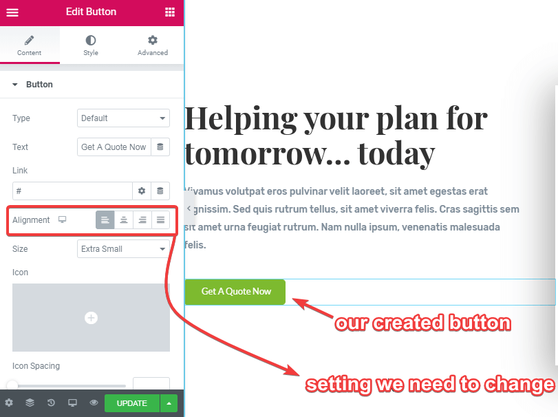
After creating a button on our page, we get it with its default layout & settings. Now let's see what are the default settings that are needed to be changed.
Check The Alignment Setting Of The Button
This is the only setting that we need to change to get a full-width button. Here we can see the default alignment of the button is left.
Change The Button Alignment Into Justified
Let's change the button alignment into justified. Now the Elementor button is changed to full width in its column.
Conclusion
We have described how you can easily make a full-width Elementor button by changing a single setting. We hope now you can create a full-width button according to your requirements.


10 Responses
Thank you! This was so frustrating to figure out.
Glad this could help!
But if there is an icon in the button, the justification spaces it too far apart from the button title.
Hey Diane! You are right indeed.
To fix this, after setting the button to justified, go under the Style tab, and then adjust the Padding. Set it in % values, set up and down to ~3% , and left and right to ~%40.
Adjust for tablet and mobile also.
I can't believe how simple this was... THANK YOU!
Welcome!
Thx!
Welcome!
I learnt here. Thanks.
Hi, my button did not go full width and fill the column. There is still space either side.