In this tutorial, I will show you how to create an Elementor vertical sticky header using containers.
We will be using the Hello Theme for this, so if that's not the theme you are using, it probably won't work.
Here is a live example of the Elementor vertical header:
Features:
- Responsive: Goes back to a normal header on tablet and mobile
- CSS Only: Just a little bit of well crafted CSS required
- Homepage only version: If you just want this on your home page, we have the CSS ready for that too
Let's get started!
First, let's create your Elementor Vertical Header Template
Go into WP Admin > Templates > Theme builder > Add New Header Template.
Copy or download the header template, and import it.
Adjust the CSS for the Vertical Header
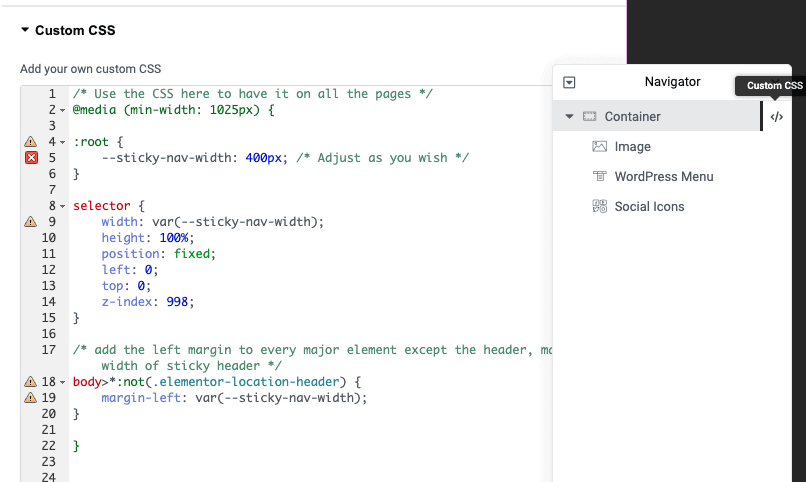
After importing the Elementor Header template, you will see the CSS on the Container > Advanced > Custom CSS field.
There, you will find two versions of the same CSS, delete the one you don't need (depending on if you want this on all pages, or on the home page only).
Here is the CSS, in case your header is already made. Add it on your parent most container, and delete the part you don't need.
<script>
/* Please login to get the code
 * The code will be for the Elementor Vertical Sticky Header with Containers tutorial
 * Found at this URL https://element.how/elementor-vertical-sticky-header-with-containers/
 */
</script>
Then, adjust the rest as you wish
If you are using the Hello theme, everything should work already! Adjust the layout in your header template as you wish.
The layout reverts to a normal top header on tablet and mobile.
Finally, enjoy your new Elementor vertical header!
You should now have everything setup and working fine.
Hope you enjoy! Cheers!


9 Responses
Maybe a stupid question but when I apply this css code the columns remain horizontally aligned instead of vertically. How can I adjust this?
Greetings,
What do you mean by 'the columns' ? The content of your header?
For simplicity, please try just creating a new header template, and importing my template. Then copy paste what you had in your old template in there, and adjust the layout to fit your design.
Cheers!
OK so when i create a new section for my header i can choose the amount of columns i want to use in my case 3. But instead of align them vertical (one on top the other) they are beeing aligned horizontaly (the one next to the other).
To be clear, are you using the old Sections and Columns ? My tutorial is really more for the Containers.
If you are using Containers, then just make them vertical as you normally would: set the flex direction to column instead of row.
Cheers!
Hi there Maxime, back again sorry to bother you.
So i managed to get to menu working what great news is, but i want the background to be transparent. Normally i would edit the container and set the background to transparent hex code, but strange enough it still shows an dark background on the website. Any idea?
Greetings,
You probably have some settings somewhere to have a dark background. Could be under your Elementor editor > header settings > Style tab > Background, or could be on your page Elementor editor > page settings > Style tab > Background, or could be some custom CSS...
Could also be Elementor editor > Site settings > Background.
Right click > inspect, see where the color comes from, that should help
Cheers!
yeah so the basic site background is indeed basic, i use some fotography for fading. If u set the sitebackground into transparent i get a white background what i am not searching for.
I tried to fill your css code for only the header with the following code to see if i can get it transparent
.transparent-background {
background-color: #00000000;
}
but unfortunally header still has same color as background.
Any suggestions ?
Sorry I meant to say that the basic background color is dark/black
Sorry I don't know where the color comes from then, if you set it to be transparent in the container > background settings, it should be transparent...