The simple CSS grid for Elementor addon allows you to very easily use CSS Grid to create great looking layouts.
With a single click, you can have one of 64 pre-set grid layouts.
Used with containers, you can create your own custom layout.
The simple CSS grid is available on the following elements:
- Container
- Loop Grid
- Gallery
- Basic Gallery
- Portfolio
- Column*
*That's right. In the event you are working on a client website that's still using sections and columns, and you would like to add a grid layout without switching everything over to containers, it will work with columns.
In the playground below you can have a quick preview of what can easily be achieved from the Elementor editor!
Visit the playground directly.
Let's see how it all works!
Getting Started
First, download and install the plugin. This button will be a download link after you have purchased access. Be certain to be logged in with the email that made the purchase.
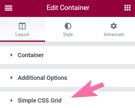
The first thing you will notice is that on the compatible elements, you will now have the Simple CSS Grid panel:
You don't see it? See why I can't see the Simple CSS Grid panel.
Clicking on it you will see all the available settings.
- Enable: Turn on to enable CSS Grid on this element
- Gap: The grid gap between the items
- Control Row Gap Separately: If you want to control horizontal and vertical grid gap independently, turn this on
- Min Height of Items: Set a min height on the items (optional in most cases)
- Layout: Choose the grid layout that you would like
After enabling Simple CSS Grid and selecting a grid layout, you might notice very little or no differences (in particular if you are working with a container). If the container is empty, almost nothing will change, visually. You will need to add enough elements within that container (be it other containers, or any elements) so that the grid will be filled.
The grid layouts
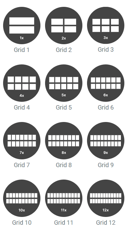
There are 64 grid layouts. You can preview the pattern of each one from their related image.
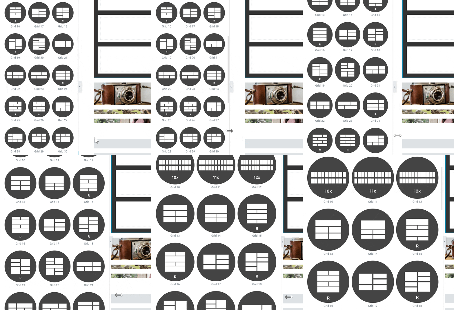
If you would like to see the layouts better (and larger), you can simply expand the settings panel:
You can also visit the Simple CSS Grid for Elementor playground.
Using with Containers
With containers, not only do you have one click access to the 64 predefined grid patterns, but you can also create your very own custom grid layout.
For this, you choose one of the first 12 options, so that you have an even grid of 1 to 12 items.
Of course choosing the 1x grid would not give you much creative freedom. The 1x grid is particularly useful to reset the grid to a very simple, stacked layout, on mobile.
Say you want a lot of flexibility in how your new custom gird is going to be laid out, so you choose Grid 12.
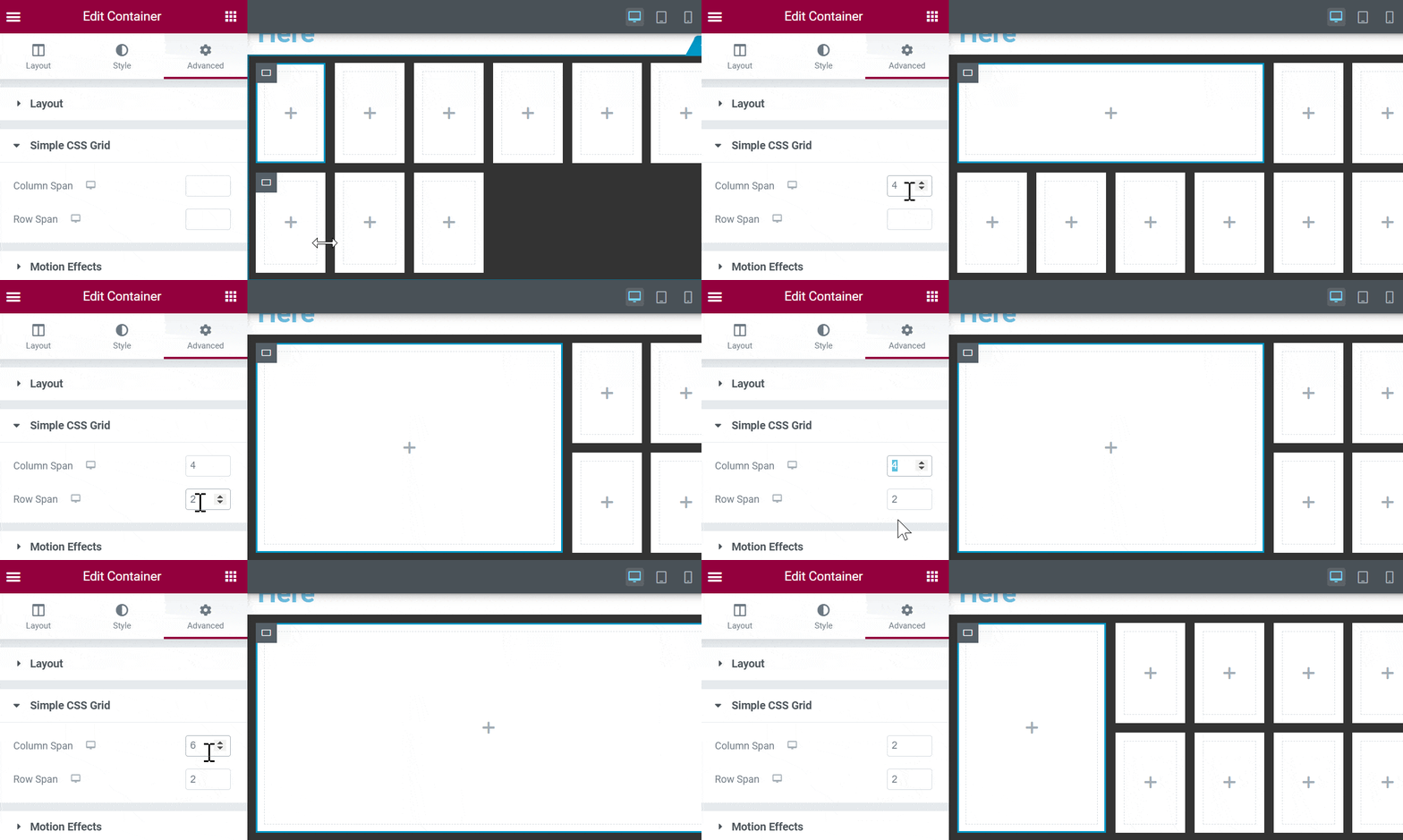
Now, you can go into the grid items directly, under the Advanced tab > Simple CSS Grid, and adjust how much space each one of them should occupy:
You will need enough items in the grid already to properly preview the results. Row span in particular won't really change anything if you only have one row.
So you can set each grid item to span the exact area you would like.
This works for containers as grid children, as well as any element at all (results may vary for some of them). It works with inner sections too, in case you need that.
Using with the Loop Grid
To successfully use with the loop grid, your loop template needs to be made so that it's layout and appearance can be flexible and adjust to different size 'boxes'.
Generally, this will mean making the featured image a background image of your container.
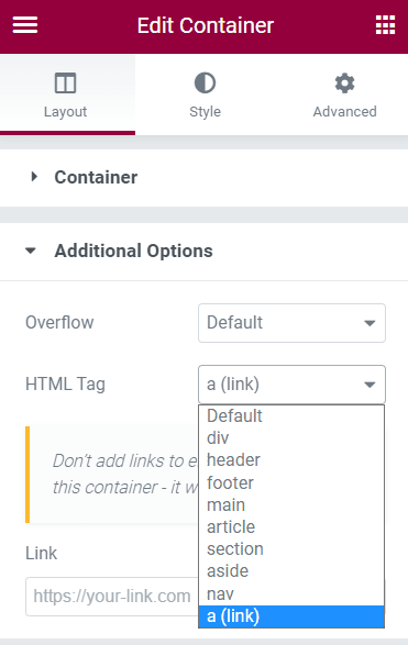
Then, you will probably want to make the entire container a link by changing it's tag to <a> here:
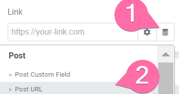
Then making it the post URL
From there, you can adjust however you want! Add the post title, make it show on hover only, add other post information, etc. As long as it will fit into your smallest grid item, your layout should work fine!
Limitations
With the container, you have to use the "boxed" layout. In the event you would like it to be full width, use "boxed" then set the "width" to "100%".
The Container Layout needs to be set to Flex (and not Grid) to avoid conflicts.
You can't use shape dividers on the same container where you have enabled Simple CSS Grid. If you require a shape divider there, simply wrap that container into a full width one, set its padding to 0, and set the shape dividers on that wrapper container.
With columns, you can't use a background overlay along with Simple CSS Grid. It will break the grid layout.
With the image gallery pro element, Simple CSS Grid isn't compatible with "justified" or "masonry" layouts. It's not compatible with "multiple" galleries either.
With the portfolio element, you can't use "masonry" layout.
Questions and Answers
Why can't I see the Simple CSS Grid panel
In some cases, the Simple CSS Grid accordion won't be present at all. This is when a setting, on the same element, is selected and is incompatible with Simple CSS Grid.
For example, the following:
On the Gallery element, if "multiple" is selected, or the layouts "masonry" or "justified", the Simple CSS Grid won't be available.
Ditto for the Portfolio element, if "masonry" is selected.
Ditto for the Loop Grid element, if "masonry" is selected.
Conclusion
I hope you find this documentation helpful.
If you have anymore questions, please ask in the comments!
Includes
- One Click GridsGet access to 64 premade grid patterns, available with a single click
- Works with Elementor Galleries, Loop Grid and ContainersWorks with the Gallery Basic, Gallery Pro, Loop Grid, Portfolio elements. Also works with containers, and even with the old columns.
- Annual license
- 1 year of updates and support
Includes
- Unlock every premium tutorial on Element.howGet access to the entire library of premium tutorials on Element.how
Preview premium tutorials - Get access to the CSS course for Elementor usersAccess the complete 14 HTML chapters, 30 CSS chapters and 7 Elementor Projects.Learn more
- Simple CSS Grid For ElementorAn Elementor Addon to Create Awesome Grid Layouts in a Single Click for Containers, Galleries and Loop Grid. Learn more
- free extra: ShapeDividers.com Premium AccessLifetime Premium Access to ShapeDividers.comVisit ShapeDividers.com
- 6 months money backNo questions asked money back. Not what you expected? Get a refund.
- One-time payment of only $299No hidden fees or subscriptions.
Sales taxes added where applicable. - Support not needed!Due to personal circumstances, I no longer offer support. The vast majority of customers never needed support to start with, so chances are you will be just fine, the tutorials and templates provided are complete.
I also extended the refund window from 1 to 6 months, during which you can get a full refund for any reason. - Lifetime access to everything Element.howThe price reflects what is currently available on Element.how. All future updates are included, but none are promised. You pay for what is available now, and the rest is a sweet extra.
13 Responses
I HAVE INSTALLED THE SIPLE CSS GRID BUT I NEDD THE CODE TO USE IT!
WHY ?
CAN OU HELP ME ?
Please go to your account : https://element.how/my-account/
Then find the tab "My Licenses"
You should have your license there. Let me know if you can't find it.
Cheers!
" You currently have no licenses " no license code in the tab.
Sorry, but when i put my licens code i have this error: You do not have permission to access this page.!
Are you logged in as an admin on this site? Could you share a screenshot with me please?
I have that error when i try to put in a grid the system ask me for a license i put the licens code in and when i push on a button to accept i show me the previus error : You do not have permission to access this page.!
Could you let me know the exact URL at that moment when you have this error message?
I use it in local ....Sorry
What does the URL look like when you get that message?
I don't no why, but now works fine! Thanks!!!
Great!
Is this still a benefit with the elementor grid-container available now?
Greetings!
It's still useful for these elements:
Loop Grid
Gallery
Basic Gallery
Portfolio
And even for containers, it's a one click solution, instead of what Elementor offers.
Hope this helps!