")
")
Elementor's recent addition of CSS Scroll Snap is quite interesting.
However, the limited availability of options and fine tuning, plus some pitfalls inherent to CSS Scroll Snap, means you have to plan your design well to make it all work.
You might also need some custom CSS to disable it on certain viewport only.
Often it will work and look well on desktop, but be more of a hindrance on mobile, particularly if the content doesn't all fit within 100vh.
Here is an example of a CSS Scroll Snap page I made with Elementor, and fine tuned with the optimizations below.
That demo was also created for my tutorial that shows you how to have the Elementor entrance animations replaying each scroll down.
The animations in that demo also uses my Elementor entrance animations improved stylesheet.
If you are interested in the template for that demo, you can get it by purchasing this tutorial.
The General Idea
To get a good result with CSS Scroll Snap, you will essentially want to plan your design so that the page becomes a kind of vertical slider.
I find that's when CSS Scroll Snap gives optimal results.
Otherwise, it becomes a kind of scroll jacking, and can be very annoying to users.
To make it a "vertical slider" kind of design, you will want to have each section / container be set to min-height:100vh. And you will want all the content to fit within this 100vh.
You will also want to be careful of smaller viewports, and verify that your content fits within, let's say, a 1100px * 570px viewport too. Otherwise, these users won't have a nice vertical slider kind of experience, but more of a scroll jacked experience.
You can also use CSS to disable the CSS Scroll Snap below a certain viewport height, or on tablet and mobile, where the content might not fit within 100vh. More on this later.
Setting Up Elementor CSS Scroll Snap
To turn on Scroll Snap, on any page you might be working on
- Click the keg icon in the lower left corner.
- Click to go to the Advanced Tab
- Turn on the toggle
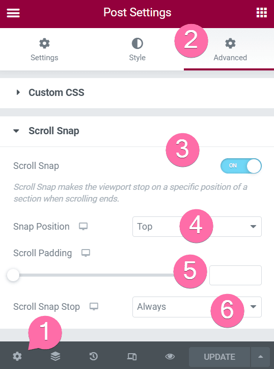
4. The Snap Position
For most designs, you will want this to be "top". Really though, if all your content fits within 100vh, any position will give the same result.
The different is that by choosing "top", if a viewer has a narrow viewport, in terms of height, it will snap to the top of the section / container, and not skip any content. If you choose "center", it might pass over content that was above, in that section / container.
5. Scroll Padding
Useful if you have a sticky header. Enter the approximate PX height of your header here, and the snapping position will consider it.
6. Scroll Snap Stop
To have it be a vertical slider kind of design, you will want this set to "Always".
Disabling Elementor CSS Scroll Snap On Mobile
The CSS scroll snap option in Elementor isn't responsive. You either turn it on or off. Often though you might want scroll snapping on desktop, normal behaviour on mobile...
Custom CSS to the rescue. You can add this CSS to your page to disable the CSS scroll snap on mobile.
If you want it disabled on tablet too, change the "767px" value to "1024px", and that will disable it for mobile and tablet.
<script>
/* Please login to get the code
 * The code will be for the Elementor CSS Scroll Snap: How To Optimize For UX (See Demo) tutorial
 * Found at this URL https://element.how/elementor-css-scroll-snap/
 */
</script>
To disable it for narrow viewports, in terms of height, use the following CSS. It will disable it for viewports that are 600px or less in height. Adjust this value to whatever you need!
<script>
/* Please login to get the code
 * The code will be for the Elementor CSS Scroll Snap: How To Optimize For UX (See Demo) tutorial
 * Found at this URL https://element.how/elementor-css-scroll-snap/
 */
</script>
Disabling scroll snap for the header and footer
By default, Elementor CSS scroll snap will be enabled for all first level sections in the page content, as well as the header and footer.
To have the scroll snapping happen only on the first level page sections, and ignore the header and footer, add the CSS below:
<script>
/* Please login to get the code
 * The code will be for the Elementor CSS Scroll Snap: How To Optimize For UX (See Demo) tutorial
 * Found at this URL https://element.how/elementor-css-scroll-snap/
 */
</script>
This will improve the UI UX and prevent from stopping after the header, and prevent snapping in the footer.
Making Elementor CSS Scroll Snapping work with Containers
For now, Elementor's CSS isn't proper for this to work well with containers. It applies the scroll snap CSS to every single containers, including inner containers. That makes the scroll snapping stops at them all, degrading the UI UX significantly.
This is likely to be fixed by Elementor directly at some point. Meanwhile, if you are using containers and CSS scroll snap, you will want to add the following CSS snippet.
With this snippet, it will only consider the first level containers, IE those that aren't inside any other "container" element.
<script>
/* Please login to get the code
 * The code will be for the Elementor CSS Scroll Snap: How To Optimize For UX (See Demo) tutorial
 * Found at this URL https://element.how/elementor-css-scroll-snap/
 */
</script>
Elementor CSS Scroll Snapping & Menu Anchors Support
By default, Elementor Scroll Snapping doesn't work very well at all with menu anchors. Interestingly enough, the problem comes from the Elementor native smooth scrolling to anchors feature.
Yet, Elementor doesn't disable that feature automatically when Scroll Snapping is enabled. They really should, it would fix these issues.
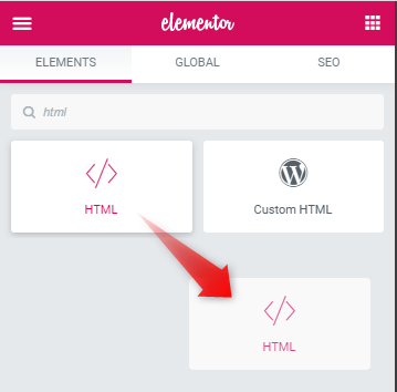
In any case, here is how you can disable it: add this code in an HTML element, on the same page(s) where you have CSS scroll snapping enabled.
<script>
/* Please login to get the code
 * The code will be for the Elementor CSS Scroll Snap: How To Optimize For UX (See Demo) tutorial
 * Found at this URL https://element.how/elementor-css-scroll-snap/
 */
</script>
You will also want to add this CSS, so that your anchor still scroll smoothly to their destination. You could add it under the page custom CSS field.
<script>
/* Please login to get the code
 * The code will be for the Elementor CSS Scroll Snap: How To Optimize For UX (See Demo) tutorial
 * Found at this URL https://element.how/elementor-css-scroll-snap/
 */
</script>
Finally, enjoy your UI UX optimized Elementor CSS Scroll Snap!
I really hope you found this tutorial useful.
Cheers!
35 Responses
Can you try this scroll snap feature which uses Nav Menu Anchor links or any other anchor links that scroll you to a specific section of the page? I really had trouble with that when I tried on 2-3 projects. I'm interested to know if you have a good solution for anchor links to work with the snap scrolled page.
Thanks
Hey!
I just updated my tutorial with a solution for this.
It seems that motion effects doesn't work when Scroll snap is on. Any idea why?
Thanks, Marko.
Hi !
I would really like to disable scroll snap for the header. But when I enter the CSS code, Elementor says "unknow property" underlining "scroll-snap-align" or "scroll-snap-stop". However, I have enabled scroll-snapping. Thank you for the article anyway and for your help if you have a solution !
Emilie
You can ignore the warning from the outdated CSS linter of Elementor... the CSS works regardless!
Great tutorial, thank you! Now everything works as it should, well almost everything, because scroll snapping also seems to break other scroll effects. I have a sticky menu and highlighting active menu items when scrolling a single page stops working when the scroll snap is enabled. Menu items are not highlighted at all, or always "active". Do you have any idea how to fix it? I tried using "Page scroll to id" plugin, but it also doesn't work properly with scroll snap enabled. I will be grateful for any help or hint.
Barbara
Yes indeed, unfortunately Elementor didn't add much support for the CSS scroll snapping feature... They could have adjusted their JavaScript to consider cases where scroll snapping is enabled, to preserve scrolling effects and active menu item styling, but they didn't.
they changed the css class to e-con
you need to update the snippets
Thank you! I updated the CSS snippets!
Thank you very much. I searched for days to find a solution for scroll snap and anchor menu. It works now! So glad!
Is it correct that it will not work on Safari?
Hey Karin,
I haven't tested really. Which part exactly won't work there?
Hello again,
I figuered out that on Safari, the threshold for scroll snap is significantly higher than in windows browsers. This means you must scroll down deeper into the next section until it snaps to it. And since all browsers on Mac are built on top of the Safari engine, you will notice this increased threshold on every major browser while using a MacBook.
Is there a solution for this?
Hey Karin,
Thanks for sharing your findings!
No I doubt there is a solution... this is how the browser is coded to implement this CSS feature.
Thank you for this great tutorial!
The basic scroll snap implementation from elementor is really bad and I managed to improve it a lot by following the steps in this tutorial.
However, I've got one more issue with scroll snap on my website which is featuring a loop grid. Basically the scroll snap is snapping to all first level containers on my site but also to containers inside the loop grid.
I've tried altering the CSS like this
.elementor .e-loop-item .e-con {
scroll-snap-align: none;
scroll-snap-stop: unset;
}
so that it doesnt consider containers inside of loop items, but sadly that didn't work out.
Maybe you can help me out here, thanks in advance!
Hey Florian!
Try this:
body:not(.elementor-editor-active) .e-con {
scroll-snap-align: none;
scroll-snap-stop: unset;
}
body > .elementor > .e-con.e-con.e-con {
scroll-snap-align: start;
scroll-snap-stop: always;
}
That will work if you are using Hello theme and have the optimized Dom out put feature enabled under WP > Elementor > Settings > Features.
Cheers!
Hi!
Thanks for the tutorial!
Unfortunately somehow the snap to first level containers still does not work for me. It keeps snapping on all containers. A also get the warning 'unknown property'.
I have the Astra theme, don't know if that could be part of the problem. Any Idea what the problem could be?
Thank in advance! 🙂 Sanne
Greetings Sanne,
You can safely ignore the warning 'unknown property'.
Yes, it is likely not working because you are using Astra. Could you share your page with me? I will have a look.
Hi Maxime,
Thanks for your reply! At the moment I'm still working on setting up the whole site, so I'm still in maintenance mode, thus can't share the link atm. (I can, but you can't see anything) I'll share the link as soon as it's online!
Alright Sanne!
thank u for this
Hi,
Is there a way to make this work with scrolling motion effect? As soon as I turn ON ''snap stop'', any scrolling motion effects stops, even with all the code (css and html) implemented.
* I'm using container.
Thank you!
Greetings,
Sorry this isn't compatible.
I tried the CSS code for disabling header and footer snap scroll, but it doesn't seem to work.
Hey LM!
Please share your page with me where you are trying this, I will have a look!
Here is the page: https://cosmohealthresolution.zeem-mockup.com/about/
I tried using a sticky and regular header and it still snapped regardless.
I had a look and it seems to be successfully disabled... I'm not certain what behaviour you are looking for?
From what I can tell it seems to work properly according to how it's setup.
I figured if snap was disabled for header and footer then a sticky footer would just be visible as usual and only the sections would be snapped. In this case, when I scroll it scroll snaps the height of the header then scroll snaps to the next section, and so forth. I don't see the snap disabled unless I am just not understanding what it's supposed to do when disabling.
I also cannot seem to understand the "disable header and footer". It continues to snap after i apply the css.
Hey Fotis!
I just had a good look at this and I can't disable it either with the containers. With the old sections and columns I think it worked as expected but with the containers, it just skips the header and footer when they are disabled, which isn't great.
Here is the CSS if you want to try:
body:not(.elementor-editor-active) .elementor-location-header .e-con.e-con.e-con,
body:not(.elementor-editor-active) .elementor-location-footer .e-con.e-con.e-con {
    scroll-snap-align: none;
    scroll-snap-stop: unset;
}
Let me know if that gets you good results!
Cheers!
Hi,
I added the scroll-behavior=smooth property but still smooth scroll doesn't seems to work. For desktop, it just jumps to the corresponding section directly but no smooth scroll. For mobile the menu anchors don't work at all. Is there anything changed in the latest elementor version?
Greetings Delan,
How is this related to the current tutorial?
Hi everybody,
love this tutorial. Thank you so much for that.
My original plan was to scroll snap most sections and pause the ones with half text and half photo....
If I understand right that may not be possible?!
https://wolflogik.de/home-new/
Is there a way to not use the elementor scroll snap settings and solve it with css codes?
(Scroll snap is off right now, because the "half-pages" would not be visible)
I loved this page and wanted to do it similar.
https://zink-miljoe.dk/
Greetings Mela!
Sorry unfortunately I don't think it's possible! I did run a few tests just now, and could not get this to work.
thank you so much for trying!