
Menu
Elementor Shrink Header & Logo on Scroll - Simple Method
No extra plug-ins required! Elementor Pro Required.
Shrink the header and logo on scroll: the simple and quick way to create this awesome Elementor design.
To begin with, create a new section with only one column

Set this section sticky
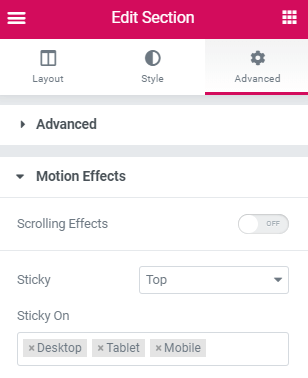
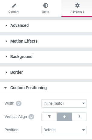
Then, set the custom positioning of the elements in the column to inline, and vertical align to middle.
For the logo and the nav menu element, and any other element you might want in your header.
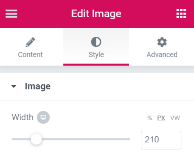
If you use a vector graphic for your logo (SVG), you will need to set a width in PX.
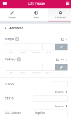
When everything looks right, give the logo image a class name
Here ‘logoflex’ is the class name of the shrinking logo. Note that you should use the default Element Image element for this tutorial to work properly.
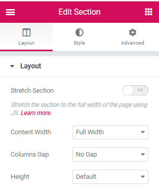
Now, add an empty section above everything else
Set these parameters for that section. This empty section is necessary so that the sticky header is not activated while you are at the top of the page. It won’t show on the front-end.
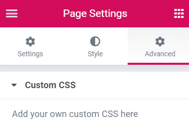
Finally, add this code to your page setting CSS
Gear icon in the lower left part of the screen
<script>
/* Please login to get the code
 * The code will be for the Elementor Shrink Header & Logo on Scroll - Simple Method tutorial
 * Found at this URL https://element.how/elementor-shrink-header-logo/
 */
</script>
This look really promising an it clearly work here. I was hopoig this would be the answer to my issue. I have followed this tutorial maticulously and it just will not work for me? 🙂
https://zic.co.uk/ocs-is/
Any ideas to try...thx
You are right. There was a slight error in my code that didn't account for images also being a link. this is fixed now... Just the code you got from earlier, and replace with what I have above.
Best tutorial ever. This fixed my issue right away. My only suggestion for improving this article is to add something about adjusting the pixel size after pasting in the CSS code to better match your own logo design. I adjusted mine to 250 px.
Also, instead of pasting the CSS at the page level, I pasted it in the Custom CSS area (under Advanced when editing logo). It worked well there too.
Thank you soooo very much.
You are quite welcome!
This is by far the least complicated solution i've found after browsing for quite a while! Thanks man!
Glad to read this!
Hello Thank you so much for this tutorial. Unfortunatly, this is not working on my website.. I copy an paste your code and followed all the steps but it doesn't change anything.
Can you help me please ?
Yes. Please share me your website URL , I will have a look!
Hi - great tutorial - thx. One thing I have noticed thought - when you scroll back up the page you get a 'white flash' across the screen which I'm assuming is the empty section. Even though I have coloured the background of that section to the same as the header bar, I still get a white flash - any fix for this please?
Good solution ! Thank you
Welcome!
This is wonderful and worked great for me! Do you have any recommendations to get the background color to change on the scroll? I tried using this but the solution to provide an empty section above makes this solution not work. Let me know what you think, thanks so so much!
.elementor-sticky--active {
background-color: rgba(0, 0, 0, 0.70);
}
Great that's nice thanks - how do you change your logo and menu from centered one above the other in the header to get them aligned side to side when shrinked? as it is on your site header 😉
Hey Matthieu! Instead of setting width to 'inline', set to 'custom' (for both logo and nav menu element, and any other elemnt you might have in that row). Then , after scrolling, make it so the total is 100% (or 99%, if 100% doens't fit). before scrolling, total should be > 100%, so that the logo will be on it's own line.
Then also set column setting > horizontal align > centered.
Looks great, unfortunately it did not work for me, I made everything according to the tutorial.
dosn't work for me 🙁 Any help?
Got a link I can look at ?
Hi Maxime. Is this post still open? If so, I could use some help. I have set it up at https://roast.longbow.design but it doesn't work.
Stephen
There was a small error in the CSS code. Actually the code itself was fine, however WordPress was applying some auto formatting and transforming it a bit.
Now I updated the code and prevented auto formatting from WordPress, so get the code again, import it in your page, and it should work.
Thanks very much. It's working now.
Such a simple and efficient solution, compared to the classic one ! Thanks Maxime 😉
Do you have updated instructions when using containers? I've run these instructions 3 times and cannot get it to work.
Maxime - I am looking for a solution to shrink-minimize the header area. Fair bit going on in the header area (website is a portal) which makes it a challenge on a mobile view. All the site (and header area) is now on flex containers. Latest production build of Elementor Pro.
Thanks, Michael
Greetings Michael,
How about just using a popup for mobile, where you will have all the space you need?
LOL ... I used to use that method years ago (when I was on Divi ... before Elementor) but I managed to FORGET about that method.
Thanks for the memory jog. Appreciate your good work and quality code.
Michael
However, I also have a situation where the site is built out with static pages in mind. So CSS is preferable (vs the Popup approach). So would this particular piece of code work with containers as described?
Not directly as is, you would need adjustments, even moreso on mobile...