Elementor Sticky Header: Scroll Changes Logo Size and Position
To begin with, create your main header, and the sticky header below it

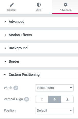
Important: the logo on the left needs to be in the same column as the nav menu. To accomplish this set the custom positioning to inline, and vertical align to middle. For both the logo and the nav menu element.

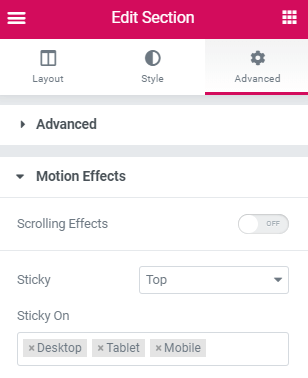
To make a section sticky, go in the advanced options and setup Sticky

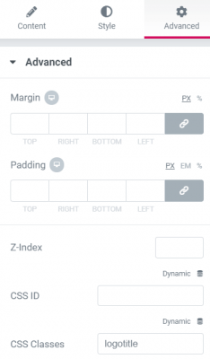
When everything looks right, give the logo image a class name
Here ‘logotitle’ is the class name given to the logo in the Elementor sticky header section.
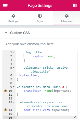
Then, add this code to your page setting CSS
Gear icon in the lower left part of the screen
.logotitle{
opacity: 0;
transition: all .4s ease;
margin-left: -230px; /*adjust this value to the approximate width of your logo */
}
.elementor-sticky–active .logotitle{
opacity: 1;
display:inline-block;
margin-left: 0px;
}
.elementor-sticky–active .elementor-nav-menu a{
font-size: 21px!important;
}
@media (min-width: 768px){
.elementor-sticky–active .elementor-nav-menu a, .elementor-sticky–active .elementor-nav-menu a:focus, .elementor-sticky–active .elementor-nav-menu a:hover {
line-height: 6px;
}
}

Now, the logo will have disappeared
Go back at the top of the page and adjust the elementor sticky header to look exactly the way you want when it is not scrolled down.
