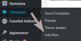

Let's learn how to make an Elementor Mega Menu using only CSS, and 0 extra plugins! It even works with Elementor Free.
To create this Elementor Free Mega Menu (works with Pro too of course!), we will be using a bit of CSS.
Mega menu plugins add bulk to the web page, loads extra CSS and JS files, and requires you to create a template for every sub menu area. Not so with the method shown here!
Very lightweight way to create an Elementor free mega menu, and super easy to maintain: edit everything right in the editor, as you normally would. No separate templates needed.
Fully optional template file where everything is in place already:

Elementor No Plugin Mega Menu Template
This download gets you the following template :
Elementor No Plugin Mega Menu Template
Related tutorial : Elementor Mega Menu Using CSS Only! No Plugins Needed!
Here is a video where Imran uses the new containers instead of sections and columns:
You don't have to watch both videos... either one will do, or just read the instructions below! Whether you use containers or sections, the instructions below are essentially the same.
To begin with, create your Elementor Mega Menu header template
If you have Elementor Free, this tutorial will still work, but you won't be able to create a header template using the Theme Builder. Elementor Pro is required for this.
When it's ready, add a new section, and set it up properly
Set your section layout settings to full-width.
Also set Columns gap to 'no gap', and Vertical align to 'middle'.
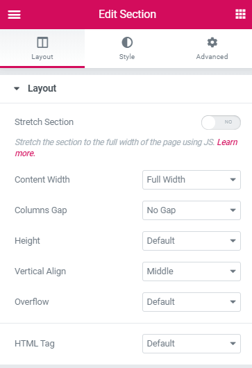
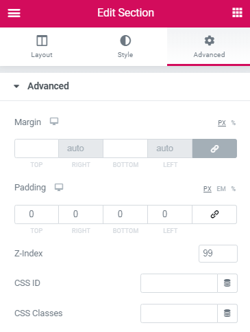
Under advanced, set z-index to 99.
Don't make it sticky yet (if you want it sticky).
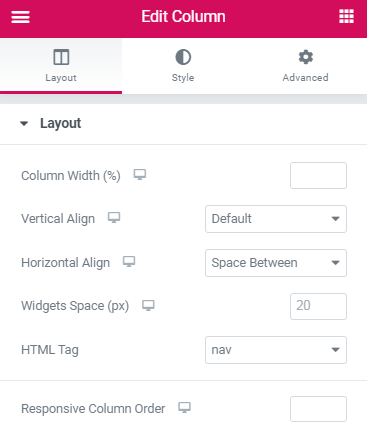
Then, adjust the column settings
There should only be a single column in your section.
Set Horizontal Align to 'Space-between' and HTML tag to 'nav'.
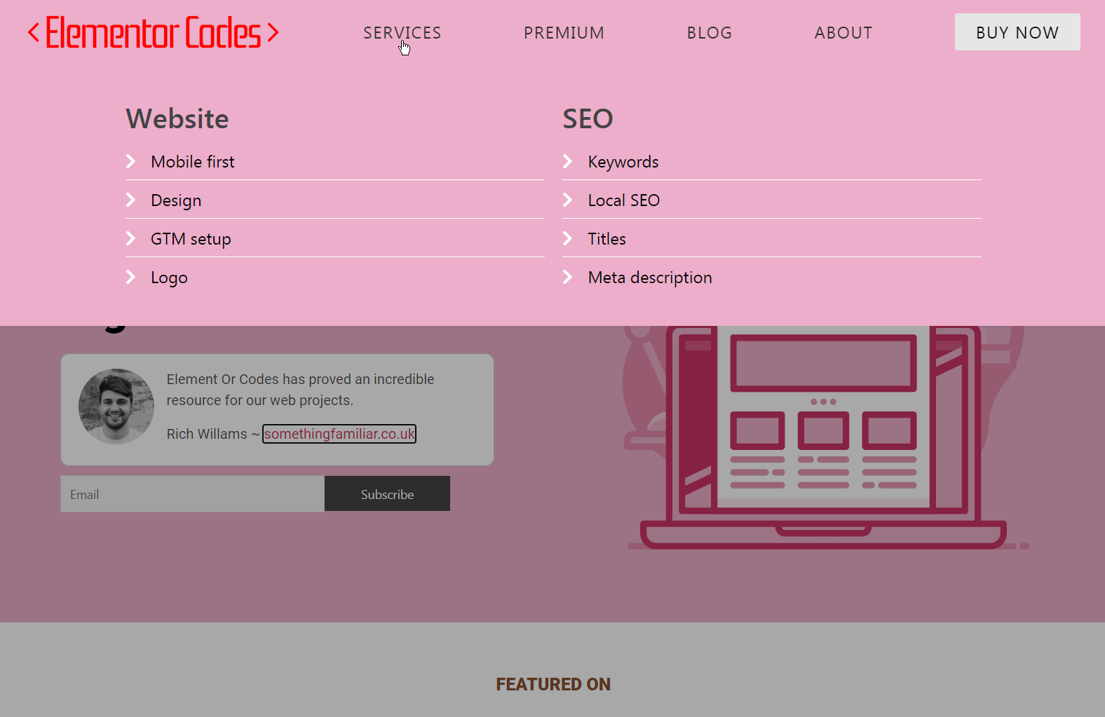
Now, add every element you will want in your Elementor Mega Menu
Just those showing by default for now (without hovering).
I used the image element, heading elements, and a button element.
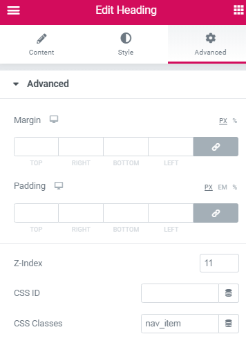
Set them all (under Advanced) to z-index:11 and width: inline (under Positioning).
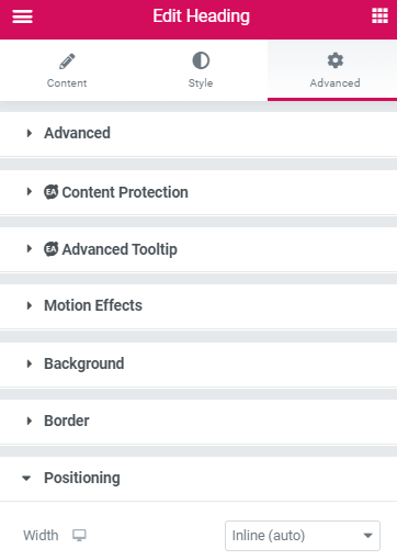
Give the heading elements the class 'nav_item'.
After this, add inner sections to create each sub menu area
When you got everything ready and looking the way you want, add an inner section per 'mega' sub menu that you want.
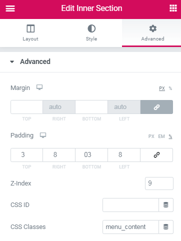
Give them the class 'menu_content'. Also give them a z-index of 9.
Design each inner section accordingly to what you will want to show up on hover.
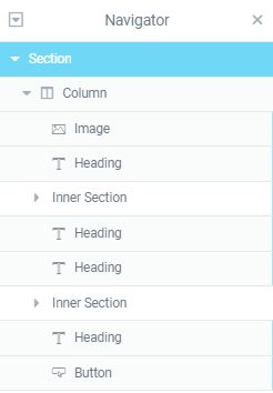
Then, open the navigator and move each inner section
Move each inner section right after the header element that you want the be the 'parent' menu item.
It will mess up the styling of the page a bit, but that will be fixed when we will add the CSS.
For example, your navigator should look like this, if you have two sub menu items like in my demo.
Finally, add the Elementor Mega Menu CSS
Copy paste this CSS in your header template CSS area (if you are using Elementor Pro), or see how to add custom CSS with Elementor free article.
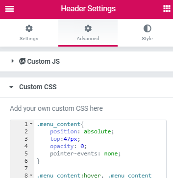
You will see this after clicking the gear icon, in the lower left corner of the editor.
<script>
/* Please login to get the code
 * The code will be for the Elementor Free Mega Menu With No Plugins Needed! tutorial
 * Found at this URL https://element.how/elementor-free-mega-menu/
 */
</script>
Modifications and improvements
See this YouTube Video for a walk through, and better explanations of the CSS.
To add a dark overlay on the rest of the page, while the sub menu areas are opened, add this CSS.
Also remove top and bottom padding that is applied to these 'sub menu' inner sections for better results. Then, adjust the 'padding' value in the CSS to fit your design.
<script>
/* Please login to get the code
 * The code will be for the Elementor Free Mega Menu With No Plugins Needed! tutorial
 * Found at this URL https://element.how/elementor-free-mega-menu/
 */
</script>
To make the nav items stay together, on the top right part of the screen, add this CSS.
Adjust the padding to your liking, to space the menu items in between themselves.
Change the 'nth-of-type' value, in case it differs. You need to enter the first header element position, as seen in the navigator. For example, if you have two logos images before the first header (one for mobile, one for desktop), change the (2) to (3).
<script>
/* Please login to get the code
 * The code will be for the Elementor Free Mega Menu With No Plugins Needed! tutorial
 * Found at this URL https://element.how/elementor-free-mega-menu/
 */
</script>
Let me know if everything works for you!
65 Responses
Thank you so much ! It used to work very well. But for a few days, it has not been displayed in front.It displays well on elementor. So why ?
Hello ! I could not say. I would need to have a look at the page. Did you try the usual, regenerating CSS, refreshing the servers, etc?
Thanks so much! Work great. However, I didn't managed to make it sticky on some pages. Any clue? Best
Hey Marc! I would need to have a look at these pages to know why it might not work there...
Hi, love this post. I have Elementor Pro but the positioning property is not available on colums. Has that changed? Does that change the approach?
Hey Jaap! I'm not certain what you mean here. No changes to the positioning of the column are required for this design!
Figured this one out, no worries
Thank you so much! It works perfectly on my site.However, for some days I've been trying to add animation effects on the dropdown menus. I would love to have the dropdown menus fade in and out when hovered on. The entrance animation won't work and it's been difficult finding the proper css code for it. Could you explain how I could make this work?
Hi! Is it possible, to open the sub menu only on click at the parent menu item?
If you not solved this, just set focus instead of hover and it works fine.
Thomas Hultgren That works yea!
Hi very nice menu thanks! I'd like to, as Mario Depauly say in his comment, have an onclick instead of hover. Is that simple to ad? Thanks in advance.
Indeed, replacing :hover with :focus allows for on click instead of hover, but it might not be 100% reliable in all cases... on mobile in particular, it might cause problems.
If you don't use the mega menu on mobile, then it should be fine!
Hi Maxime, thanks for your awesome content! Question, is it possible to highlight the active menu item? For example, if you click and land on the page "About us", that the according menu item is styled differently? Thanks a lot!
I found a simple hack, for all of you who are interested: just give the menu item an ID and use that ID (for example #about-us) in the CSS on the page you want that specific menu item to look different.
Thanks for sharing!
Hello,
Thank you for this tip. Do you or Maxime know if it is possible to have this CSS on a template section-- not a page itself? I tried this, and put CSS styling for my .nav_menu items which I gave individual classes. Each section then has CSS to change the color of the #id-- for instance, the About Us template section targets #aboutus and turns it blue.
However, all this does it turn ALL of my .nav_menu items blue, no matter which #id is hovered and which template (such as About Us) is visible.
So it looks like adding the CSS to an ID on individual pages doesn't work when you want different IDs to be highlighted depending on which .menu_content section is highlighted. You can really only do it based on the specific page, like Muhjidin said. But what I want to do is show a highlight on the specific nav_item related to the menu_content that is being hovered-- regardless of which page you are on.
What I'd like to do:
--I have a menu with: About Us and Our Services
--If you hover (focus on) the About Us menu content section, the About Us nav item will highlight in blue.
--If you hover over Our Services, the Our Services nav item will highlight blue, etc.
I've tried doing this directly in the CSS provided by Maxime. I tried mimicking the states in the provided CSS (hover, focus, and focus-within). I assigned each nav_item and menu_content a unique ID (for example, #aboutus-nav and #aboutus-content):
____
#aboutus-content:hover + .nav_item, #aboutus-content:focus + .nav_item, #aboutus-content:focus-within + .nav_item {
background-color: #CAE5FF; }
____
^The problem is that this is looking for the closest .nav_item *immediately following* #aboutus-content. Based on the way this menu is set up, that means that hovering over the "About Us" content highlights the "Our Services" nav item. 🙁
Using #ourservices-content just results in nothing, because there are no nav_items after Our Services.
So, I tried specifying the .nav_item with a specific ID as well...
____
#aboutus-content:hover + #aboutus-nav, #aboutus-content:focus + #aboutus-nav, #aboutus-content:focus-within + #aboutus-nav {
background-color: #CAE5FF; }
____
^but, the added specificity doesn't help, because this tutorial has us arrange the nav_item BEFORE the menu_content in Elementor. And the "+" selector is only able to see following elements, not previous elements. Using this second piece of code just results in nothing at all being highlighted in blue, because #aboutus-nav comes BEFORE #aboutus-content
Is there any way to target a previous element?
_________
(It is possibly worth noting that I've used a Shortcode inside of each menu_content section, which calls up an Elementor Template with my mega menu content. This makes it easier for me to let other team members update the menu content-- I just have to tell them to edit the correct Elementor Template, and they won't accidentally mess up all this custom setup from Maxime's wonderful tutorial!)
CC Marketing, great tries...
However, to answer your question:
Is there any way to target a previous element?
No. That's not yet possible with CSS. (Actually, it might be with the new :has selector, however browser support is still low.)
So to achieve what you want here, it's only possible with JavaScript for now.
Cheers!
Is there a way to ad transition to it?
I have tried with transition: opacity 1s
But it doenst work
Hey Ariel!
Yes it's possible. add this:
.menu_content{
transition: 0.3s opacity!important;
}
Cheers!
Hi Maxime, I love your work. I am wanting to create sub menu items from the sub menu ie top level there is a nav menu item of 'courses', when you hover there appears below 4 different course categories in my inner section and when you hover over those I'd like another level to appear below each course category where I can list all the courses in that category.
I have tried by inserting inner sections in the inner sections (which I could do) but I think I might need more code or it needs to be done differently. Any tips?
BTW I have managed to get the course categories to show up perfectly using your method 🙂
Hey Gemma!
Yes I think you might need a little bit more code to make this work fine for another level. Generally the code should still work by following the exact same setup, however the 'top' value for example will need to be changed for these sub sub navs.
try adding this css, and adjusting the top value to fit your needs:
.menu_content .menu_content{
top:247px;
}
Hi,
Great tutorial, works fine and save me a lot of speed adjustment to make on the regular mega menu addons.
I have used it in mobile as well, made an icon as the "nav_item".
Is it possible to close the mega menu on second click of the icon? as in regular menu..
or make a "close" button?
Hey Or!
Yes it's possible, however outside the scope of this tutorial. At some point I might make a premium version where mobile will be considered. For now it's a 'desktop only' design!
hi Maxime, can you please update the version to container ?
thanks allot!
Hello,
I have two questions:
1) Will this still work with a section ABOVE the menu in the header template? In our use case, we want to have a "top section" stacked on top of the menu, containing our social links and our phone number. Then, the section section would have the menu.
2) If this is for desktop only, as mentioned in one of the comments above, how do you suggest handling mobile viewers?
1. Yes it will
2. That's up to you... you could use the default Nav element from Elementor on mobile, or a popup.
Hello,
I do have one new question. Is there a way for the navigation text (the header elements with class nav_item) to change color on hover and once clicked? I've tried targeting .nav_item without luck.
Hey Catholic!
Yes, you need this selector :
.nav_item.nav_item:hover a
So for example to make it white on hover, you have this:
.nav_item.nav_item:hover a {
    color: #fff;
}
Be aware though that it won't stay the color you give it when you will be hovering the sub menu...
Hi Maxime, thanks for putting this tutorial together - it's great! I had a quick question about this guide (https://elementor.com/blog/shrinking-sticky-header/) - I tried the method prescribed to create a shrinking sticky menu with this mega menu and while the logo shrinks, the rest of the menu section remains the same height. Any ideas?
Hey!
Yes indeed, that would happen with the way this is coded now. To have a shrinking header along with this mega menu, a bit more coding work would be required to change and animate the height of the nav_item items... Then the menu_content sections would need to have their top value adjusted... and there might be a few more changes required as well.
A bit beyond the scope of this tutorial so I won't code and test this all out. It would rather be custom work, you can message me if interested.
The issue I am having with this nav feature is that when I want to select a link or button that is on the far left and the far right of the menu content, the drop down fades out.
Any suggestions?
Hey Christopher!
Here are a few suggestions:
Bring your sections even closer up to the trigger Headings, so that there won't be an hover off event.
Alternatively, change your design in another way so that the user's mouse has to enter the sub mega sections first.
To fully prevent this, JavaScript is required, and this specific tutorial is meant to use CSS only.
Great tutorial, and works with flexbox.
One question, I've made the nav items open up the content on click using :focus instead of :hover. To make it work, I had to leave the # in the link-input. The problem here is that that page scrolls to the top and the URL gets the ugly #. Any ideas of a workaround?
Hey Alexander!
Try this: for the nav items, go under Advanced > Attributes , add : tabindex|0. Then remove the # in the link field.
Let me know if that works!
Wow! You are awesome. Made my day. Wanna get married? xD
Trying to add a scale animation... Not working. Any ideas of why?
.menu_content{
animation: growOut opacity 0.3s ease-in-out forwards;
transform-origin: top right;
transition: 0.3s opacity!important;
}
@keyframes growOut {
0% {
transform: scale(0)
}
80% {
transform: scale(1.1)
}
100% {
transform: scale(1)
}
}
I'm using the new Elementor Flex Box and there are no such thing as inner sections or columns any more. Could it still work?
Hey Anders!
I added Imran's video to the tutorial, and in short, yes it works with the flex containers just fine too!
Works like a charm! Thanks.
I've used both the sections and the new container. It works quite well In both. My only issue is that the mega menu stops working after a while. No edit or alteration. It just stops working.
I've had this across multiple websites. I am forced to use popups as my mega menu for now. It would really be nice if one could help out with why the CSS stops working all of a sudden - usually within a month.
Dear Maxime hi.
I have beet enjoying your mega menu instructions for quite some time now. Thank you very much. I am using it in my ango.gr website. I have one question if you please. How can I make the mega menu work on click and NOT hover on the button ?
Thanking you in advance
Georgios Greece
:focus is the magic word.
Sorry to trouble you but I noticed it in the comments after I read them all.
I can confirm that it works fine
Georgios
Thank you Georgios!
Dear Maxime the more I get into this the more inovative I get. Is there a way (using the click instead the hover mode) to click open AND click close way?
Kind regards
Georgios
Sorry Georgios this isn't possible. We would require JavaScript to close the sub nav on click, and this tutorial's intention is to use CSS only.
Thank you Maxime - one last try. Is there a way in the hover status to delay few milliseconds the opening ? i.e. when hover upon the button to open the mega menu, that hovering delay few milliseconds. Thanking you in advance.
Hey Georgios!
Add this CSS:
.menu_content{
transition: opacity 0.3s 0.2s;
}
Adjust the 0.2s to your preference!
Dear Maxime thank you. I have added the code you gave me at the end of you magic css but it did not worked !
Best regards
Georgios Greece
Hey Georgios!
Try this instead:
.menu_content.menu_content.menu_content{
transition: opacity 0.3s 0.2s;
}
Let me know!
Dear Maxime thank you very much for the reply.
I can now confirm that the new css script is working well.
Thanks again
Georgios
Hi Maxime,
Thanks for this awesome article. I used it for my website pidz.nl
I want to make the mega menu work on click and not on hover. I tried to change :hover to :focus but then the mega menu is not working anymore. Not sure what I am doing wrong.
Lucia
Greetings Lucia!
For :focus to work properly, you need to do the following:
For the nav items, go under Advanced > Attributes , add: tabindex|0 then remove the # in the link field, if you had it there.
Thanks Maxime for your reply.
I added the tabindex to the nav item 'hamburger icon', which seems to work. Menu is now showing up on click. When I am using safari as browser then I the links of the sub menu items are no longer working. Is this common? In chrome everything is working perfect.
Lucia
Greetings Lucia!
Do you have the same issue in my demo page here: https://templates.element.how/elementor-no-plugin-mega-menu-template/
or here : https://templates.element.how/elementor-no-plugin-mega-menu-containers-template/
Please let me know!
Hey and thank you for the awsome tutorial. I created a mega menu with anchor links. I would like to know is there a way to add jQuery I guess to close the menu (make it opacity:0 again) when clicking on an anchor link in the same page? right now I need to click again somewhere in the page to close the menu. Thanks in advance!
Hey Nicky!
Yes it would be possible with JS, however this particular tutorial's intention is really to be about a CSS only mega menu...
Starting to add JS to show/hide would change things significantly...
Hi Maxime,
How can we change the fade in effect of mega menu into slide in down?
Hey Lucas!
Try this code, instead of the code provided in the tutorial:
.menu_content {
    position: absolute;
    top: 47px;
    opacity: 0;
    pointer-events: none;
    transform: translateY(-100px);
    transition: opacity 0.4s, transform 0.4s !important;
}

.menu_content:hover,
.menu_content:focus,
.menu_content:focus-within,
.nav_item:hover+.menu_content,
.nav_item:focus-within+.menu_content {
    opacity: 1;
    pointer-events: visible;
    transform: translateY(0);
}

.nav_item {
    display: flex;
    align-items: center;
    height: 76px;
}
Cheers!
Hi, Maxime! Thanks for the code,
I've tried your code, When I applied css and declare class name "menu_content" to menu item, it does the opposite. It "slideOutUp".
But when we hover over the mega menu it need to "slideInDown".
Can you please help me with that?
Thanks in Advance!
Greetings Lucas,
You don't need to add or remove any class name compared to what you had before... just swap the CSS with what I provide.
The CSS is tested working. On hover of menu item, the content fades in down. On hover off, the content fade out up.
Cheers!