How to Create a Netflix-Like Elementor Horizontal Scroll Section
No extra plug-ins required! Elementor Free Compatible.
This is how you can easily create a smooth horizontal slider that doesn’t automatically skips to the upcoming item. A la Netflix.
This particular tutorial will work the normal image element. It will also work with most other ‘plain’ elements, like icon, image and icon boxes, video, even inner sections.
It will not make an image carousel change it’s behavior though. Just use many image elements, as in the example below.
If you want to save yourself some trouble, just download the template, and swap the content with yours!
Although you will want to read through, to understand how it all works.
Elementor Netflix Like Horizontal Scroll Section Template
This download gets you the following templates :
Elementor Netflix Like Horizontal Scroll Template (Old Sections)
Elementor Netflix Like Horizontal Scroll Template (Containers)
Related tutorial : Elementor Netflix Like Horizontal Scroll Section
Exclusive features when you get the downloadable template:
- You get a 'section' version, and a 'container' version of the template.
- You get Elementor Posts element compatibility
- You get Elementor Basic Gallery compatibility
- You get Elementor Pro Popups compatibility

Sections can be set to full width for a more seamless look.
Lorem ipsum dolor sit amet, consectetur adipiscing elit. Ut elit tellus, luctus nec ullamcorper mattis, pulvinar dapibus leo.
Lorem ipsum dolor sit amet, consectetur adipiscing elit. Ut elit tellus, luctus nec ullamcorper mattis, pulvinar dapibus leo.
Lorem ipsum dolor sit amet, consectetur adipiscing elit. Ut elit tellus, luctus nec ullamcorper mattis, pulvinar dapibus leo.
Lorem ipsum dolor sit amet, consectetur adipiscing elit. Ut elit tellus, luctus nec ullamcorper mattis, pulvinar dapibus leo.
Lorem ipsum dolor sit amet, consectetur adipiscing elit. Ut elit tellus, luctus nec ullamcorper mattis, pulvinar dapibus leo.
Lorem ipsum dolor sit amet, consectetur adipiscing elit. Ut elit tellus, luctus nec ullamcorper mattis, pulvinar dapibus leo.
Lorem ipsum dolor sit amet, consectetur adipiscing elit. Ut elit tellus, luctus nec ullamcorper mattis, pulvinar dapibus leo.
Lorem ipsum dolor sit amet, consectetur adipiscing elit. Ut elit tellus, luctus nec ullamcorper mattis, pulvinar dapibus leo.
Lorem ipsum dolor sit amet, consectetur adipiscing elit. Ut elit tellus, luctus nec ullamcorper mattis, pulvinar dapibus leo.
Lorem ipsum dolor sit amet, consectetur adipiscing elit. Ut elit tellus, luctus nec ullamcorper mattis, pulvinar dapibus leo.
Lorem ipsum dolor sit amet, consectetur adipiscing elit. Ut elit tellus, luctus nec ullamcorper mattis, pulvinar dapibus leo.
This one is 3 columns, icon with 'leftarrow' class in the first column, middle column has class name 'horizontale', third column is the icon with the class name 'rightarrow'.
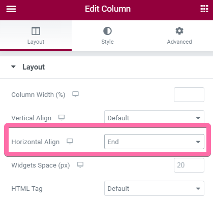
To center the left and right arrows, use the column 'vertical align' and 'horizontal align' settings.
You will understand all these instructions after going through the tutorial.
This is the heading
Click edit button to change this text. Lorem ipsum dolor sit amet, consectetur adipiscing elit. Ut elit tellus, luctus nec ullamcorper mattis, pulvinar dapibus leo.
This is the heading
Click edit button to change this text. Lorem ipsum dolor sit amet, consectetur adipiscing elit. Ut elit tellus, luctus nec ullamcorper mattis, pulvinar dapibus leo.
This is the heading
Click edit button to change this text. Lorem ipsum dolor sit amet, consectetur adipiscing elit. Ut elit tellus, luctus nec ullamcorper mattis, pulvinar dapibus leo.
This is the heading
Click edit button to change this text. Lorem ipsum dolor sit amet, consectetur adipiscing elit. Ut elit tellus, luctus nec ullamcorper mattis, pulvinar dapibus leo.
This is the heading
Click edit button to change this text. Lorem ipsum dolor sit amet, consectetur adipiscing elit. Ut elit tellus, luctus nec ullamcorper mattis, pulvinar dapibus leo.
This is the heading
Click edit button to change this text. Lorem ipsum dolor sit amet, consectetur adipiscing elit. Ut elit tellus, luctus nec ullamcorper mattis, pulvinar dapibus leo.
This is the heading
Click edit button to change this text. Lorem ipsum dolor sit amet, consectetur adipiscing elit. Ut elit tellus, luctus nec ullamcorper mattis, pulvinar dapibus leo.
This is the heading
Click edit button to change this text. Lorem ipsum dolor sit amet, consectetur adipiscing elit. Ut elit tellus, luctus nec ullamcorper mattis, pulvinar dapibus leo.
Works with the Posts element, with some extra CSS (exclusive to template customers)
Elementor Tabs And Accordion Opening On Scroll
In this tutorial, I will show you how to toggle open and close the Elementor Tabs and the Accordion elements, by scrolling the page normally.
Elementor Circular Arc Carousel Premium Design
In this tutorial, I will show you how to create a circular cards carousel with Elementor Pro. The cards are forming an arc pattern. See
How To Use WooCommerce JavaScript AJAX Events
In this tutorial, you will learn how to use WooCommerce’s AJAX events to improve user interactions. Depending on your setup, and on the event in
Elementor Sequential Cross Fading Images Mosaic Gallery
In this tutorial, I will show you how to create an Elementor gallery of images that are sequentially fading in and out, one at a

Elementor Text Wrap Around Image (Free Template)
In this tutorial, you will learn how to wrap text around images with Elementor. This also works to wrap Elementor featured images around post content.
Simple Elementor Copy Text And Link URL To Clipboard Button
In this tutorial, you will learn how to add a copy paste button to Elementor Heading and Text Editor elements. This button will allow users
How To Use Crocoblock JetSmartFilters JavaScript Events
In this tutorial, I’m going to show you how to use JetSmartFilters Events to run your own code after a filtering event. This tutorial works
Elementor Tabs Closed By Default and Make Closable (2024)
In this tutorial, you will learn how to close the Elementor tabs by default, on mobile and desktop, on page load. You will also learn
Elementor Animated Story Line Premium Design
In this tutorial, I will show you how to add an animated line that goes from element to element, across your entire Elementor page. With

Showcase Your Websites in a Live Responsive Previewer
In this tutorial, I will show you how to very easily open any link (probably to a portfolio website) in a live, responsive iFrame preview.
Elementor Horizontal Navigation With Optional Hover Image Change
In this tutorial, I will show you how to create an Elementor horizontal navigation menu with some custom CSS. You will also learn how to
Elementor Trendy Carousel With Floating Tags
In this tutorial, I will show you how to create this trendy kind of Elementor carousel where there are little tags or labels here and
Works with the Basic Gallery element, with some extra CSS (exclusive to template customers)
Even works with containers directly as horizontal scroll content, so you can truly make anything scrollable.
WooCommerce Integration
Elementor Pro allows you to seamlessly integrate with the WooCommerce platform to create a functional store for your business.
- Create your single product pages
- Create your product archives pages
Powerful Animations
Bring your site to life with the powerful animations features on Elementor pro.
Create a parallax scrolling effect, or wow your readers with the horizontal scrolling and 3D tilt as they navigate your pages.
Or, as on this page, use great Lottie animations.
Elementor Pro Popups
Do you want to take your marketing a notch higher?
The Popups feature allows you to achieve precisely that.
Grab your readers’ attention with the sleek and functional popups on Elementor Pro. You can even integrate the popups with your other marketing tools for even better results.
Amazing Theme Builder
Get the power to create everything on your site, right from the header, to the footer, and everything in between!
Seamlessly edit and create new archives templates, single posts designs, even 404 pages!
Powerful Forms Creator
Every smart marketer knows what great power lies in forms.
With the powerful forms creator, you can easily integrate marketing tools such as MailChimp, HubSpot, ConvertKit, and Zapier (amongst others), to make your campaign even more effective.
Important: the slight layout shift you see in my examples (those with only images), when scrolling to the right, is because of how image lazy loading is implemented on this website. You will see in the template here that the behaviour is much better (no layout shift).
On your website, simply select a lazy loading that accurately calculates the image sizes to avoid this layout shift. It will also prevent other bugs such as anchor links scrolling to the wrong place.
The above isn’t exactly what you are looking for? Check out this related premium tutorial:
Elementor Full Screen Horizontal Scroll on Scroll Containers
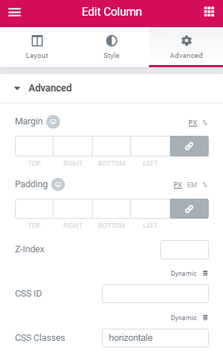
To begin with, create a new section with one column, and give that column the class ' horizontale '
Unless you want the arrows to be to the left and right of the horizontally scrollable column (as in one of the demos above).
In this case, add 3 columns, and add the class name ‘horizontale’ to the middle column. You will then add the arrow icons in column 1 and 3.
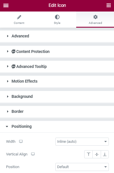
Then, add all of your elements in that column. Set custom positioning to 'inline' for every element.
Under the Advanced tab of each element.
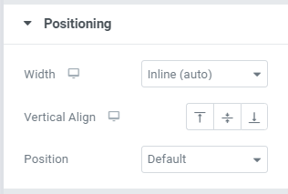
Note for inner sections: I added the code needed right in the CSS. No need to modify anything related to Positioning for them.
You will need to set specific width for the images, when set to inline. (Under the Style tab).
It might look better if they are all the same size. You can give these images a link.
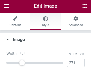
For most other elements, you will also need to specify their width, by adding this CSS under Advanced > Additional CSS.
<script> /* Please login to get the code * The code will be for the Create a Netflix-Like Elementor Horizontal Scroll Section tutorial * Found at this URL https://element.how/elementor-horizontal-scroll-section/ */ </script>
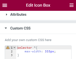
Important: Space your elements appart from each other using the margin setting, under Advanced, for each of them.
If you have elementor free, give your elements a class name, and use this code instead. More information in the Elementor Free custom CSS tutorial.
<script> /* Please login to get the code * The code will be for the Create a Netflix-Like Elementor Horizontal Scroll Section tutorial * Found at this URL https://element.how/elementor-horizontal-scroll-section/ */ </script>
Or even better for free users, or those who want this whole design as simple as possible, just fill your ‘horizontale’ column with inner sections, then add what you want there. It is just more simple that way.
After that, add a section right below the horizontal section, and add your arrow icons in it
Choose the icons you want. Give your left icon the class name ‘leftarrow’ , and the right icon the class name ‘rightarrow’.
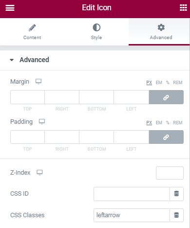
Set both icon Position to Inline, then you will be able to use the column ‘Horizontal Align’ setting to position them.
Finally, add this code in an HTML element on the same page
For sections and columns
<script> /* Please login to get the code * The code will be for the Create a Netflix-Like Elementor Horizontal Scroll Section tutorial * Found at this URL https://element.how/elementor-horizontal-scroll-section/ */ </script>
For containers
In the case of containers, instructions are the same, except the class ‘horizontale’ is added to the container element.
Only thing to be careful about is that the container needs to be set to full width. If you need it boxed, just add it inside a boxed container.
<script> /* Please login to get the code * The code will be for the Create a Netflix-Like Elementor Horizontal Scroll Section tutorial * Found at this URL https://element.how/elementor-horizontal-scroll-section/ */ </script>
Code is heavily modified and adapted from this codepen.
The code is commented out with all kind of useful information to style this the way you want! Read through it, and tune it to your needs!
This design will work for desktop and mobile. If you want to use this only for a mobile section, use the CSS below instead of the code above.
Note that with this mobile-only code, the arrows won’t work.
@media (max-width:1024px){
.horizontale > div > div > div {
flex: 0 0 auto;
width: max-content;
}
.horizontale > div > .elementor-section {
min-width: max-content;
}
.elementor-widget-wrap .elementor-element.elementor-widget__width-auto, .elementor-widget-wrap .elementor-element.elementor-widget__width-initial {
max-width: unset;
}
.horizontale > div > .elementor-section {
min-width: 100vw;
}
.leftarrow, .rightarrow{
cursor: pointer;
line-height: 0;
}
/* Remove default browser :focus styling */
.leftarrow:focus, .rightarrow:focus{
outline:0;
}
/* Replace focus styling with this for accessibility */
.leftarrow:focus .elementor-icon, .rightarrow:focus .elementor-icon {
transform: scale(1.04); /* Size of arrows when :focus state is active */
color: #000; /* Color of arrows when :focus state is active */
}
.horizontale > div {
display: flex;
flex-wrap: nowrap;
overflow-x: scroll;
-webkit-overflow-scrolling: touch;
-ms-overflow-style: -ms-autohiding-scrollbar;
cursor: grab; /* Change to unset to have the normal cursor */
}
.horizontale > div::-webkit-scrollbar{
height: 14px; /* Change to 6px to make the scrollbar smaller, or to 0 to remove it */
}
.horizontale > div::-webkit-scrollbar-track{
background: rgba(0, 0, 0, 0.1);
} /* Color of scrollbar track */
.horizontale > div::-webkit-scrollbar-thumb{
background: rgba(0, 0, 0, 0.31);
} /* Color of scrollbar thumb */
.horizontale > div.active {
cursor: grabbing; /* Change to unset to have the normal cursor when mouse button is clicked down */
cursor: -webkit-grabbing; /* idem */
transform: scale(1.01); /* Size of elements when mouse button is clicked down */
}
}
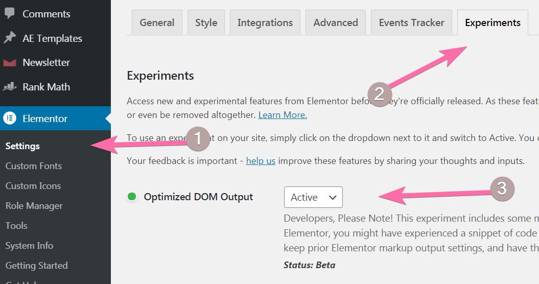
If for some reason the code is not working, you might have the older DOM from Elementor 2.x
You can verify here if that is the case… if you see ‘default’ or ‘disabled’ there, it probably is. Change to ‘Active’ for the code to work. Be aware though that it might break some other custom code elsewhere on your website.
Et voila! Thanks for reading!
Let me know if you need help!
Special thanks to Darrell Johnson for sponsoring this tutorial!
Checkout his website, Where Hip-Hop Lives around the World.






Any chance of making this infinite?
It would be possible, but that is kind of not the point of that design... which was to get something different than what other elements already offer... and it would not play well with the horizontal scrolling bar (it would stay in the middle) ... if you want looping, go with the Elementor free and pro elements!
I would like to make this infinite as Elementor's version doesn't allow me to place dynamic links on the images in the slide. This is the whole reason I'm using this solution. Any idea to make it infinite?
Sorry, this is not possible with that design. You are better using a slider in these cases. As for dynamic links, yes it makes it more complex. I could code a solution that would function the way you want but it would require some work. You can message me if interested.
Hello, i can't make it work.
Elements auto adjust their width to fit the section. I can't get overflow.
Did you set the Custom Positioning of every element to 'Custom Width' , and then gave them a PX value? Is the CSS you added (form my code) being applied?
Maxime Desrosiers hello sorry for the late answer. I finally designed my page in an other way but I'll check your recommandations.
Thank you.
I can get it to work on desktop and for it to view on mobile in the elementor preview on mobile but actaul mobile doesnt work.
I can help you! would you have a link to the page where you tried to implement this so that I can inspect and see what's the problem?
Maxime Desrosiers thanks, I got it to work in the end just had to play with it a little bit. Thank you so much, awesome guide!
Mick Hoyer-Smith great! glad to hear this!
Hi Maxime
can it be used with woocommerce? I mean product thumbnails?
yes, there should be no problems!
Maxime Desrosiers
Thanks..
Is it possible to add navigation arows ?
Sasa Maric unfortunately, not really... I would have to code that in!
This is great, thanks. Would be great if you could give me a hint how to make the elements centered in case they all show. I have a site with 3 fields only and want them to scroll on mobile. On desktop they all show, so I do not need the scroll and they should center. Currently they left allign and its seams to overwrite the section settings
Hello Alexander! There is no simple way for this. You will have to either code it all in CSS, or create a new section for the desktop version!
This is amazing. Thank you very much. It is really simple to make it centered. All you have to do is select the column, go to Layout -> Horizontal Align and select Center.
I'm glad you enjoyed the tutorial!
Waiting instructions for arrows 🙂
Me too.
Krisha Collins It's here now!
Hi, everything is there but the scrolling does not work. I made sure to put the class as horizontale, I input the css in the same element text, and set the width to custom. Any idea why the scrolling won't work?
You place the class on the column, and not the section? (comon error) , If Yes, and it is not working, I would need to see your page to know more about this and find the problem. You can message me by messenger.
Hey when will you show us how to create the arrows to move the carousel left or right?
This is fantastic - was exactly what i was looking for.
Arrows appreciated...and friends: Use the "column" section for the class-name 😉
I am setting this up on a new page, but it does not work fine.
The elements aren't in a horizontal arrangement - they are vertically alligned.
Scrollbar is visible and it seems to use the HTML code properly. DOM is active.....could you help?
I found the answer in your other comments: Custom Positioning and a defined with was the solution to make it work. Thanks man!
What's your page?
Shit, not completely solved: The Elements are alligned horizontically now, but each element got its own slider. If there are more element, than the viewport allows, they break to the next row.
Can you make this for columns so that we can have column content to be sliding like this?
I'm also looking for this, awesome tutorial!
Hi, can you help make it work on http://www.ilovecostabrava.es ? only mobile, seems to be working only if i edit the widht of the second and third image to less than the first...
I helped Gala get this working in private... and I added a part to the article for the fix for those who are not yet using the optimized DOM output. See the end of the article...
This is great and very usefull!
However, I can make it work for dsktop to mobile, the mobile only doesn't work for me. The images got stacked.
Anyway, I like the first method the most.
I added something. I had only 6 icons and on desktop they were all visible but the were left aligned on desktop.
I added margin: 0 auto in the first CSS rule to center them, looks much better 🙂
Thanks Frank! I might need to update the code for mobile only... This code was working many updates ago, haven't verified since then.
This whole article needs an update soon. I actually found a better way to make this, with a bit different code, that allows for different width inner items, and for the arrow navigation... coming soon hopefully.
Article is now updated!
Hello, I'm trying all the ways but it don't show the elements in the same line, already checked all the things to do but elements after elements are not in the same line for the scroll. Can you please help me understand why? Thanks ????
Share your page URL with me, I will have a look!
Doesn't work with iOS mobile devices. Do you have a fix for this?
Just tested, seems to be working fine. What exactly is not working?
Thank you so much for this tutorial! Can you explain how to do this for a blog posts archive please?
I'm also looking this carousel design for blog posts, Hope he will figure out that also.
Thank you very much. This was very helpfull and I love the results!
But still, I have a question. Why is the last element 'falling' down approximately by 19px? I just cant figure that out.
I don't know! Would need to see the page...
how to remove the gap at the bottom and fit it to the height content of element without space in the bottom content
The space in some of my examples is caused by lazy loading the images. To prevent this, use a lazy loading that calculates the right size of the images, such as Rocket Lazy load. https://en-ca.wordpress.org/plugins/rocket-lazy-load/
problem has been solved, the cause is because I added a
tag for custom text in the description of the image box content. thank you for the response
Hi! That was working to me until yesterday, I update for the last version of Elementor (also activating 'optimized DOM output). I'd like to know if there is something I can do. Thank you!
I don't know why it stopped working. I would need to see the page!
Maxime Desrosiers also me! the samething... i have updated Elementor and it stoped to working 🙁
Francesco Caruso Change
.horizontale > div > div > div > div
at the start of the code, to
.horizontale > div > div > div
Thank you! The code worked perfectly. You are an amazing developer!
I'm using inner sections within the horizontale column, and they just show up stacked on top of each other. How would I make these inline in order for the scroll to work?
Hey Tamara! I would need to see your webpage where you are testing this out... Share it here, or by private message, if you prefer!
Hi thanks!!! It works perfect. Any possibility to add "scroll-snap-type: x mandatory;
"to get the slider effect
Hmmm I'm noot certain what you are asking here
Hi! I did this, used inner sections inside the horizontale column, and used the CSS (only wanted the resource in mobile view). However, although it does work to make it horizontally scrollable, the height of the columns inside the inner sections is wrong, it compresses the content. Can you help me?
What's your URL?
Hi Maxime,
Thanks for this tutorial.
I'm usually good at this but I honestly don't know what to do with the CSS for mobile version only.
Where do I put it? Do I still need the HTML widget and change the CSS code in there?
I think this part of the tutorial is not very clear.
Thank you for your help!
(Maybe some screens of the whole page would help to understand where to put elements and which ones exactly. Because between section/column/element, it can be a bit confusing).
Hi again,
I finally managed it. But I still have an issue.
I have one big image that I cut in 3 so I put them in 3 Image widgets to reform the big image. I set all of them "in line", and now the slider starts on the second image and won't slide left, so I see the image on the middle and the one on the right but not the one on the left.
I want to keep the starting point on the middle image but I'd like to be able to slide left and right from this starting point.
Yes, me again.
I'm sorry for this 😉 (we can't edit comments so I have to post a new one).
So, the starting point on the middle image was because I set the column to centered horizontal alignment. Now that I set it back to default, I see the 3 images starting from the left one.
But I'd still like to start from the center and be able to scroll left and right.
Thanks!
Hi man, thanks a lot for your work.
Question: I've placed some CTA within the column. I've used the CSS you mentioned for the width. But even though, it doesn't work properly on the front-end. They are super wide. Do you have a trick?
thanks
http://www.borasurfar.pt
They look perfect to me ! Looks like you solved this already!
Hello, I'm also having the same problem as Tamara above. I'm using inner sections and for mobile view the columns stack on top of each other. Is there a fix for this?
Hey Chris! Thank you for your purchase of the template!
Yes, this can be fixed. Add this CSS, right before the closing tag. Change the '900px' values to the width you prefer for the inner sections on mobile.
@media (max-width:767px){
.horizontale > div > .elementor-section.elementor-inner-section{
width:900px;
min-width:900px;
}
}
You will also need to set the column width to the value you want, on mobile. Go to your inner sections Column Settings > Width > Mobile viewport, enter the % required. By default Elementor makes all columns 100% on mobile, so they will stack up. Change to 50% if you have two equal columns, 33% for three, etc.
This code worked great. Thanks Maxime!
Hello, can I make this work for dynamic contents such as Elementor's post widget? How would I go around achieving that as the posts are usually displayed in a grid. I understand that I can use some plugins for dynamic post carousel, however most of them doesn't have the smoothness when scrolling like this solution.
Hey! Add this code under Posts > Advanced > Custom CSS to make this work with the Posts elements
selector .elementor-grid{
grid-auto-flow: column;
}
selector .elementor-grid article {
width: 360px;
padding: 30px;
}
Hey Maxime,
Thank you, I made it work somehow by changing the grid view, but I will try your solution as well. Thank you for taking the time to respond, appreciate it. =D
Fantastic tutorial! Thanks! Can you help with how it is possible to have more than one slider on same page?
Simply follow the exact same instructions, for another column, in another section!
Except the part about adding the code to the page... it's only required one time on the page!
Wauw! Fast reply! thanks! Done it, and works perfectly! Awesome 🙂
Hello 🙂 Thank you for your work. This article and code was really helpful 🙂
Unfortunately my arrows don't work :<
Any suggestions on what might have gone wrong? 🙂
Also, the grabbing on computer doesn't work :<
Today I tried to do it again and followed everything step by step. It turned out that last time I pasted the whole code into the CSS in the "advanced" tab of the page and not in a HTML element as it was in your instructions. My mistake 🙂
But I have a question. Is there a way to set the Scroll Amount the way that it scrolls to the next element? I know I can just set the scroll amount to the same px that is my element width, but I have different width for desktop and mobile.
That would be helpful for displaying kind of a slider with posts from one category on mobile version. The post would be 100% width of the screen (or almost) and I'd like the arrows to display the next post.
Is it something that can be done?
Also, is there a way to set different scroll amounts for the desktop version and mobile version? 🙂
I really appreciate you take time to answer our questions <3
Hey Kinia!
`That would be helpful for displaying kind of a slider with posts from one category on mobile version. The post would be 100% width of the screen (or almost) and I'd like the arrows to display the next post.`
I added the code for exactly this! Just grab the code from the tutorial again,and it should work as you want.
Cheers!
It works perfectly. Thank you! <3
Welcome!
Thank you for the tutorial, it works great! I am using it with Woo Products, and I am getting a vertical scrolling line. Do you know what could be the issue here? Thanks!
http://sitebankp9.sg-host.com/
Hey Atila!
Add this CSS it fixes it!
.horizontale > div {
padding: 20px!important;
}
Thanks a ton, Maxime!
How can I hide the scrollbar and get it to appear when I hover over the image or scroll the images?
Hey Chris!
In the code provided, you will find:
.horizontale > div::-webkit-scrollbar-track{
background: rgba(0, 0, 0, 0.1);
} /* Color of scrollbar track */
.horizontale > div::-webkit-scrollbar-thumb{
background: rgba(0, 0, 0, 0.31);
} /* Color of scrollbar thumb */
Replace with:
.horizontale > div::-webkit-scrollbar-track{
background: rgba(0, 0, 0, 0);
} /* Color of scrollbar track before hover */
.horizontale > div::-webkit-scrollbar-thumb{
background: rgba(0, 0, 0, 0);
} /* Color of scrollbar thumb before hover */
.horizontale:hover > div::-webkit-scrollbar-track{
background: rgba(0, 0, 0, 0.1);
} /* Color of scrollbar track on hover */
.horizontale:hover > div::-webkit-scrollbar-thumb{
background: rgba(0, 0, 0, 0.31);
} /* Color of scrollbar thumb on hover */
Thank you Sir!
Welcome!
Hi,
This worked beautifully for elementor posts, is there some way to get it to work for addons as well? Such as ultimate addons elementor?
I tried to adjust the CSS code but with no luck;
selector .uael-post_body{
grid-auto-flow: column;
}
selector .uael-post_body article {
width: 360px;
padding: 30px;
}
Currently it creates the scroll, but keeps the layout in a grid format.
Thanks
Indeed, with the right CSS it should work for addons as well. However I can't rework the codes provided in my tutorials for every addon out there! That would rather be custom work, you can message me if interested. Cheers!
Thank you, completely understand. I'm having some trouble with the arrows however for elementor posts, I can only get them to work in the desktop responsive mode, and they scroll very little when clicked on. But the scrollbar works really well. Can you please help?
Hey Maxime!
When I change the horizontale > div overflow setting to hidden, Everything becomes unclickable. I would simply like to show part of the next items on the right while keeping the section content boxed. I've done this in the past with overflow-x: visible. Thanks!
Hey Brian!
It won't work in this particular case... overflow has to be set to 'scroll', otherwise, well, it will just overflow, and not scroll!
You probably did this with a slider, where this was working... But with this design here it won't really work.
Instead, you will need to have a left padding, and have the rest be essentially full width. That will replicate what you are after!
So just make it full width, and add this CSS. The selector might need adjustment...
.horizontale > div {
padding-left:calc( ( 100% - 1140px ) /2 );
}
Hi and thanks for this wonderful code. i was looking for a solution to have all the images of my website in a horizontal scroll widget to give the viewer a quick overview of them.
But is it possible to have a horizontal section with a gallery so i dont have to put the images inside one by one and also have a lightbox where you can click from one image to another.
Good idea. I added this, exclusively for the customers of the template!
Just a big "thank you" for this article! It has saved me a ton of time!
Hi Maxime, first of all thank you for the code snippets. Working nicely except that I have 5 collumns inside and at first sight there are 4 and halth visible. I'd like to see 3 and a half columns and 4th and 5th one reveals only when actively scrolling to right side. Which part of the code do I need to alter? Any hints?
Cheers and thank you
Forgot to mention I work with inner-section. My problem seems to be related with the column width not being able to set as high as I want since it calculates 1400 content width / 5 columns. In an ideal scenario each column would be around 400px width, which elementor kindly ignores, since it tries to fit it all in. Any ideas?
This is how my custom class for each column is defined:
.appartementbox {
max-width: 416px !important;
margin-right:30px;
}
develop.knappaboda.com/wohnen/
solved it!
you need to clarify one needs one inner-section for each column one wants. in my case its 5 inner-sections.
thx though
Indeed that might not have been clear enough! With inner sections, you need many of them!
Cheers and thanks for sharing!
let smoothFunction = function(){horizon.setAttribute('style','scroll-behavior:smooth;')};
This part is unforunately problematic for Safari / iphone users. It results in not smooth scrolling because safari still does not support the scroll-behavior:smooth; CSS rule. Do you have a solution for this?
Hey Manuel!
No I don't have a solution for this. I didn't notice it was a problem... I will have to check to see what happens there, and see if I can improve it.
Do you know if a recent change to Safari might have caused problems that weren't there before?
Looking through the web this seems to be a huge issue concerning lots of people. You can find out more here, including a jquery script but i've yet to manage how to implement this... https://howto-wordpress-tips.com/smooth-scroll-jquery-scroll-behavior-css/
Hey, my arrows dont work. Anyone the same problem?
Get the template, import it, and the arrows should work fine!
hi. i was having the same problem - then noticed that if i viewed the page from within wordpress, ie come out of elementor, then it worked fine. hope that helps
Thanks for sharing!
Worked for me!, but I faced a few problems with the mobile and desktop versions.
Hey Maxime, any chance to adapt it for element that open a dropdown. Right now it has fixed height so if I open a selector the items remain in the fixed height and it doesn't adapt.
Any advice on it?
Works well in Chrome, but not in Firefox. Any fix for Firefox?
alguna forma de hacer que el carousel funcione solo ?
No sorry this isn't possible. For this you should use an actual carousel or slider!
Hey Maxime, thanks for the tool. Unfortunately, the horizontal slide doesn't work on mobile. All columns are displayed one below the other. How does the slide work on mobile?
Hey !
Is it working in my examples, or is it broken?
If it's working I suggest you get the template. It should be working fine there. Then replace the content with your own.
Cheers!
hi! i would like to buy this template, but how is it now with the new elementor 3.6. when column and sections is replaced with the new "container" ? will it work as containers?
Hey Rickard!
I will update the template soon with support for the container element.
Also, keep in mind sections and columns aren't really being replaced. They will still work just fine...
But yea, with the container available, it will be preferable to use that. I will update both the templates and tutorial with support for the container element, however first I'm waiting until it's at least somewhat stable. For just now, it's still very early.
If you do buy the template, for now you will have the section & column version. When I will update it with containers instead, you will have that already, ready to download from your account. No need to purchase again or purchase something else.
That sounds great i will get the template now and looking forward to the update when that comes. Thanks
Hi Maxime ! Are you planning on making the updates for the containers soon ? Thanks.
Hey Cedric!
I already have the containers included in the template purchase option. I will probably update the tutorial more generally after the containers are officially out.
Thanks for the tutorial! Is it possible to make this work with the new elementor "container"? Looking forward for your reply.
Yes. I will be releasing an update soon. I'm just waiting for the container to be out of "Alpha" first.
Hi,
I've used your template and got it working however I want to use 3 inner section columns instead, how can i do this as it just displays them vertically instead.
Do you have a template for 3 inner sections, I couldnt see it in the file i purchased.
thanks
Hey Theo!
The design at the bottom of the template file, uses 4 inner sections as horizontally scrollable content.
You can see it here, at the bottom : https://templates.element.how/elementor-netflix-like-horizontal-scroll-section-template/
Hope this helps!
Ahh I didn't think about changing the width in the mobile viewport for this section 🙁
only question i have is how can I totally hide the scrollbar on mobile. I've set the height to 0 in the scrollbar css however on mobile as soon as you scroll a scrollbar appears.
thanks again
Hey Theo!
Yes that scroll bar comes from the browser agent. There isn't anything we can do to remove it really.
You can try this : https://stackoverflow.com/questions/55284960/is-possible-to-hide-scrollbar-on-mobile-for-webpage
But I don't think it will work everywhere. On iOS & Safari in particular, I doubt it.
Hi
I've managed to get this working but reading through the comments,
Thanks!
Hi
I have another question, I've created a product grid for products, as you scroll across the size gets bigger. There are 6 columns and 6 products in the row. How can i fix this.
Thanks again
Hello, my website is https://hboczernica.pl/pab/ I have a problem that I do not see a slider on my mobile phone and I can see how to fix it in elemntor
Would it be possible to achieve this with the Tab Headers, where in the Tab headers can horizontally scroll along with a pagination (next and previous arrow)
Can auto-scroll & infinite looping features be added to this?
Greetings Stephen,
Sorry, not with this design. For auto scroll and looping, you really want a slider / carousel in this case!
Cheers!
Hi,
Thanks for this tutorial. I have applied it on two of my websites. One is with inner section and column. And the other one is with the container. The inner section site is working fine. But the container site is not working. I have placed the container code in it. but it was not working.
Here I am using the Elementor flip box element for scroll. The elements are not overflowing the view area.
Can you give any idea, on how to solve it.
Do you have a link to your page?
Hi Max and the community! No questions. Everything is working. Maxime, you once again helped me out great! Words are not enough to express my gratitude and admiration for your work. Thanks a lot!
Cheers thanks so much for the kind words!
Hi Maxime, thanks for this tutorial. I can't seem to get it to work - I have a very wide infographic which you can see at this link. I want it to be much bigger with a scroll bar below so users can horizontally scroll. Can you let me know what I need to fix please?
https://smartmaoriaquaculture.co.nz/home-new/
In this case some native CSS form Elementor prevents the image from being over 100% width.
Add this CSS in your image element Advanced > Custom CSS field:
selector img {
width: 2200px; /* adjust as you wish */
max-width: initial;
}
Perfect, thank you Maxime!
Hi,
Does this code still work? I am using the free version of Elementor, version 3.17.3, with the Hello theme, version 2.9.0.
Many thanks
Greetings Michael,
Yes it should work fine, just get the code provided that's for the containers. Or easier, get the template.
Cheers!
Hi all,
I used this code in combination with the 'vertical mega menu' from Crocoblock. It works fine. Does anyone knows a way to change the behavior of the 'vertical mega menu' from hover to click? If there are many elements in the submenus, the visitor has to scroll too much on mobile devices.
I'm using Crocoblock and Elementor Pro.
You can see what I mean om the testpage: https://w-idee.be/nieuw/historiek
Thanks for any suggestion,
Bart
Unbelievably I have done Step by Step, and no luck.....
(i'm using containers, and some info about it comes after 3/4 of the directions)
Pls Share a more specifics steps.....
Thanks for the content! For product categories it worked perfectly (image grid) but for product grid I'm not getting it, any tips? Thank you one more time!
Greetings Leonardo!
The product grid is for people who bought the template, did you buy it?
If so please share your URL with me where you are testing this, I will have a look why it's not working as intended for you!
Cheers!